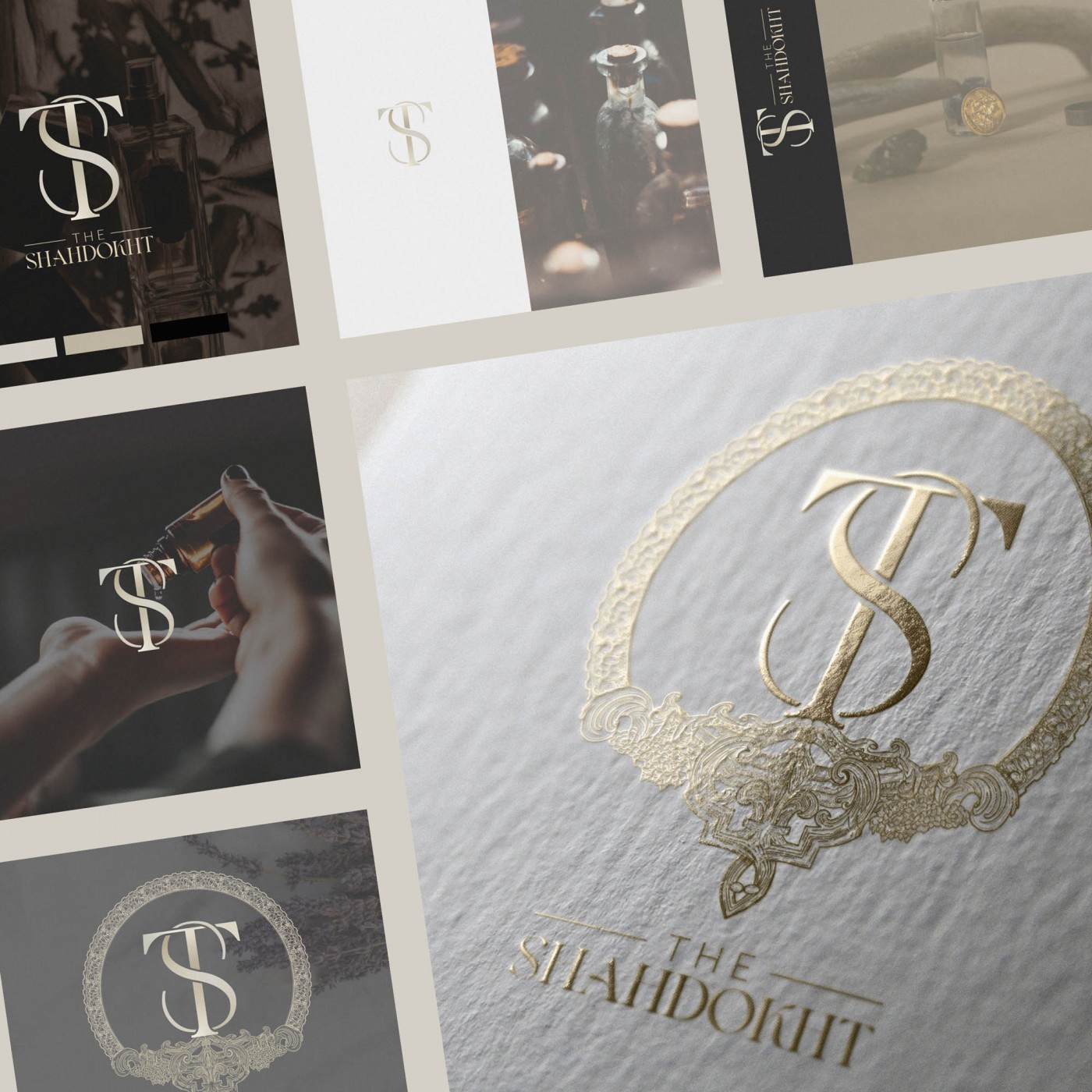
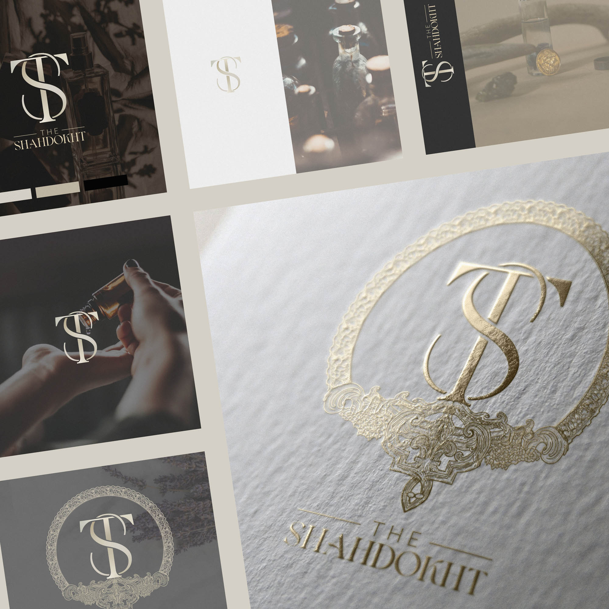
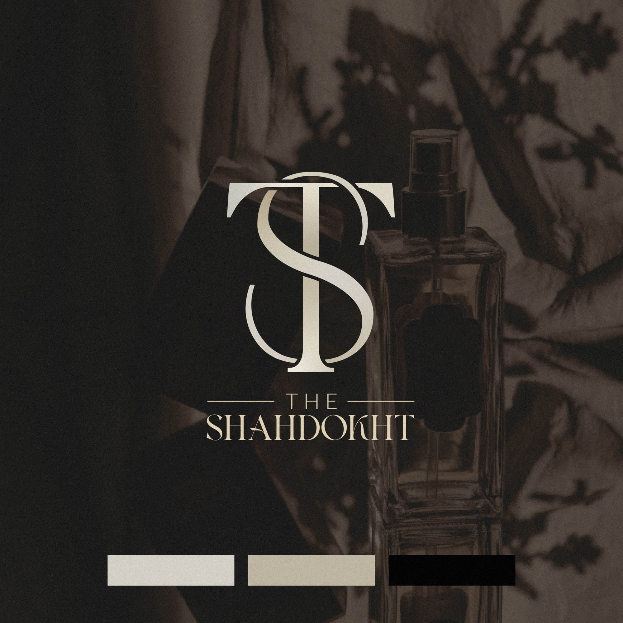
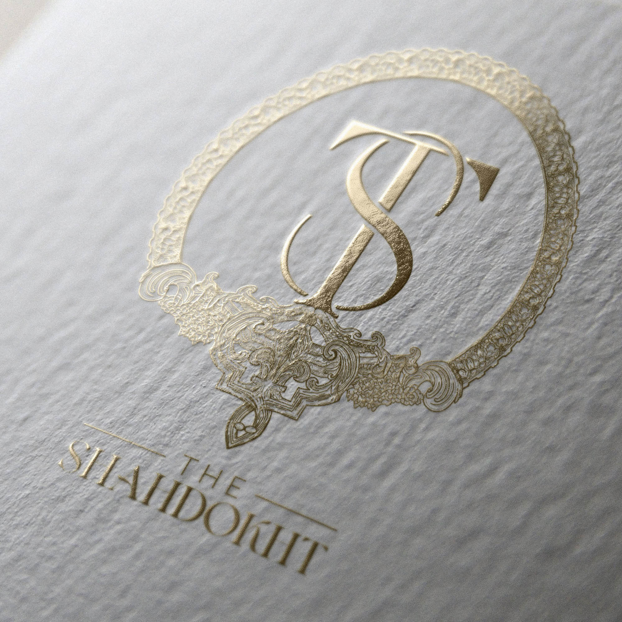
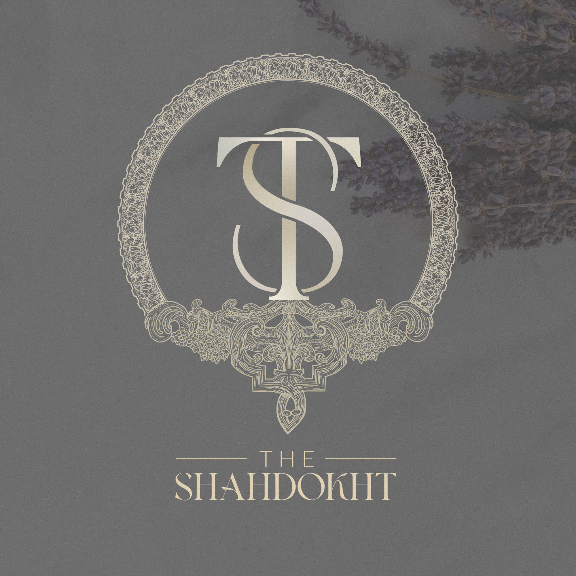
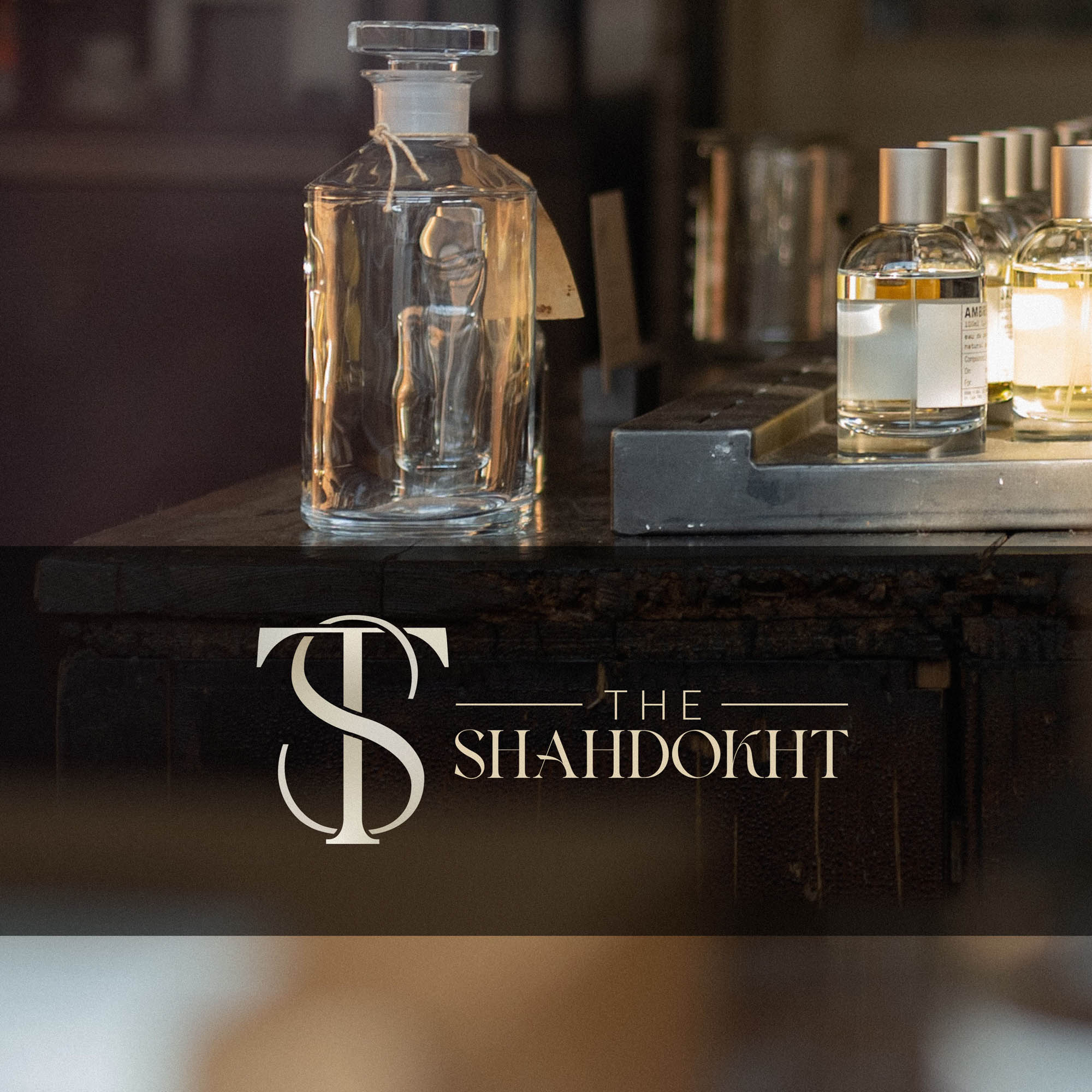
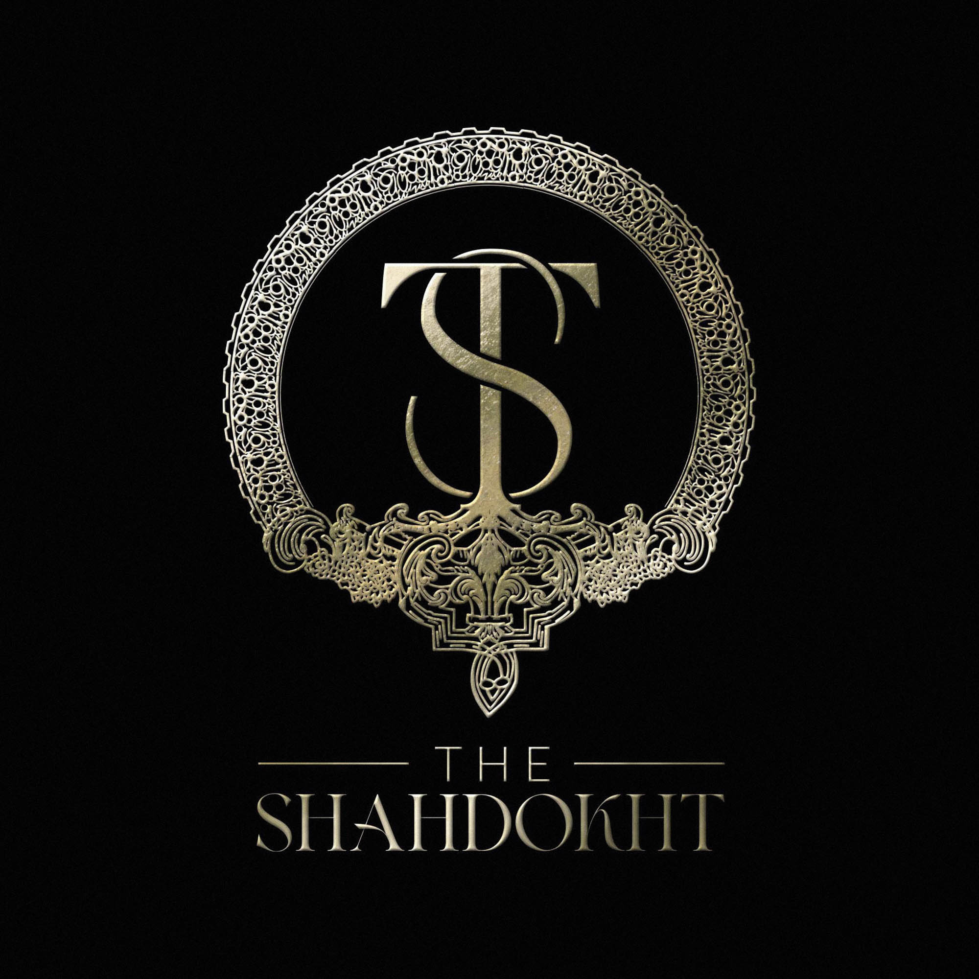
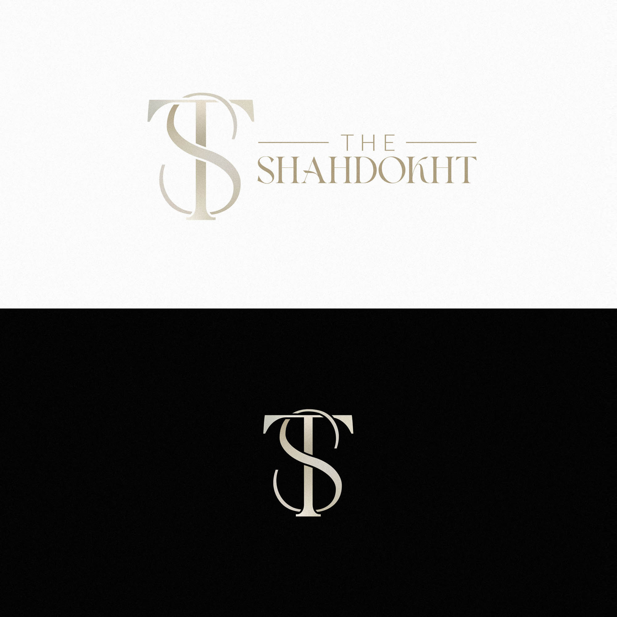
The rich version of the Shahdokht Logo is by far the most detailed, complex logo I’ve ever designed. In fact, it was only possible to even consider such a high level of detail by using a modular approach… The core features of the logo are present in the regular version, with a recognisable monogram as the centerpiece. The added detail in the rich version complement and enhance the core features – so that both are clearly part of the same brand identity.
The Shahdokht produces unique and exclusive purfumes containing rare raw oils and ingredients. The handdrawn artwork for the rich version of the logo was inspired by historical architecture, with several references and an overall concept provided by the client. An initial drawing was created using an iPad pro, digitally refined, and then carefully worked into an overall logo lockup to create a breathtakingly detailed version to be used in certain situations.
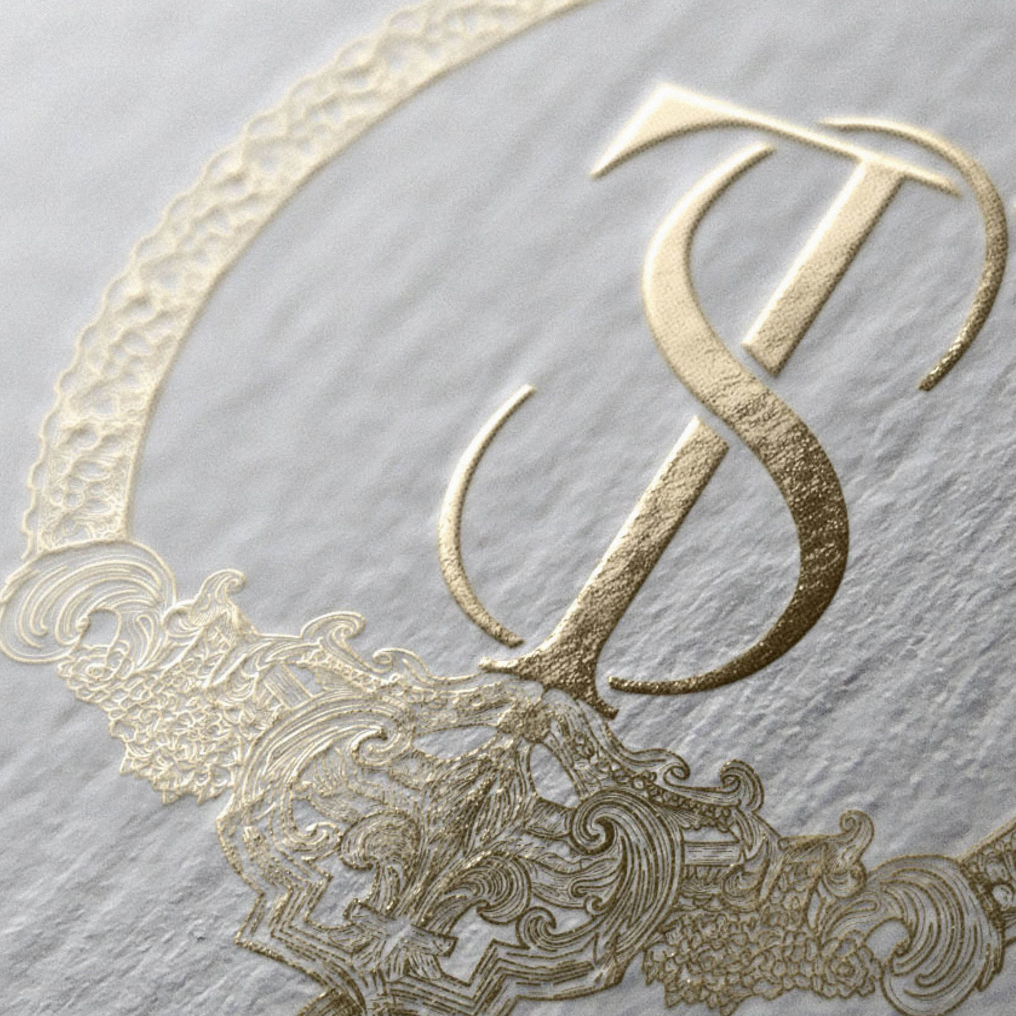
A version with a lower level of detail was also created specifically for gold foiling on business cards – with wider lines and increased gaps to avoid the foil bleeding at such a small size.
This ambitious concept really paid off, and the result is a stunning luxury logo which can be used responsively across a range of situations.
Case Study
Opportunity
Luxury perfume brands often default to generic monograms or ornate scripts that blur together. The Shahdokht invited a different path: a meticulously crafted emblem that feels heirloom-worthy yet modern — and a system that scales from grand statements to the smallest details.
Objectives
- Create a flagship “rich” mark that embodies exclusivity and craftsmanship.
- Retain a consistent brand DNA across a simplified “regular” logo and a compact monogram.
- Engineer variants that reproduce beautifully in specialist finishes (e.g., gold foil) at small sizes.
- Define clear usage rules so the identity performs across packaging, cards, and digital touchpoints.
Insight & Strategy
Customers drawn to rare oils and bespoke blends value provenance and craft. Our approach centred on a responsive identity: the monogram as the immutable nucleus, with modular ornamental layers that expand or contract depending on scale and substrate. Historical architectural references supplied by the client informed the aesthetic, grounding luxury in story and substance.
Identity Solution
- Responsive Set: A trio of marks — Rich (high-detail master emblem), Regular (streamlined lockup preserving all core features), and Monogram (the recognisable centrepiece) — all unmistakably from the same system.
- Craft Workflow: Hand-drawn on iPad Pro, then meticulously refined and vectorised before being composed into the final lockup for precision and repeatability.
- Foil-Optimised Variant: A dedicated version with increased line weights and wider gaps to prevent fill-in and maintain clarity on gold-foiled business cards and other small-format applications.
- System Rules: Scale thresholds, minimum sizes, and spacing guidance ensure the right mark is used for each context, preserving legibility and the intended level of ornamentation.
Competitive Edge Now
Where many luxury marks are interchangeable, The Shahdokht’s emblem communicates rarity and narrative craft at a glance. The modular architecture means the brand never has to choose between spectacle and clarity — it delivers both, appropriately, across contexts.
What This Enables
The identity is poised for limited editions, collector packaging, and special releases, while remaining practical for day-to-day applications. With a consistent monogram at its core and production-ready variants, the brand can scale its presence without sacrificing coherence or detail.

