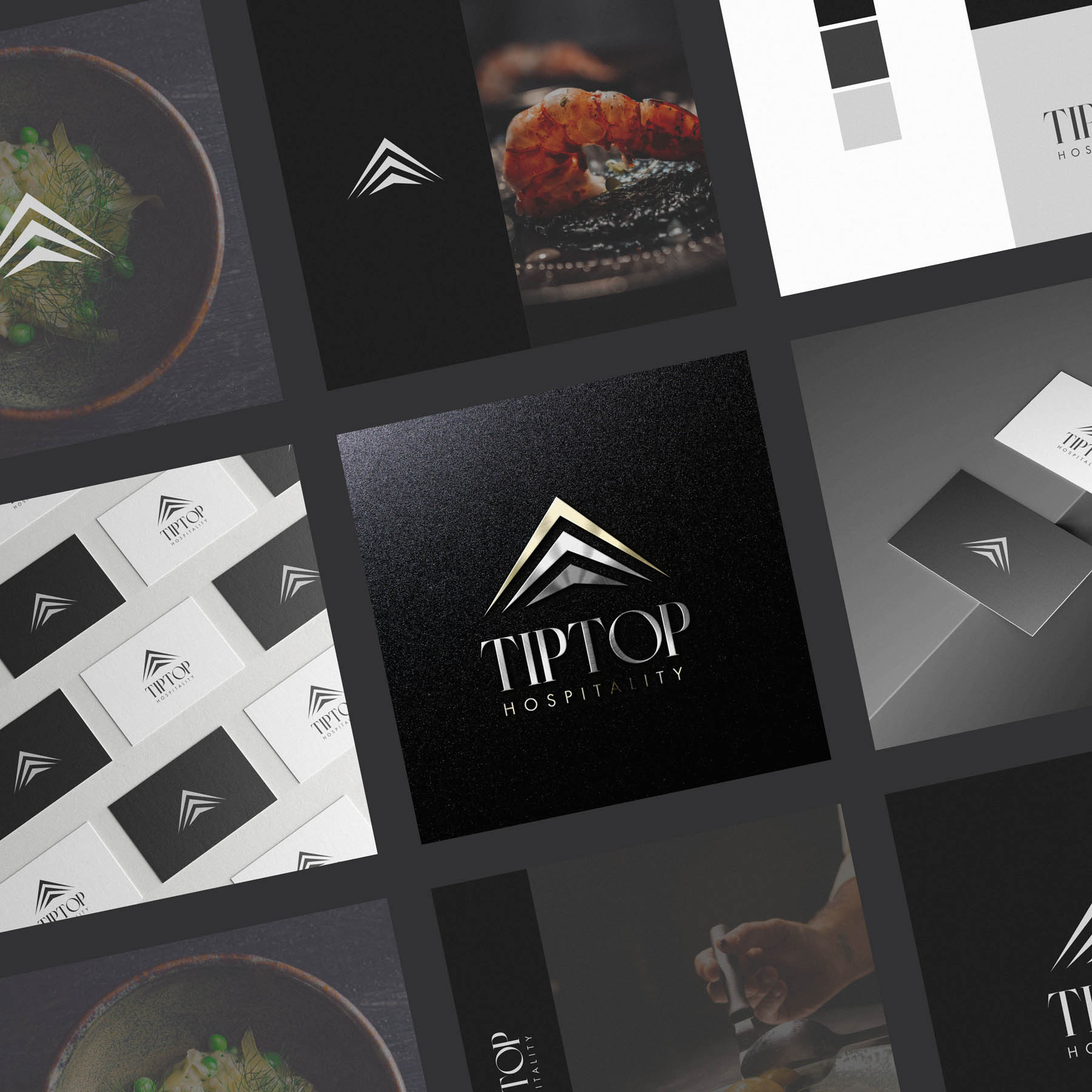
I was commissioned to create new brand identity (which of course includes logo design) for Tip Top Hospitality, specialising in high end events and catering internationally. We wanted to play on the strong brand name, and the concept of 3 unique chevrons worked beautifully; on one level it represents an abstract building or marquee, on another it indicates the very finest in quality and service.
Case Study
Opportunity
In premium events and catering, many brands look interchangeable. With a strong name, there was an opportunity to craft a mark that signals best-in-class service and the architectural drama of a marquee or event space—instantly recognisable on print, digital and in-venue.
Objectives
-
Translate “Tip Top” into a distinctive, high-end visual signature.
-
Create a symbol that reads clearly at distance and at small sizes.
-
Pair the mark with a refined wordmark that feels editorial and luxurious.
-
Provide a palette and finishes that elevate menus, invites and event collateral.
Insight & Strategy
Guests and clients read quality in seconds. We distilled the idea of “top” and “venue” into a set of three ascending chevrons—a minimal, architectural gesture that suggests a marquee/roofline and the notion of reaching the top tier of service. The tone is modern, composed and celebratory without glitter.
Identity Solution
-
Symbol: Three clean chevrons arranged as an elegant peak. It doubles as a submark for small contexts (glassware, lapel pins, favicons, social avatars) where typography would be too fine.
-
Wordmark: A high-contrast serif TIPTOP balanced by a finely spaced HOSPITALITY line—engineered for poise on dark and light grounds.
-
Colour & Finish: Monochrome core (charcoal to soft silver) with champagne-gold metallic as a controlled accent for premium moments (foil, metallic ink, or digital highlights).
-
System: Horizontal and centred lockups, reversal rules, and minimum sizes to protect clarity across badges, proposals, wayfinding and screens.
Competitive Edge Now
The identity carries a clear story in a single silhouette: upward, architectural, best of the best. The chevron peak sticks in memory, the typographic pairing elevates perceived value, and the restrained palette ensures imagery and cuisine remain the heroes.
What This Enables
A coherent presence from proposals to event backdrops; confident small-scale branding via the chevron submark; and a production-ready kit (including metallic guidance) that keeps every touchpoint polished as the brand delivers high-end events internationally.


