A range of digital and print collateral created for Websters Surveyors and their parent brand Sawyer Fielding Ltd, including various guidance notes, brochures, and a collection of custom icons we’ve created and added to over the years.
I embraced the existing style and brand guidelines Sawyer Fielding had in place, but have also had the scope to grow and evolve this style over time – including new brand identity for Websters Surveyors, which we created from the ground up.

Case Study
Opportunity
Websters Surveyors and parent brand Sawyer Fielding required a unified set of digital and print materials—guidance notes, brochures, and visual assets—that present clearly, feel cohesive, and can evolve over time. This included creating a dedicated brand identity for Websters while respecting the established Sawyer Fielding style.
Objectives
- Deliver a coherent system for guidance notes and brochures across digital and print.
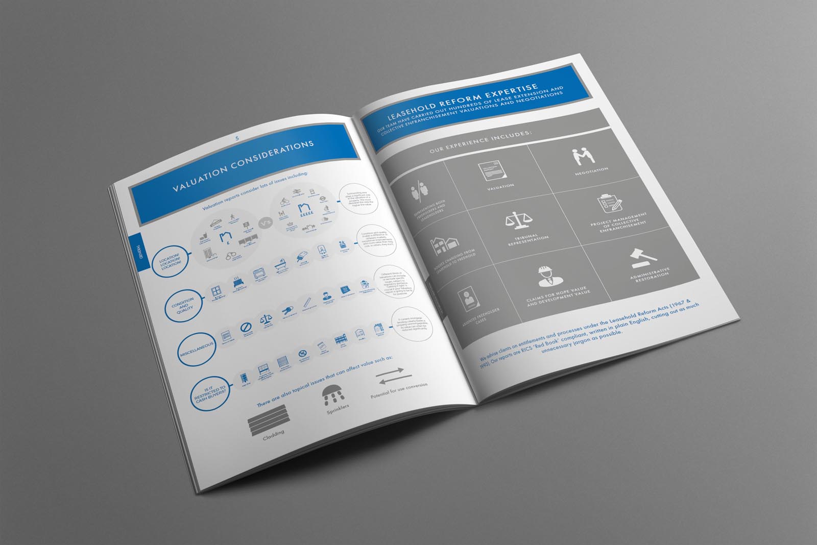
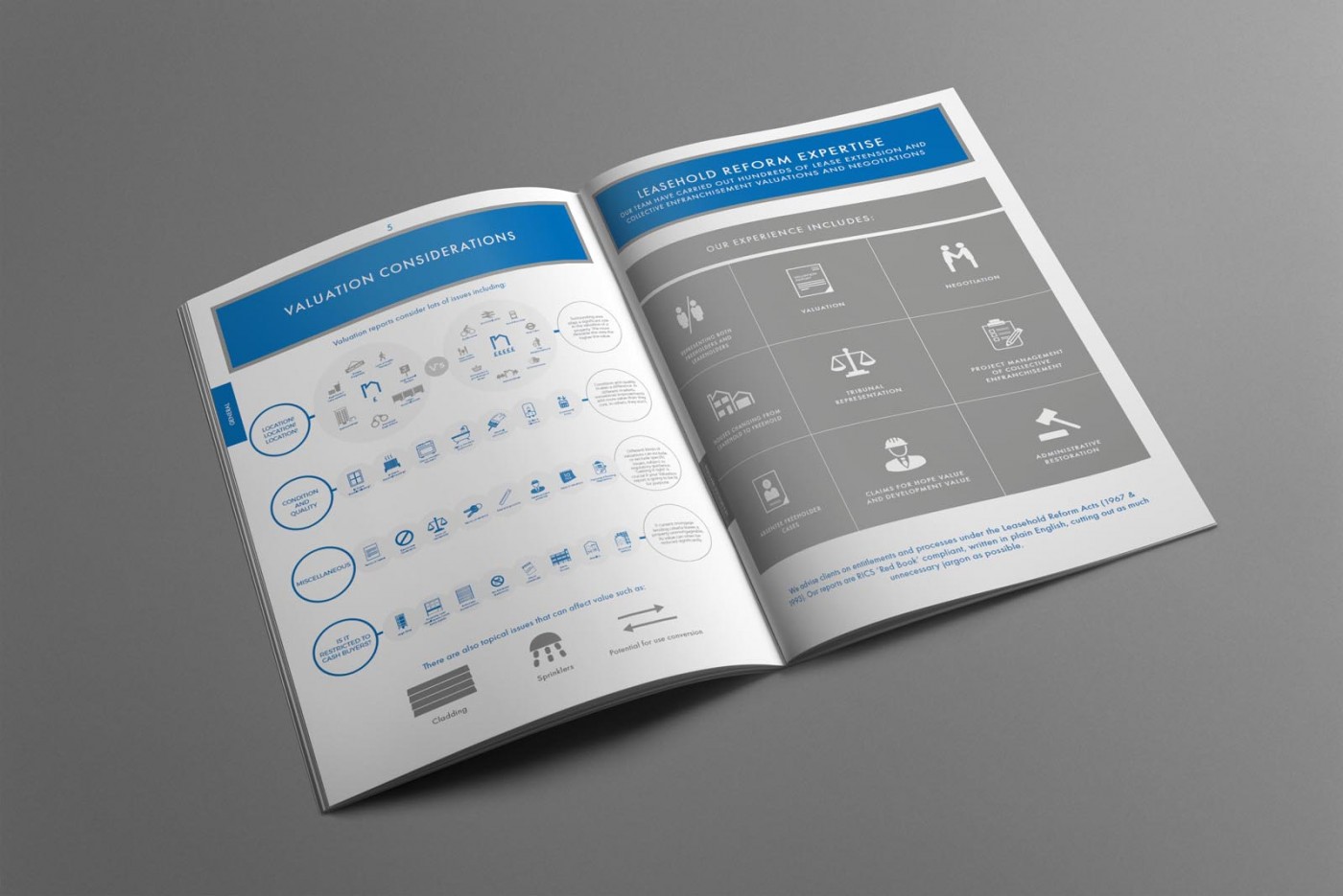
- Develop and maintain a custom icon set that communicates services and ideas at a glance.
- Create a new, stand-alone identity for Websters Surveyors that aligns with the parent brand architecture.
- Provide templates and repeatable layouts so updates are fast, consistent, and high quality.
Insight & Strategy
We built on the existing Sawyer Fielding guidelines to ensure continuity, then defined the visual relationship between the parent and Websters. A modular layout approach, clear hierarchy, and an expandable icon style make the system straightforward to extend—supporting long-term communications and incremental additions.
Identity Solution
- Websters Identity: A new brand created from the ground up, designed to sit comfortably alongside Sawyer Fielding while standing confidently on its own materials.
- Guidance Notes & Brochures: Structured cover and inside-page layouts that balance clarity and pace, suitable for both PDF and print.
- Custom Iconography: A growing library of consistent, on-brand icons used across documents to aid quick understanding and visual navigation.
- System & Templates: Reusable masters with spacing, headline/body styles, and export presets to keep every new piece on-brand and production-ready.
Competitive Edge Now
The materials read as one family—recognisable, orderly, and easy to digest. The dedicated Websters identity works seamlessly with the parent brand, while the icon set and templates speed up future projects without sacrificing polish.
What This Enables
An adaptable communications toolkit that supports ongoing guidance notes, brochure updates, and new collateral—positioning both Websters Surveyors and Sawyer Fielding to communicate with clarity and consistency as their content grows.