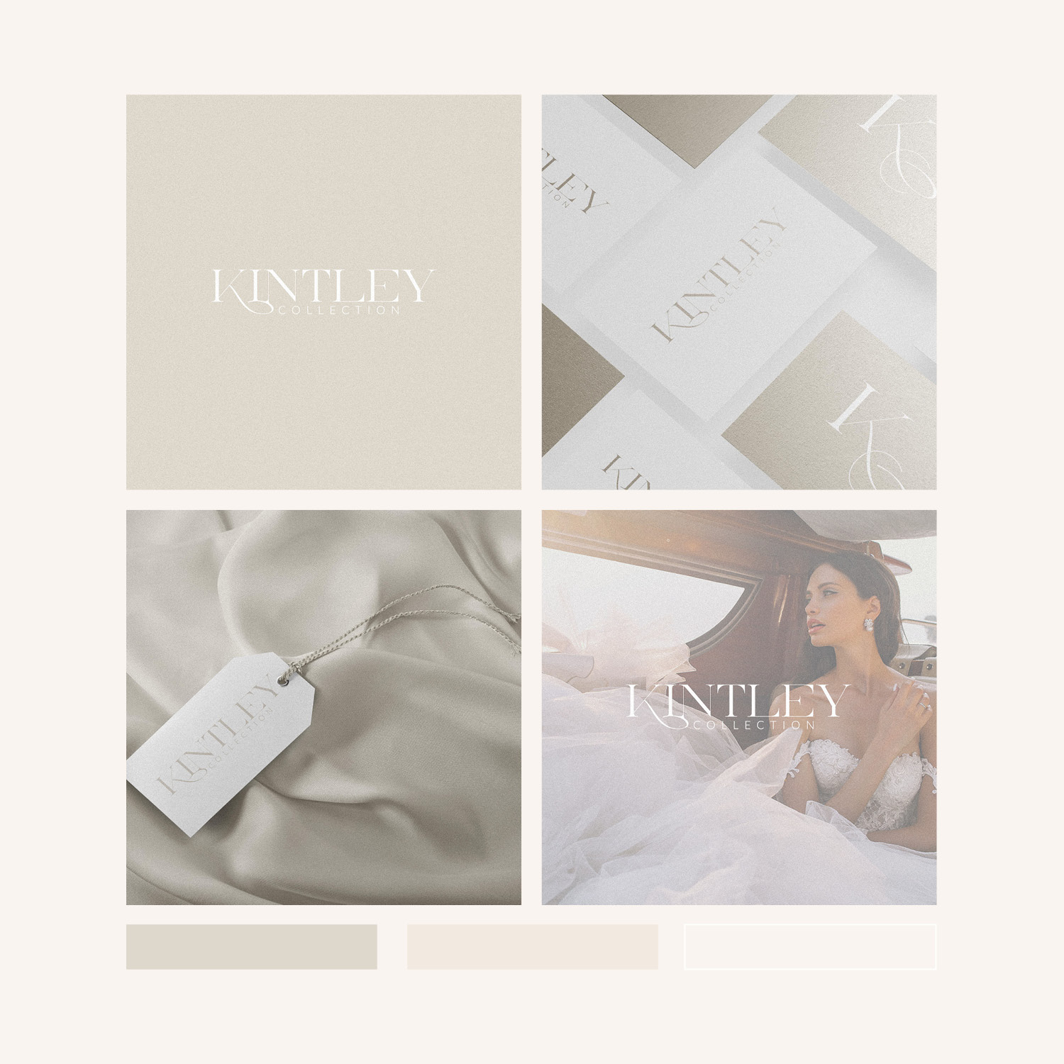
Brand Identity Design for the Kintley Collection – a high end bridewear boutique based in London. The subtle, neutral palette beautifully compliments the light tones frequently used in wedding fashion, and creates a soft, almost dreamy aesthetic.
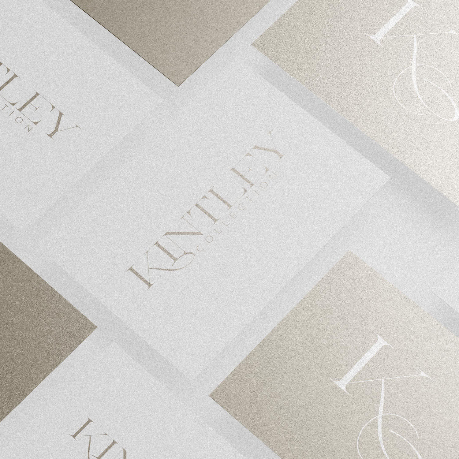
The customised font positions this brand perfectly as high end fashion boutique, with a combination of classic elements complimenting the modern to create something that feels timeless. The K features a sweeping ligature that frames the 2nd line of text and connects the base of the ‘I’ & ‘N’ in a visually interesting way.
A submark was also created using the K & C, again featuring a script style leg to the K.
Combining modern serif fonts (didone style) with ligatures or flourishes from script fonts is an excellent way to stylise type.
Case Study
Opportunity
A London bridalwear boutique aimed at discerning clients needed an identity that feels couture-level yet approachable. In a space full of ornate scripts and heavy florals, there was room for a calm, modern classic that flatters the light, airy tones of bridal fashion.
Objectives
-
Convey high-end craftsmanship and taste from the first glance.
-
Create a typographic identity with subtle character, not ornament.
-
Establish a neutral, elegant palette that photographs beautifully and doesn’t compete with gowns.
-
Ensure clarity at small sizes across digital use and printed collateral.
Insight & Strategy
Bridal clients equate restraint with refinement. We focused on a softly editorial voice—confident spacing, gentle contrast and typography tailored to feel timeless rather than trend-led. The goal was to let fabric, light and silhouette take centre stage while the brand frames the experience.
Identity Solution
-
Customised wordmark: A refined logotype built from a classic base and carefully modified letterforms—balancing heritage cues with a contemporary cut so it reads poised on signage and delicate on packaging.
-
Palette & tone: A suite of nuanced neutrals (ivory, sand, dove) chosen to complement bridal palettes and create a dreamy, low-contrast atmosphere in print and on screen.
-
System notes: Primary horizontal lockup with spacing and minimum-size guidance, plus monochrome/reversed variants to protect legibility on photography-led layouts and textured stocks.
Competitive Edge Now
The brand feels couture-clean: unmistakably premium, quietly romantic, and free of cliché. The tailored lettering becomes the signature; the neutral palette lifts the work without stealing attention—ideal for lookbooks, labels and digital touchpoints.
What This Enables
Confident presentation across galleries, social and client communications; a recognisable, graceful presence that supports premium positioning; and a flexible foundation for future launches and collaborations while maintaining the boutique’s calm, modern-classic character.


