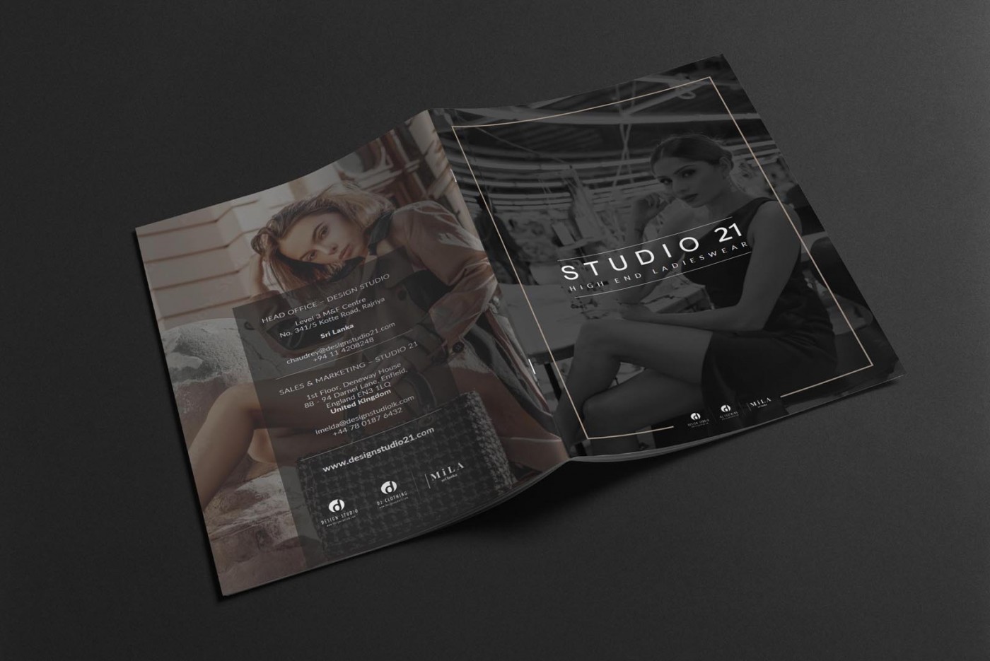
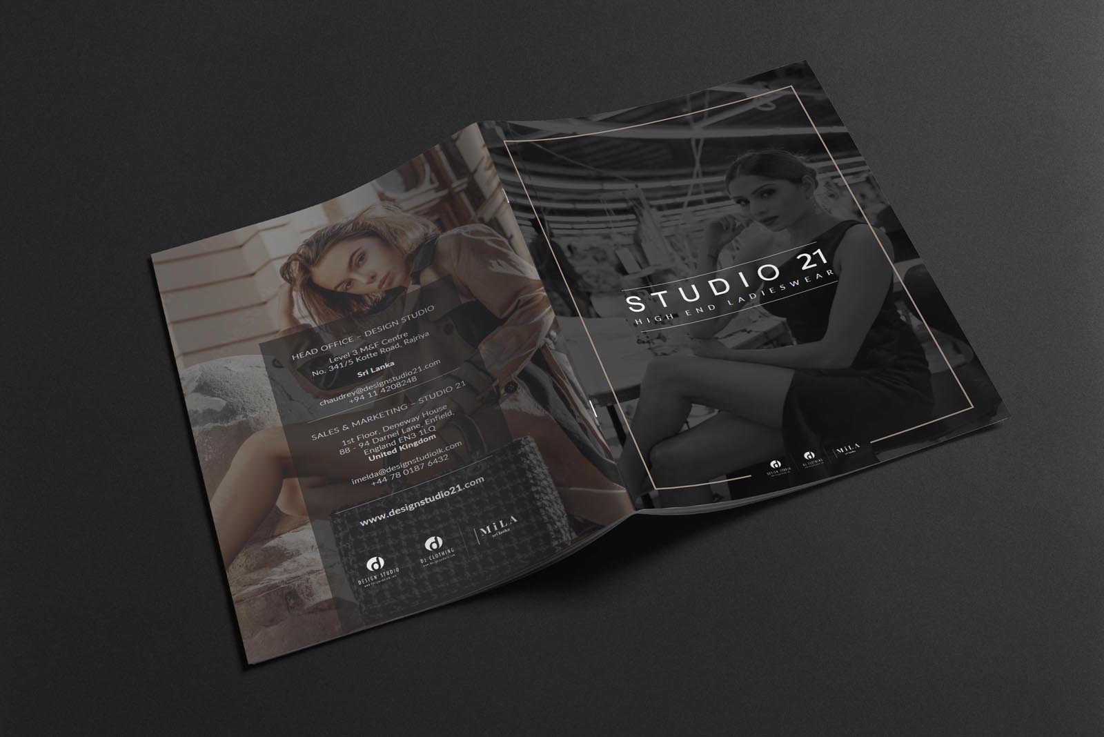
High end brochure design for Studio 21; producers of high end clothing behind the scenes for some of the top brands in fashion. While they don’t market directly to the public, they needed professional branding to ensure their business to business interactions reflected core brand values and engendered trust.
Case Study
Opportunity
Studio21 produces high-end clothing behind the scenes for leading fashion houses. They don’t market to consumers; they win trust with brand-side directors, buyers and production teams. The brief was to create a brochure that mirrors that professionalism—projecting values, reliability and discretion at a glance for B2B conversations.
Objectives
-
Present a credible, brand-safe identity to procurement and production stakeholders.
-
Communicate who they are, what they do and how they work in a fast, scannable format.
-
Balance editorial polish with business clarity (no consumer-facing flourish).
-
Deliver both a print brochure and a lightweight PDF for email/remote use.
Insight & Strategy
Time-pressed brand teams read in layers and look for signals of quality, capacity and care. We structured the brochure around a simple, repeatable rhythm—Who we are → Values → Capabilities → How we work → Contact—so decision-makers can skim headlines then deepen where needed. The tone is “quietly expert”: confident, discreet and practical.
Design Solution
-
Editorial cover: Monochrome imagery with a fine double keyline and a restrained wordmark set the premium mood without feeling consumer-advertorial.
-
Information architecture: Each section opens with a full-bleed image and a vertical side band for section titling—clear wayfinding for quick meetings and screenshares.
-
Values & proof points: Concise copy blocks express craftsmanship, consistency and partnership; small supporting visuals (details, materials, workroom moments) add credibility without revealing client IP.
-
Capabilities & process: A tidy spread outlines services and the collaboration flow—enquiry → development → approval → delivery—keeping attention on reliability and communication.
-
Palette & type: Black/charcoal with a champagne-taupe accent and elegant, high-readability typography—premium, calm, and production-friendly.
-
Outputs: Press-ready artwork for a short print run and an optimised PDF for quick distribution.
Competitive Edge Now
The brochure reads like a trusted partner document—not a consumer catalogue. It is editorial in finish, businesslike in structure, and deliberate about discretion—exactly the balance brand-side stakeholders expect when engaging a behind-the-scenes producer.
What This Enables
Sharper first impressions with buyers and production leads, easier vendor onboarding, and a reusable asset for outreach and follow-ups—keeping Studio21’s B2B positioning consistent across meetings, email and remote presentations.


