I was commissioned to create new brand identity for Looking Glass Studio, (previously known as Pictures of Prose) led by the talented Deirdre Lewis and based in Belleville, Illinois, USA. With a focus on children’s portraiture, the studio invites you to join them ‘through the looking glass’, with meticulously crafted scenes that feel like they’ve come straight out of a fairtale.
LGS is positioned as a luxury brand, and so we wanted to reflect this with a rich, sophisticated brand identity that would clearly indicate the level of experience the studio create for their clients.
A stylish LG submark provides a versatile range of applications where the full logo might appear a little too small.

Case Study
Opportunity
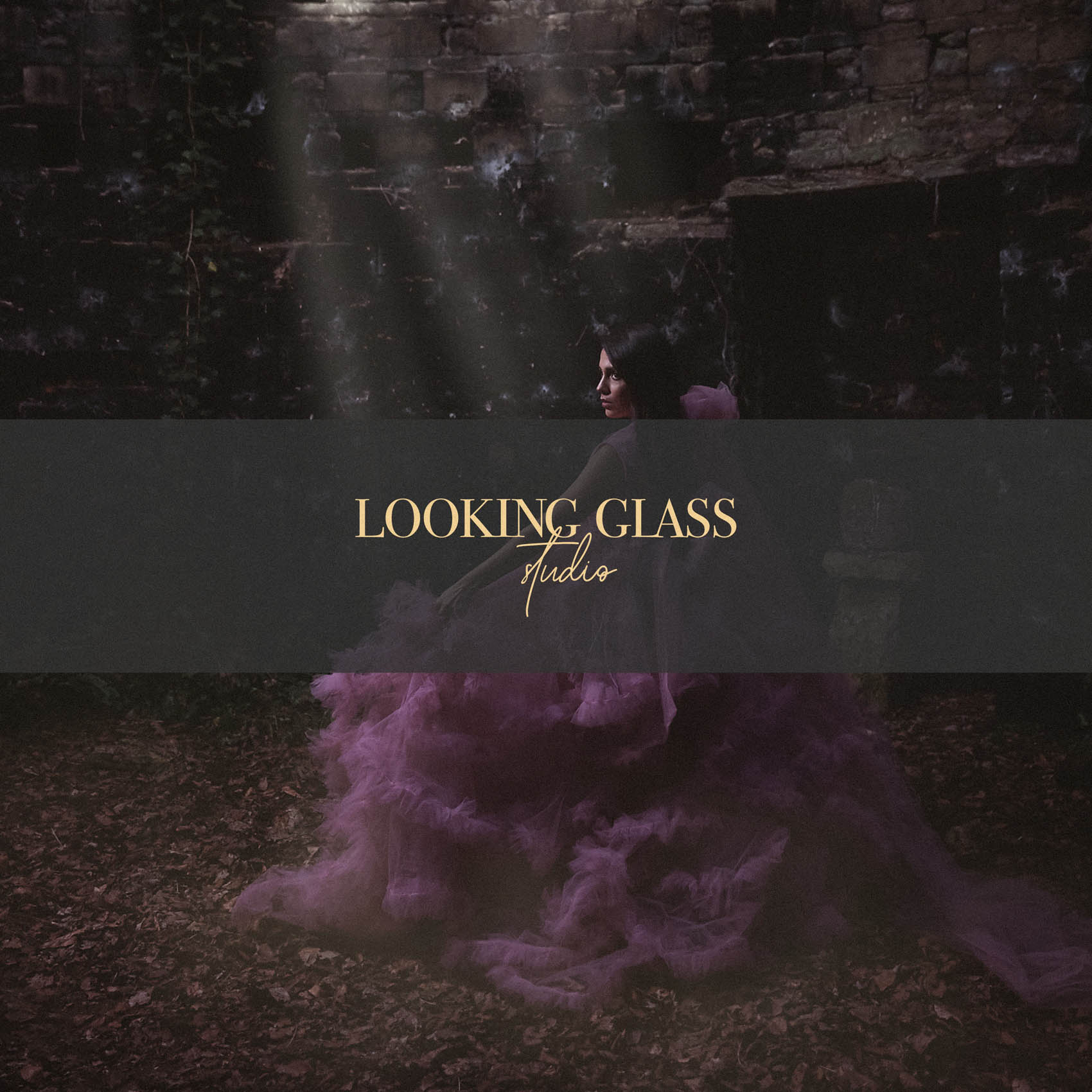
A fine-art portrait studio that stages fairytale scenes needs a brand that communicates luxury and imagination in the same breath. The identity had to feel editorial and rich—yet disciplined enough to reproduce flawlessly on prints, certificates, packaging and a photographer’s watermark.
Objectives
-
Convey a premium, story-driven experience from the first glance.
-
Create a signature mark and secondary LG submark for small-space and watermark use.
-
Establish a refined palette and typographic system that pairs with cinematic imagery (no visual noise).
-
Ensure legibility and consistency across print, digital and signage.
Insight & Strategy
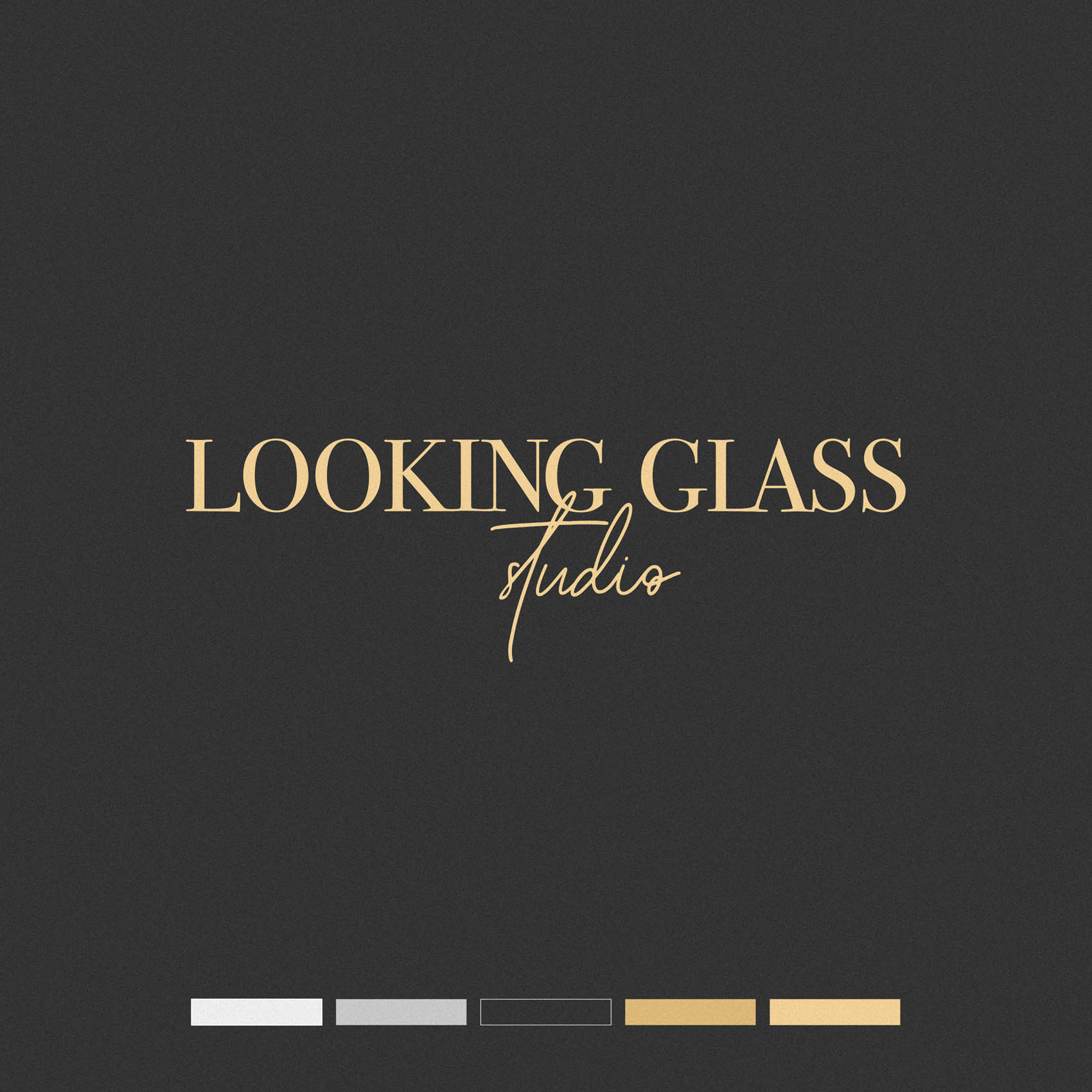
Clients are buying heirloom memories, not just pictures. We centered the brand on enchanted sophistication: composed typography, generous spacing, and a restrained charcoal-and-gold world that signals theatre and craft without tipping into pastiche. The tone is assured, imaginative and carefully edited.
Identity Solution
-
Wordmark: Refined lettering with calibrated spacing and contrast to read with poise at both hero and micro sizes.
-
Submark: A compact LG monogram for seals, social avatars and subtle watermarks—engineered to remain crisp over complex imagery.
-
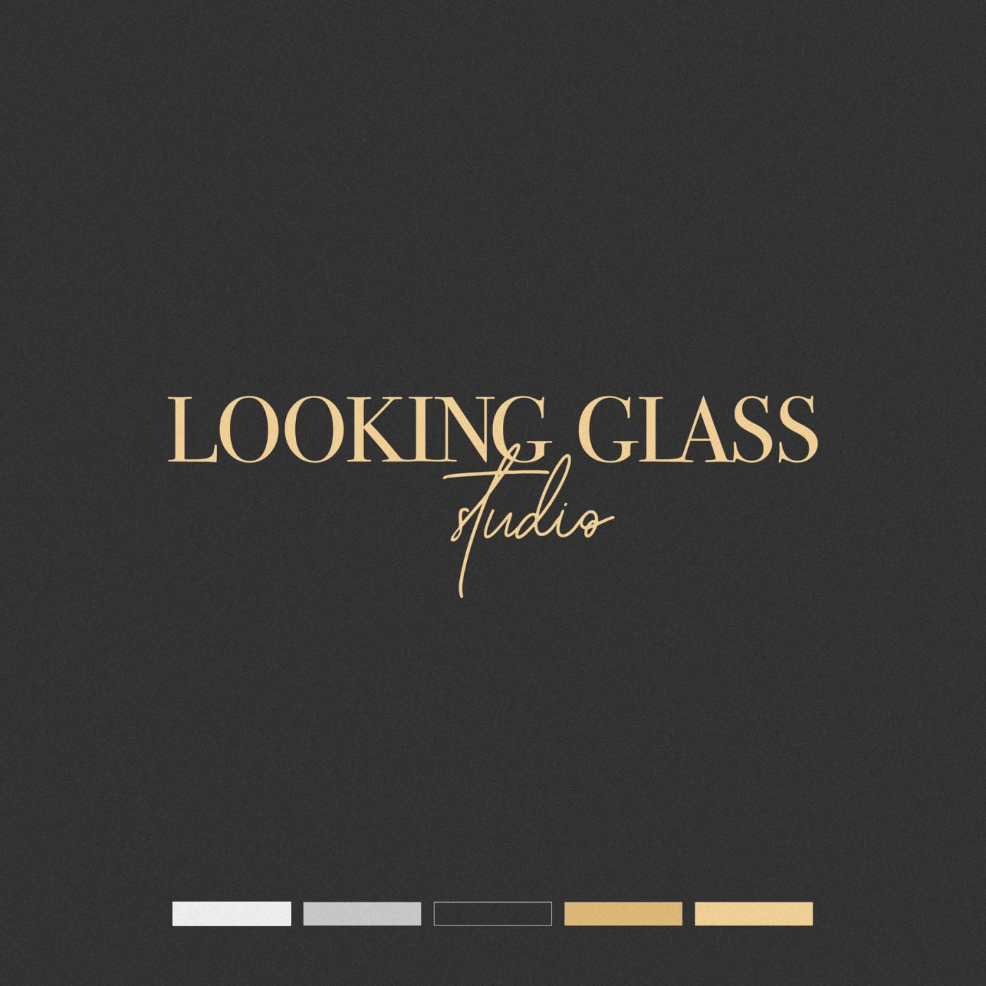
Palette & Type: Charcoal foundations with gold accents, paired with an editorial serif/sans combination for headlines and supporting copy.
-
System & Use: Clear lockups (horizontal/compact), minimum sizes, reversal rules and guidance for watermark placement so the identity supports, not competes with, the photographs.
Competitive Edge Now
The studio presents as sumptuous and disciplined: a memorable monogram, a composed wordmark and a colour world that elevates the fairytale aesthetic rather than overpowering it—helping the brand read premium across every touchpoint.
What This Enables
A cohesive presence from gallery prints to packaging to the website; confident small-scale branding via the LG submark; and room to expand into special editions and events while preserving the studio’s luxurious, story-rich character.