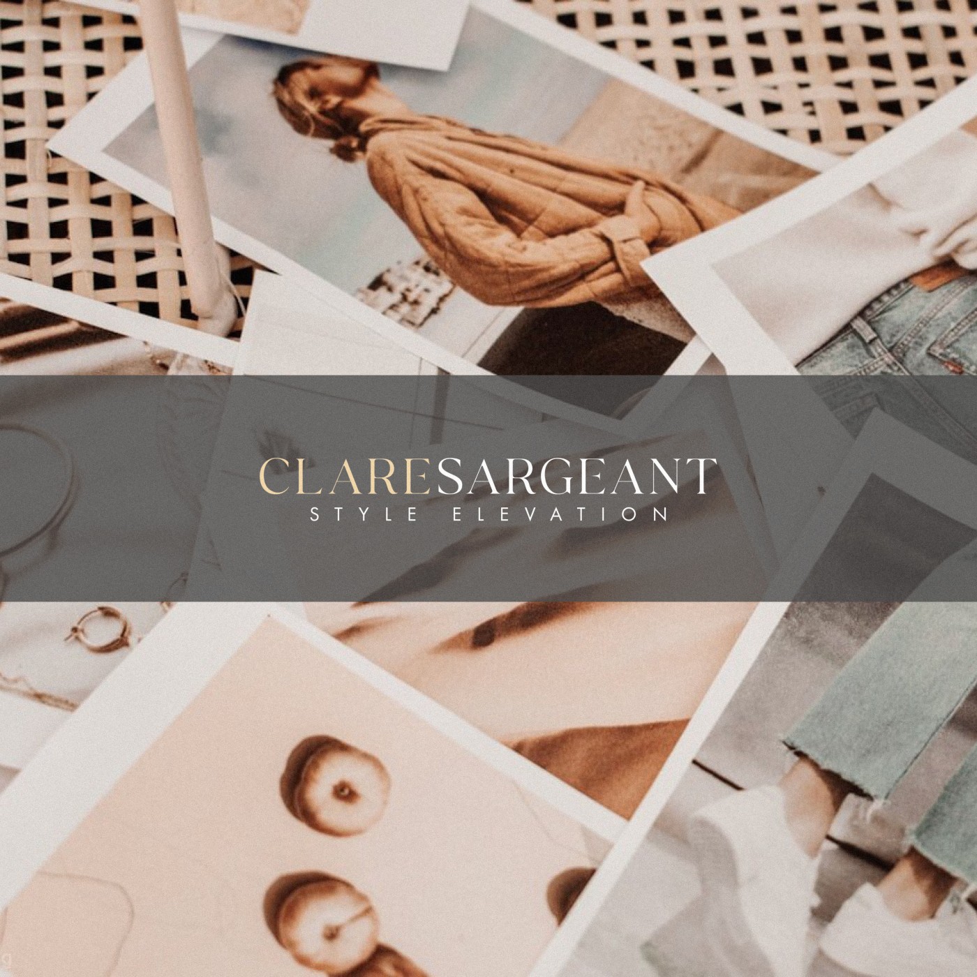
It was a pleasure working with Clare to create brand identity for ‘Clare Sargeant Style Elevation’. Clare is an accredited Personal Stylist based in Surrey, with over 10 years experience in the fashion industry and a degree from the London College of Style.
Clare is also proudly partnered with Harvey Nichols and their prestigious Stylist Club in Knightsbridge, London.
Naturally we wanted to create a brand positioned as luxurious and exclusive (without feeling unapproachable or unobtainable), to attract an audience who would benefit from her services and experience.
After exploring a number of potential monogram logos, we feel in love with a particular version (as seen in the images below) and the pairing of traditionally luxurious type with modern for the tagline.
We also experimented with a subtly pearlesent gradient colour, Clare’s idea, which after testing in a few situations I really grew to like. Subtle application is key, but the slight variation in tone really catches the eye and creates quite a unique background element.
Case Study
Opportunity
For an accredited personal stylist with over a decade’s experience and a Harvey Nichols partnership, the brand needed to project editorial polish and quiet exclusivity—inviting to prospective clients while clearly signalling high standards.
Objectives
-
Create a refined mark and wordmark that read as premium without feeling aloof.
-
Pair classical cues with a modern secondary type style for the tagline.
-
Establish a distinctive yet subtle visual device that can extend into web and social.
Insight & Strategy
Clients at this level respond to understatement and proof of taste. We built the identity around editorial restraint: precise letterforms, generous spacing and a limited colour world. A signature background treatment adds recognition without competing with imagery or copy.
Identity Solution
-
Monogram & Wordmark: After exploring multiple monogram directions, we selected a version whose geometry balances grace and clarity. The primary wordmark delivers a timeless, luxurious tone; the tagline set in a modern style introduces contemporary freshness.
-
Signature Gradient: A subtly pearlescent gradient—proposed by Clare and tuned through testing—acts as a quiet brand backdrop. Used sparingly, it catches light in a way that feels unique and elegant across print and digital.
-
System: Clear lockups (horizontal and compact), spacing and minimum sizes ensure the identity remains poised and legible from social avatars to presentation headers.
Competitive Edge Now
Compared with typical fashion-adjacent styling brands, the system feels assured and considered. The monogram provides a memorable anchor, the typographic pairing balances heritage with modernity, and the gradient motif gives Style Elevation an immediately recognisable, ownable touch.
What This Enables
A cohesive presence across proposals, social, and the single-page website; space for imagery to lead without visual noise; and a scalable set of assets that maintain the calm, premium character as services and content grow.


