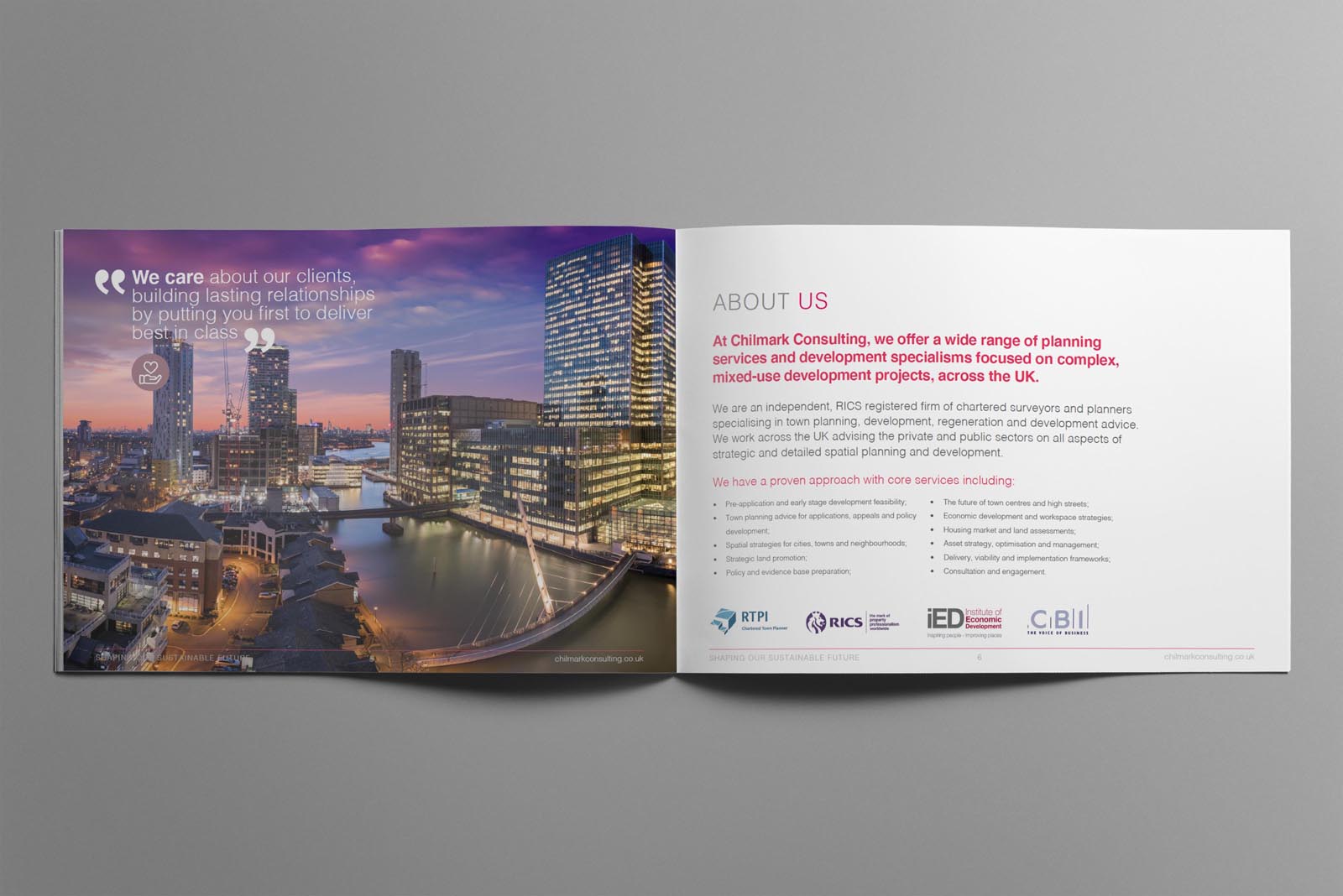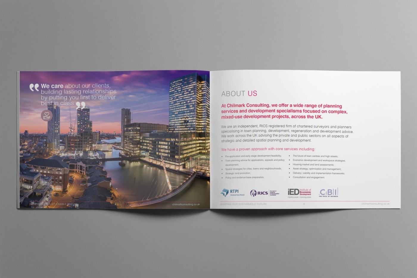
Chilmark Consulting are independent planning, regeneration and development advisors to the private and public sectors – and are RTPI Chartered Town Planners. We wanted the brochure to break the mould of regular corporate documents, and although the subject matter is serious and information driven, tasteful use of bright colours, strong images and dynamic layouts helped us acheive this goal.

Case Study
Opportunity
Chilmark Consulting commissioned a brochure that communicates expertise with clarity—showcasing services and project experience in a format that feels polished in print and effortless to read as a PDF.
Objectives
- Present complex information with a clear hierarchy that’s easy to skim and satisfying to read in full.
- Reflect the brand’s professional tone through disciplined typography, spacing and structure.
- Create a layout system that scales to additional pages or editions without redesign.
- Deliver artwork suitable for quality print and a lightweight, screen-friendly version.
Insight & Strategy
Decision-makers scan for the essentials first—what you do, why it matters, and proof of outcomes—then dive deeper. We shaped the brochure around that journey: concise section openers, clear signposting, and supportive visuals that steer the reader without visual noise.
Identity Solution
- Layout System: A strong grid and generous margins create rhythm and order, keeping key messages prominent.
- Typography: A refined pairing with measured line lengths and spacing for long-form readability across print and screen.
- Colour & Accents: Brand neutrals with strategic highlight tones for headings, pull quotes and key facts.
- Visual Structure: Consistent chapter starts, summary panels and callouts to surface benefits and credentials at a glance.
- Production: Print-ready files with defined bleeds and safe areas, plus an optimised PDF export for digital sharing.
Competitive Edge Now
The brochure reads with precision and ease: information lands quickly, longer sections remain comfortable to read, and the brand voice stays consistent from cover to closing page—supporting credibility in both meetings and inboxes.
What This Enables
A scalable communications asset that can absorb new case material, service lines and data without losing coherence—ready for reprints, targeted handouts and digital distribution while maintaining a high standard of presentation.