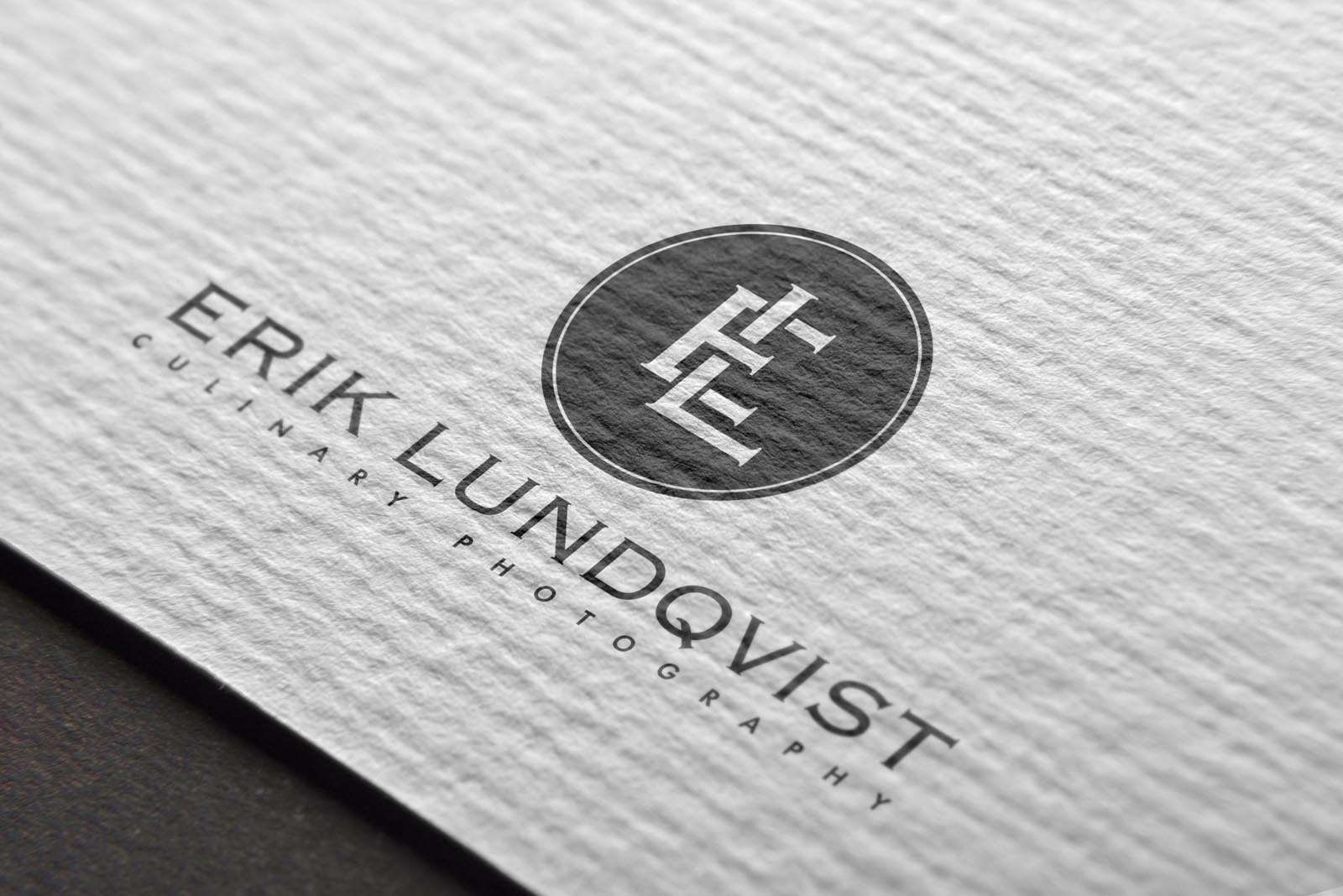
I was commissioned to create a logo along with new brand identity guidelines for Erik Lundqvist, a culinary (food) photographer based in London. The new brand needed to bring perceived value and expection in line with the high standard of photography Erik offers. It also needed to clearly identify him as a specialist in this field, rather than a generic or mixed discipline photographer.
We achieved the former goal by creating a unique monogram that immediately feels appropriate for a high end, luxury brand – together with a refined colour palette of soft greys. The contrast between the copperplate font and modern sans serif for the tagline create just the right balance; refined, elegant, and modern.
The later was achieved in a simple way that is overlooked surprisingly often; we included it in the tagline! Rather than create a symbol that communicates important brand messages AND somehow resembles the subject matter; food or photography – it’s so much more effective to employ the symbol as a statement of not ‘what’ the brand does, but ‘how’ it does it. The tagline then says it all… culinary photography.
Both goals reached, in a simple and effective way.


