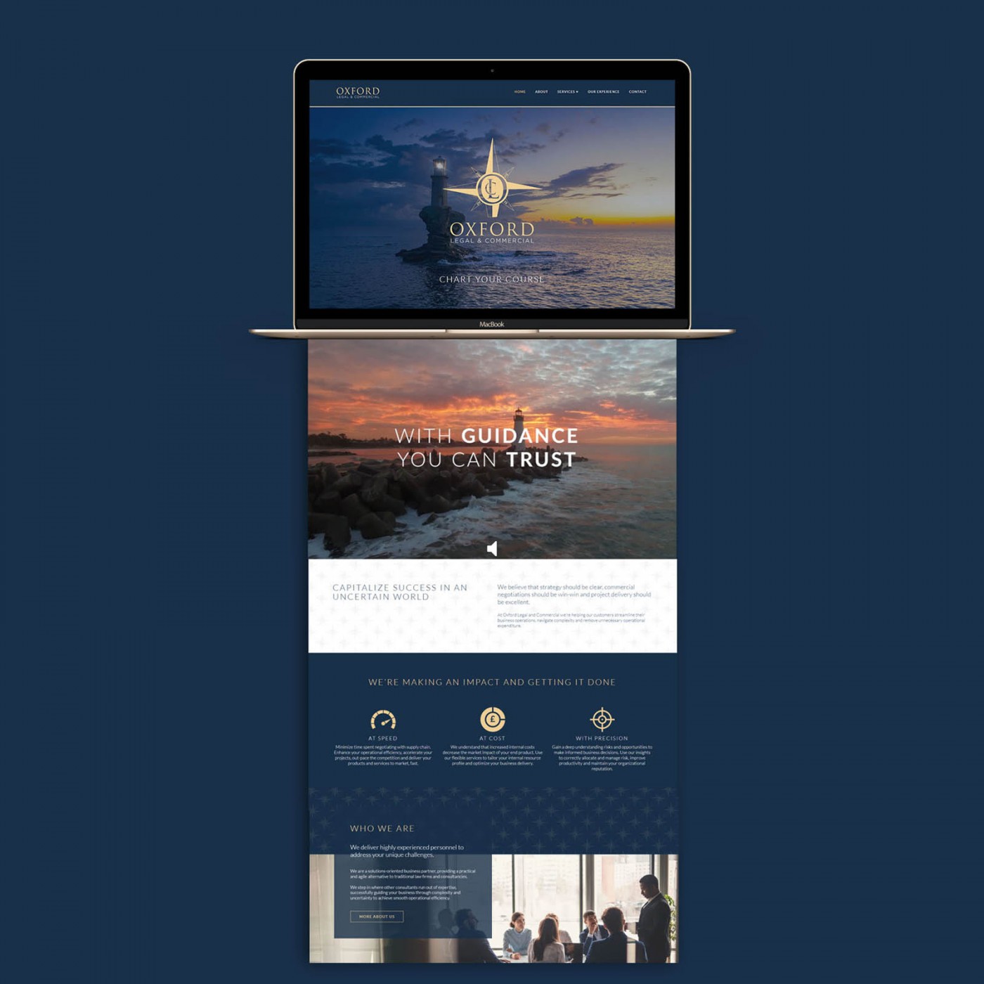
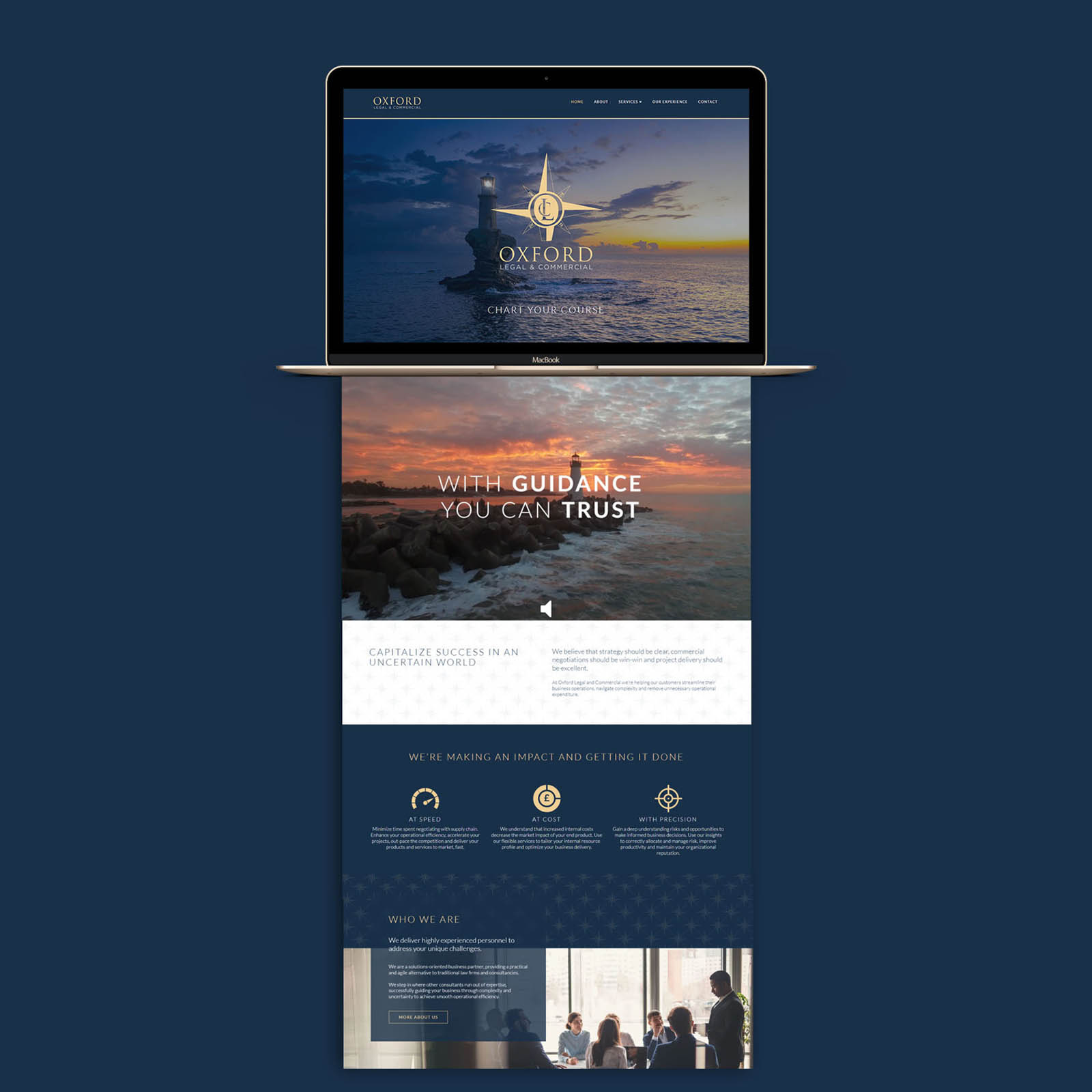
Oxford Legal & Commercial commissioned me to create their new website (as well as their brand identity, which you can view here; Oxford LC Brand Identity Design). The site uses the very latest Gen WordPress and is powered by a custom modified version of the PRO theme – meaning we were able to take advantage of tastefully implemented micro animations, parallax effects and latest generation responsive design features. It also features a custom intro video (which I created for them), autoplaying on most browsers with a simple button to unmute if desired. (Browsers will block videos attempting to autoplay with sound)
The legal, marketing and management services offered are quite technical, and could easily feel overwhelming to read through – so using the nautical theme (compass = navigating as a business… get it?) and a mixture of impactful imagery, one of the biggest challenges (and successes!) was to present this information in a palatable, attractive way.
The website is fully responsive, with custom adjustment to ensure the experience on mobile devices is just as impressive as desktop, laptop or tablet. (I don’t believe in leaving a plugin / theme to automatically create a responsive version – it should be just as carefully considered on mobile as it is for other views).
Case Study
Opportunity
Oxford LC required a website that conveys academic credibility with a warm, welcoming tone—showcasing programmes clearly and guiding prospective learners and parents to enquire with confidence.
Objectives (Business + User)
- Present courses, outcomes and key information in a structured, easy-to-skim format.
- Make next steps obvious: enquiry, call-back, or visit booking.
- Highlight proof points (results, testimonials, affiliations) without clutter.
- Ensure the site is effortless to update as programmes and dates evolve.
UX Insight & Strategy
Visitors scan for “What can I study? How good is it? How do I start?” We built a guided journey: concise value proposition, programme overview with quick comparisons, focused detail pages, and persistent calls to action. Navigation groups content by intent—learn, compare, contact—reducing the hops from interest to enquiry.
Design System & Content
- UI & Typography: An academic, modern pairing with generous spacing for calm readability across devices.
- Palette & Imagery: A restrained, collegiate colour system and photographic style that communicates care and achievement.
- Components: Modular hero, programme tiles, outcomes/benefits lists, FAQs, testimonials and contact panels—reusable across pages to maintain consistency.
- Content Framing: Plain-English headings and short paragraphs support fast comprehension for international and local audiences alike.
Interaction & Performance
- Motion: Light, purposeful micro-interactions to cue hierarchy without distraction.
- Speed & Accessibility: Optimised media, semantic structure, sensible contrast and keyboard-friendly focus states.
- CMS Practicality: A modular, block-based setup so new courses, dates and updates can be published quickly while preserving layout quality.
Competitive Edge Now
The site brings clarity and confidence together: programmes are easy to compare, proof points are surfaced at the right moment, and enquiry routes are consistently visible—creating a polished, student-friendly experience from the first scroll.
What This Enables
A scalable platform for new programmes, seasonal intakes and content growth—supporting outreach, improving discoverability and keeping presentation coherent as Oxford LC evolves.


