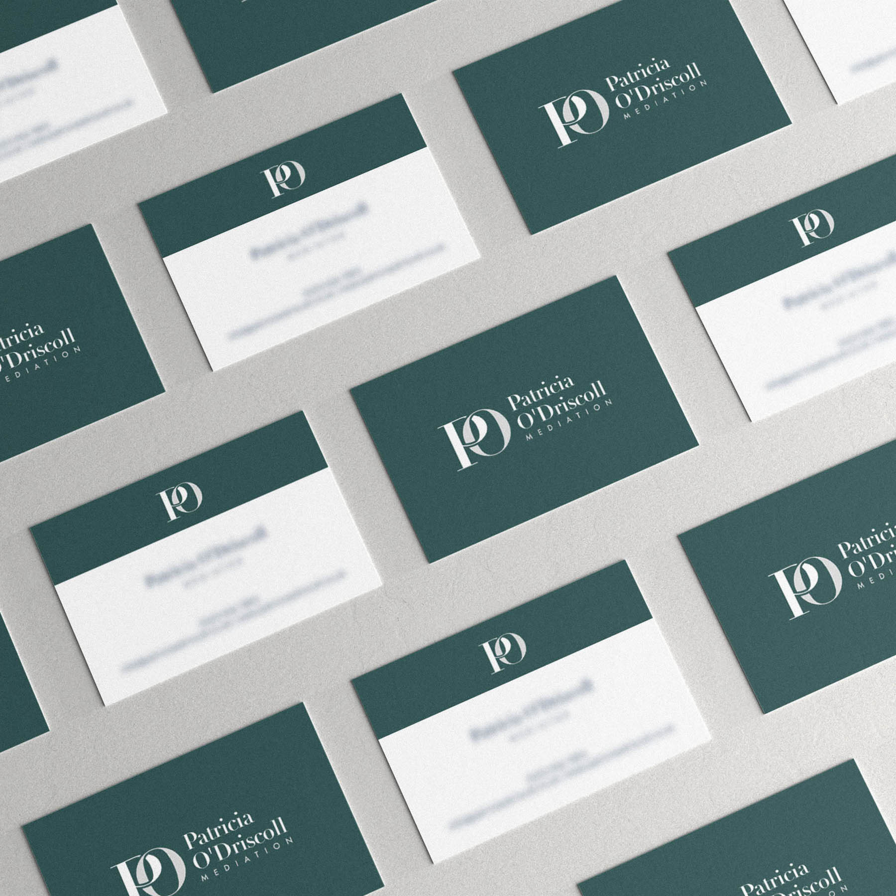
I was commissioned to create the new brand identity for Patricia O Driscoll Mediation, along with front end website design (Designing the layouts, look and feel of a website, but then passing the concepts on for a developer to build).
The brand needed to feel approachable yet professional, with a sense of peace / tranquility – a little softer than a law firm, but more serious than family counselling, as mediation takes place when divorce is pending. We felt the brand colours in particular reflected the kind of respectful, peacefully enviroment Patricia endevours to create for her clients – while the logo itself aligns well with her background as a Barrister and considerable legal experience.
The interlocking ‘P’ and ‘O’ in the monogram is an appropriate nod to the interlocking (and sadly, seperation of) wedding rings at the stage clients engage Patricia, highlighting her specialisation.
Case Study
Opportunity
Mediation sits in a delicate space: it must feel kinder than a law firm yet more formal than counselling. There was an opening for an identity that projects even-handed authority and genuine calm—especially for clients navigating separation and divorce.
Objectives
-
Convey professionalism with warmth and discretion.
-
Avoid “generic legal” visuals while acknowledging legal expertise.
-
Build a logo system and palette that reduce anxiety and encourage trust.
-
Ensure clarity across stationery, reports and the website UI.
Insight & Strategy
Clients need to sense neutrality and safety immediately. We positioned the brand around measured reassurance: refined typography for credibility, generous spacing for ease, and colours chosen to create a peaceful, respectful atmosphere. The voice is confident but gentle—focused on resolution rather than winning.
Identity Solution
-
Monogram: Interlocking P and O letterforms reference wedding rings—together yet separating—signalling the practice’s specialism without sentimentality.
-
Wordmark & Typography: A modern, readable serif paired with a clear sans keeps communication accessible while retaining legal-grade poise.
-
Colour World: Soft, tranquil tones selected for their calming effect and legibility in long-form documents and on screen.
-
System & Usage: Primary horizontal and compact lockups; clear-space and minimum-size rules; guidance for headers, footers and document covers so the identity carries through reports and digital touchpoints consistently.
Competitive Edge Now
The brand lands in the exact middle ground clients are seeking—approachable, impartial and competent. The monogram provides a memorable, meaningful anchor; the palette and typography make complex, emotional information feel easier to absorb.
What This Enables
More confident first impressions with clients and referrers, clearer documentation and web content, and a scalable visual language that can extend into resources and outreach while maintaining a calm, professional tone.


