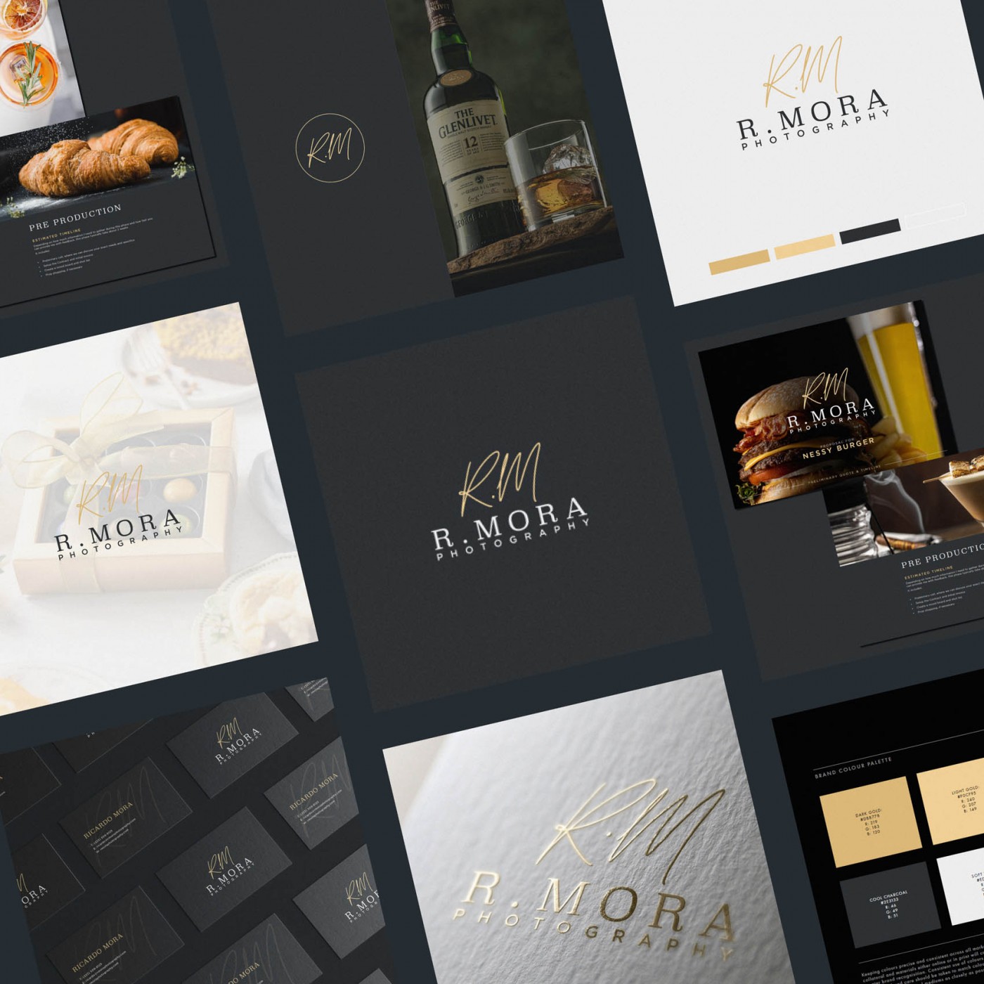
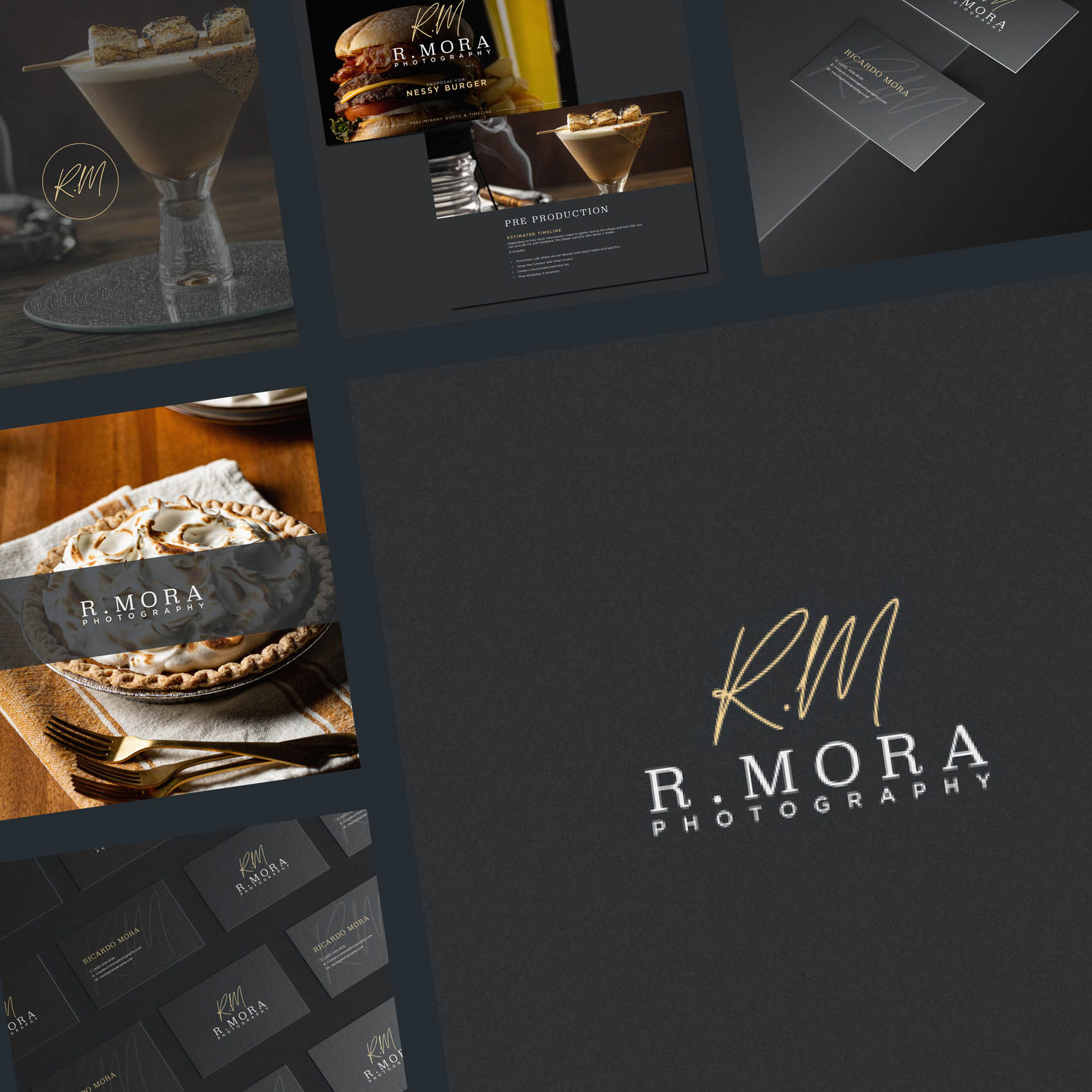
I was commissioned to create new Brand Identity for R Mora Photography, specialising in beautiful, mouth-wateringly detailed Food Photography in Los Angeles, United States. Ricardo is very talented and fast making waves in the industry, so wanted a brand to reflect the high level of clientele he is often recommended and referred to, which include venues, creative directors and art buyers, as well as larger nationwide brands.
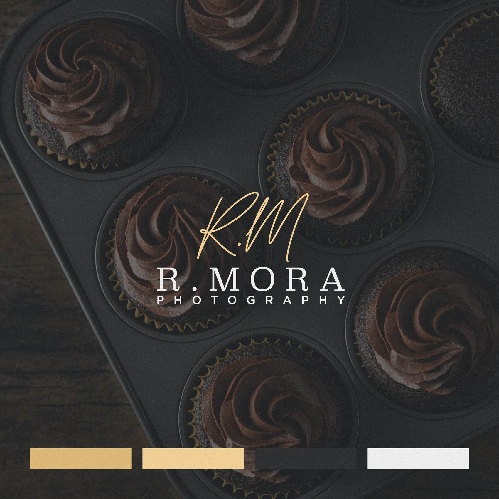
The idea of a signature style logo appealed to us from our initial discussions, as we both loved the many positive connotations behind signatures; an artist signing their work, a masterpiece, pride in one’s craft… Not to mention the fact a signature style logo placed over artwork or photography always adds a touch of class.
We arrived at a version we loved very quickly, repeating the brandname in full to ensure the signature could serve as a stylistic element without legibility concerns. However, there is more to brand identity than the logo itself! The logo is just one element. The full identity suite included a carefully selected colour palette, with a dark, cool charcoal grey paired with golds. Used alongside good imagery, this has the effect of slightly warming the imagery (we wanted to ensure it wasn’t made to feel cold alongside the brand colours). It also looks incredibly smart, and together with the option of an off-white background, provides a versatile palette.
The project scope also included templates for quotes, estimates and a price guide – each of which look stunning when combining Ricardo’s impressive photography with the various identity elements we developed.
Case Study
Opportunity
A fast-rising Los Angeles food photographer working with venues, creative directors, art buyers and national brands needed a visual signature that matches the calibre of his work—elegant enough to sit on top of imagery, and clear enough to read in every context.
Objectives
-
Create a signature-style logo that conveys authorship and craft while staying highly legible.
-
Provide a lockup that works as a tasteful watermark without fighting colour or detail in photographs.
-
Establish a palette that flatters food imagery—cool, refined neutrals lifted by a warm metallic note.
-
Deliver practical assets for day-to-day use (quotes, estimates, price guide) that present work with polish.
Insight & Strategy
Signatures carry the right associations—ownership, mastery, a finishing touch—yet pure script can sacrifice clarity. We paired a signature treatment with the brand name repeated in full so the mark can act as a stylish overlay while the name remains instantly readable. The colour system balances a dark, cool charcoal with gold accents (and an off-white option) to add a subtle warmth beside photography rather than cooling it down.
Identity Solution
-
Signature + Wordmark: A composed signature treatment supported by a full wordmark for clarity at any scale; horizontal and compact lockups safeguard legibility on web, print and over imagery.
-
Palette: Cool charcoal grey with controlled gold accents; optional off-white ground for light, editorial layouts.
-
Usage & Applications: Watermark guidance for placement and opacity; templates for quotes, estimates and a price guide that integrate the identity with portfolio visuals for a cohesive presentation.
Competitive Edge Now
The identity reads as authored and refined. The signature gives an unmistakable personal touch, the full name preserves legibility, and the palette adds a gentle, appetising warmth—helping the brand look premium across overlays, documents and digital touchpoints.
What This Enables
Consistent, high-standard presentation to agencies, venues and national brands; confident watermarking that elevates rather than distracts; and an adaptable kit that keeps every client interaction—visual or written—on the same polished level.


