
Some businesses decide to revise their brand identity in order to re-position or attract new clients; but for Russ Jackson things happened in reverse! The success of his thriving business began to overtake his existing branding and website – which meant there was a risk of confusing clients with mixed messages… Russ achieved such international acclaim that he is regularly flown to various industry workshops and forums around the world as a special guest speaker. His incredible photography and well deserved success set the bar high – so when he contacted me I was excited to see what we’d be able to come up with. I say “we”, because branding is always, always a collaborative effort; it’s impossible to convey the essence of your business in a bespoke way without you.
By the way, the brand identity was part one of the project, part two involved designing a brand new website, which you can see here: https://www.jmgraphicdesign.com/graphic-design-london/russ-jackson-photography-website-design-development/ In my opinion the two go together wonderfully; brand identity design sets a tone which you can then allow to flow into the website design, giving you a great sense of uniformity and brand consistency.
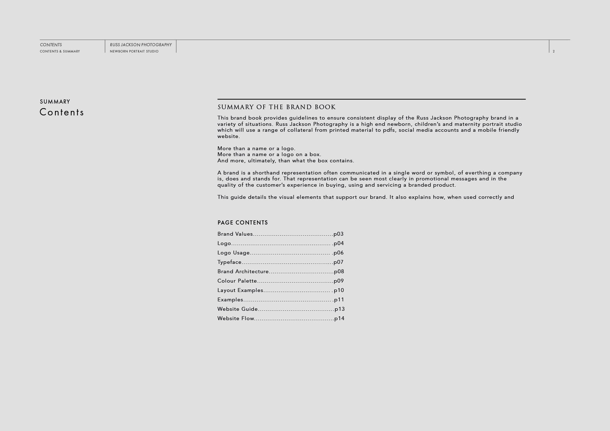
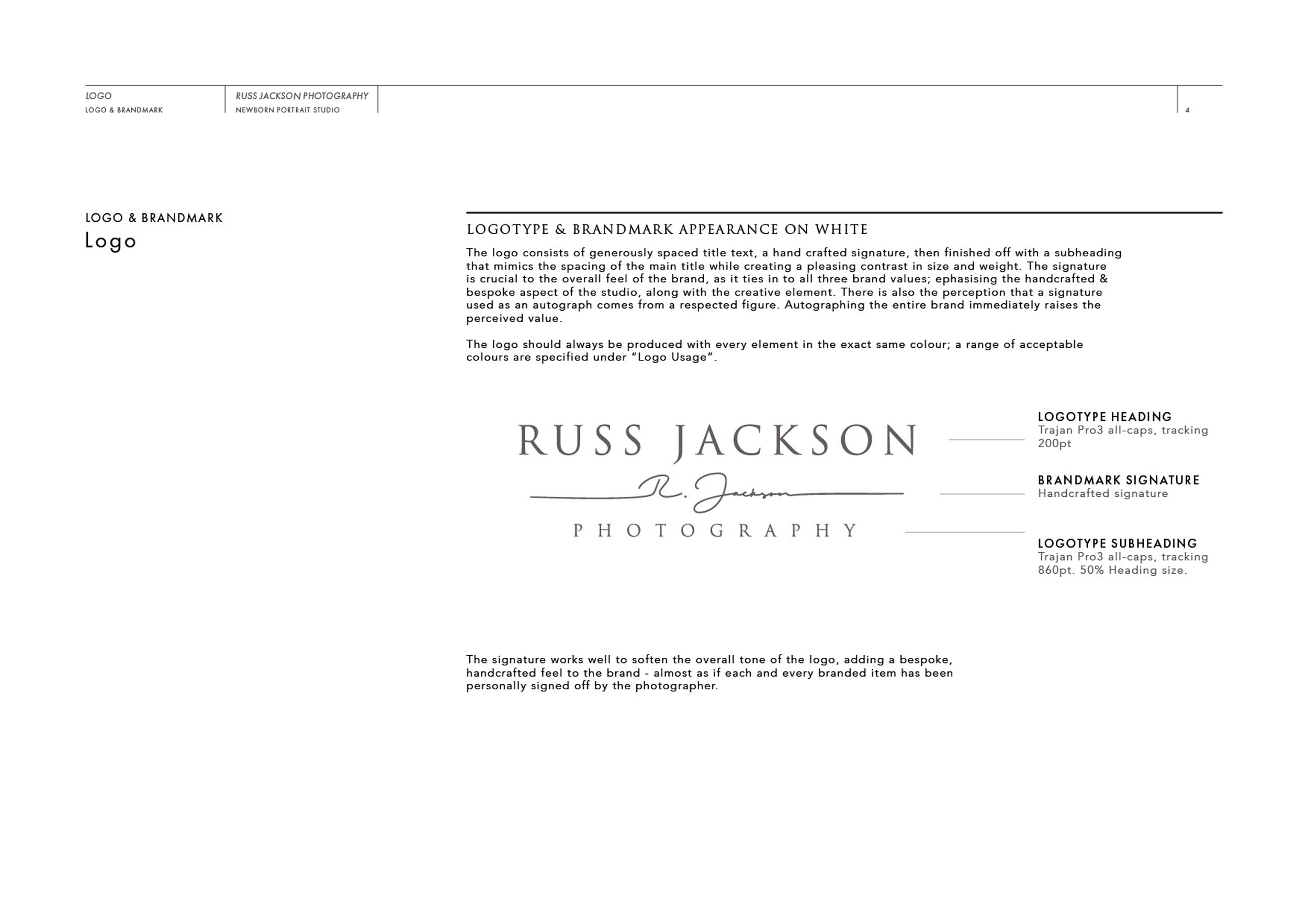
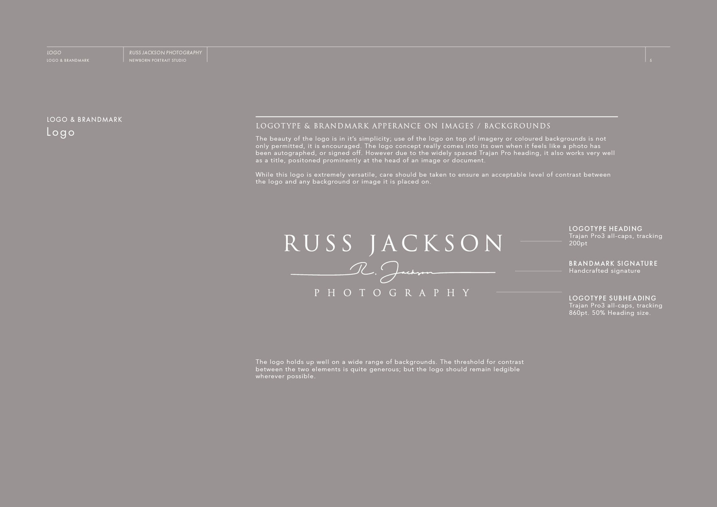
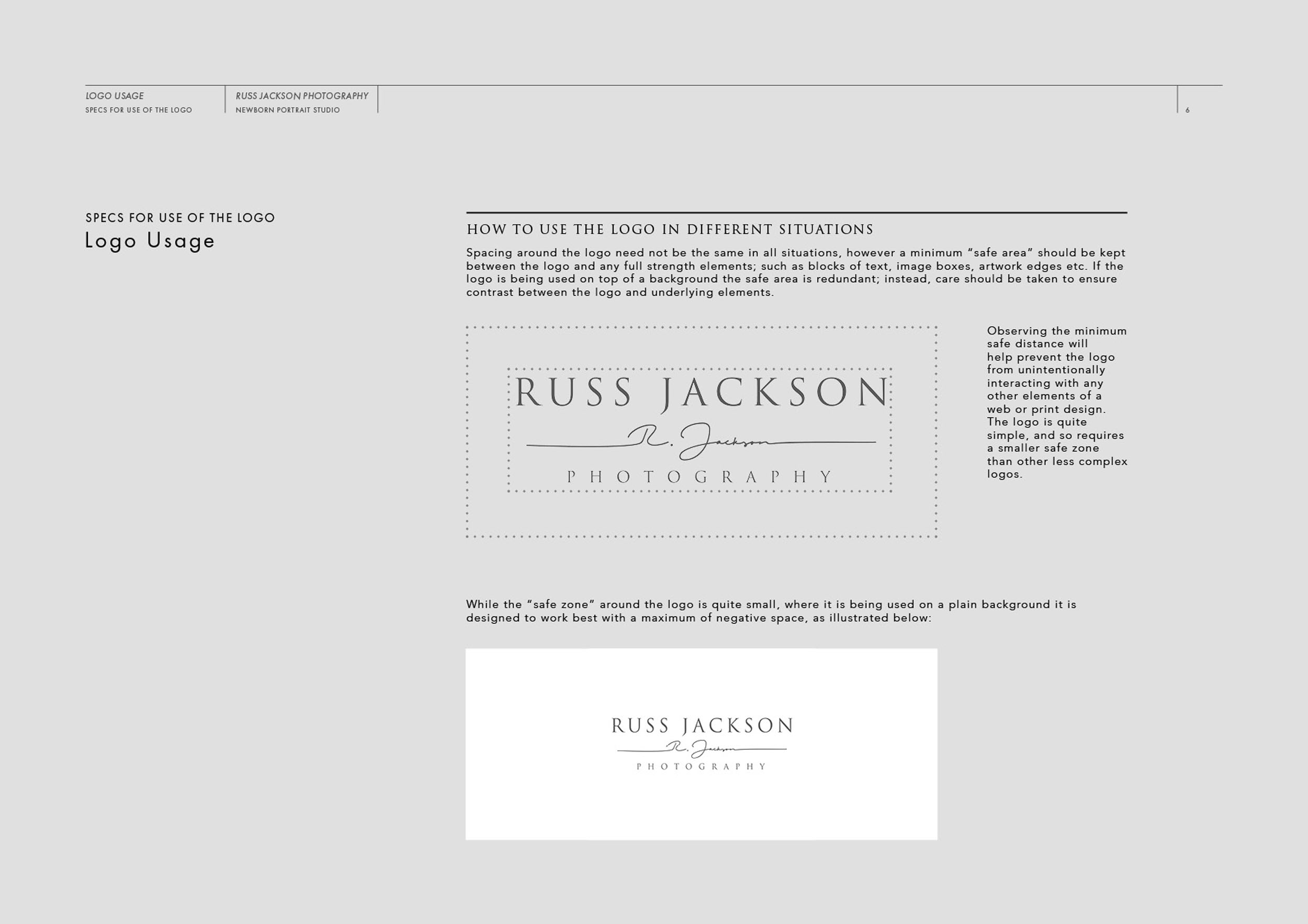
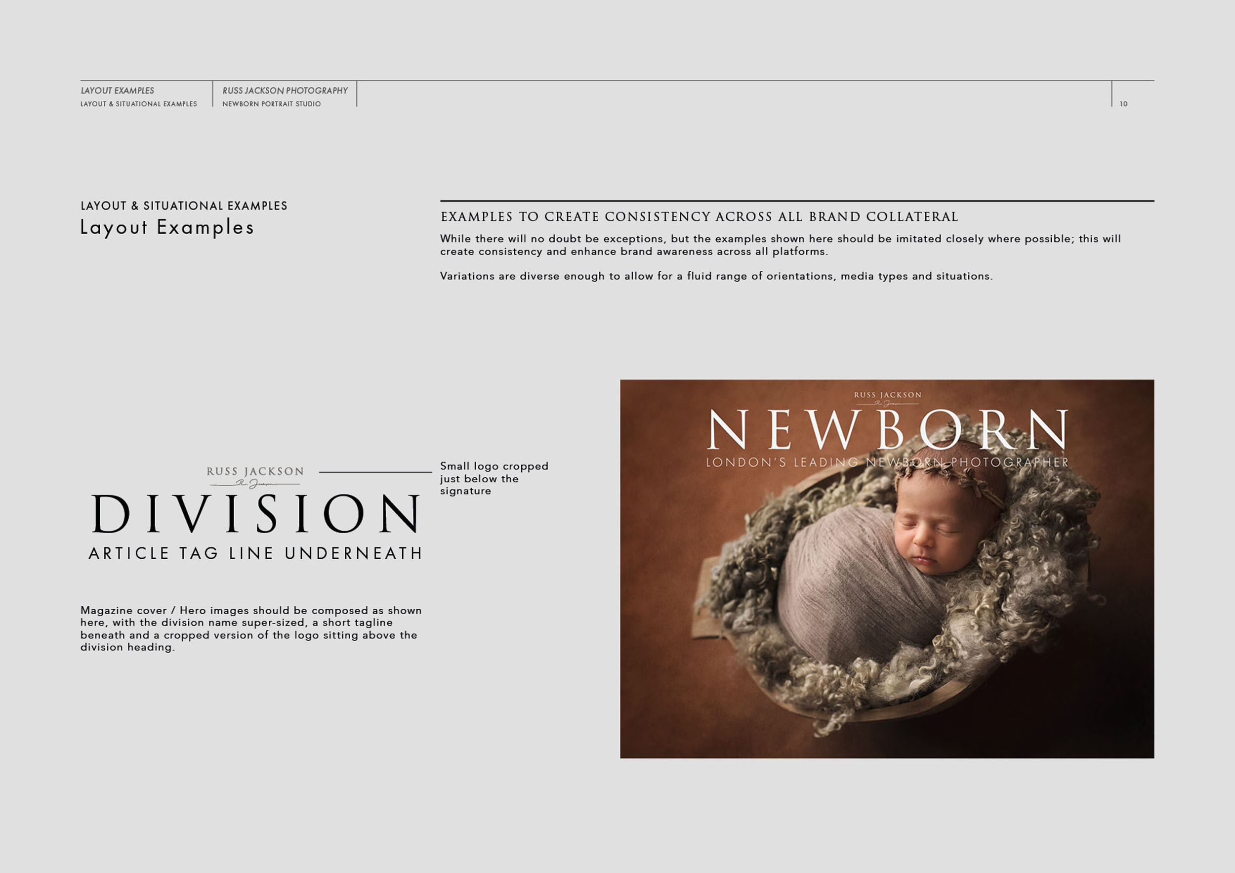
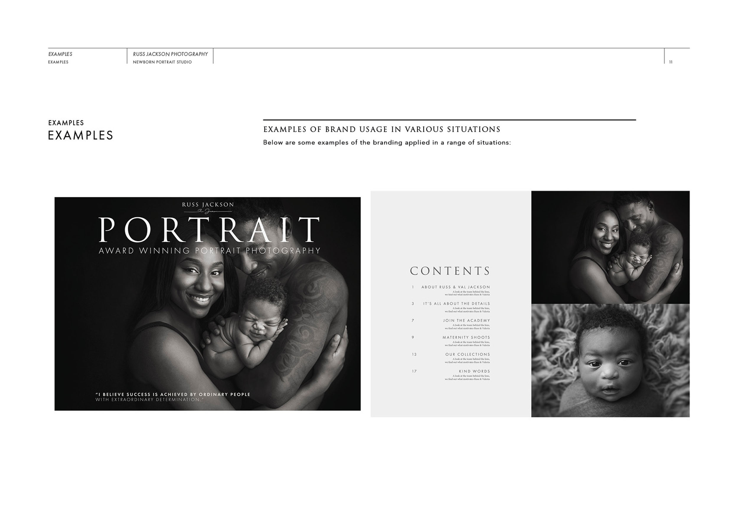
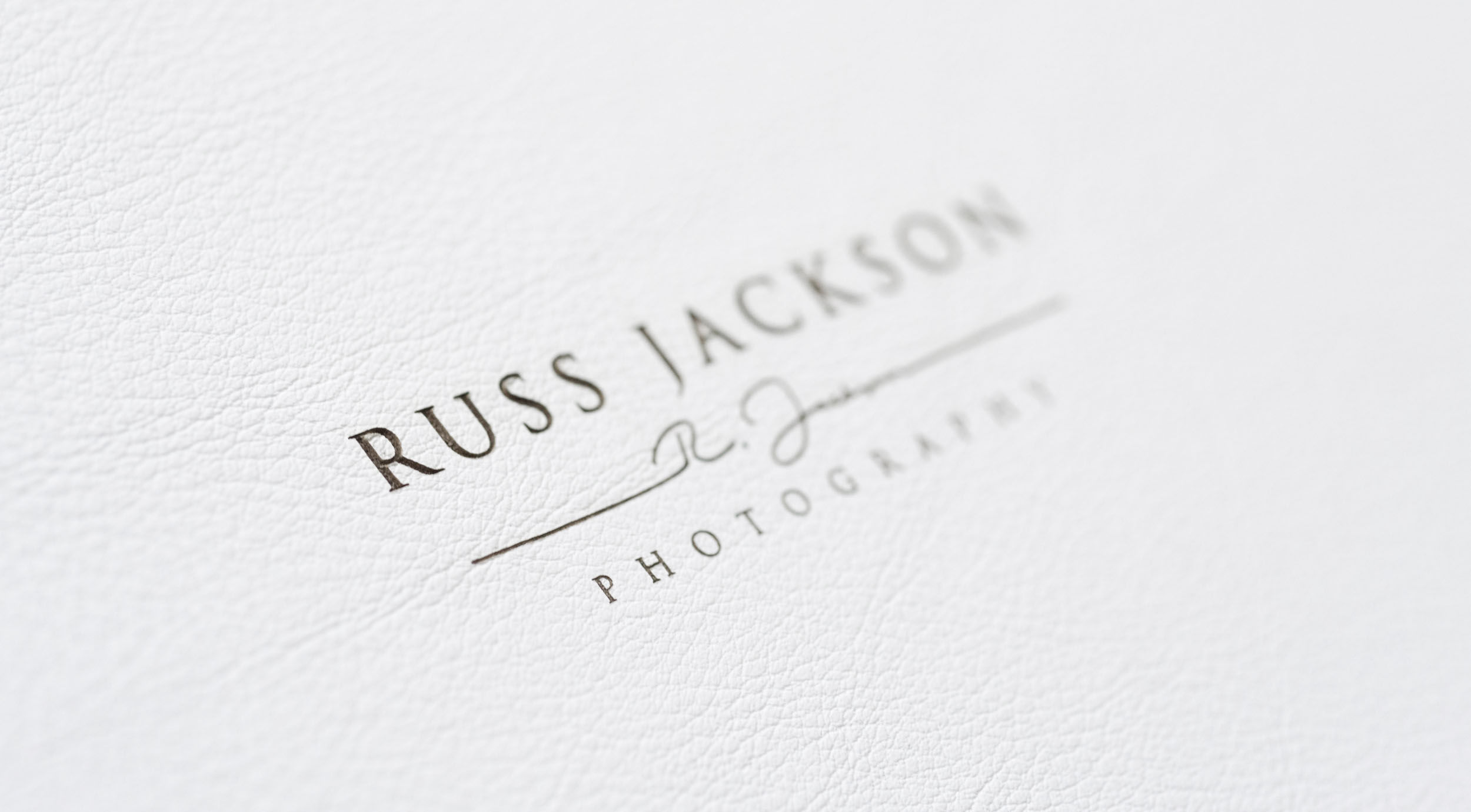
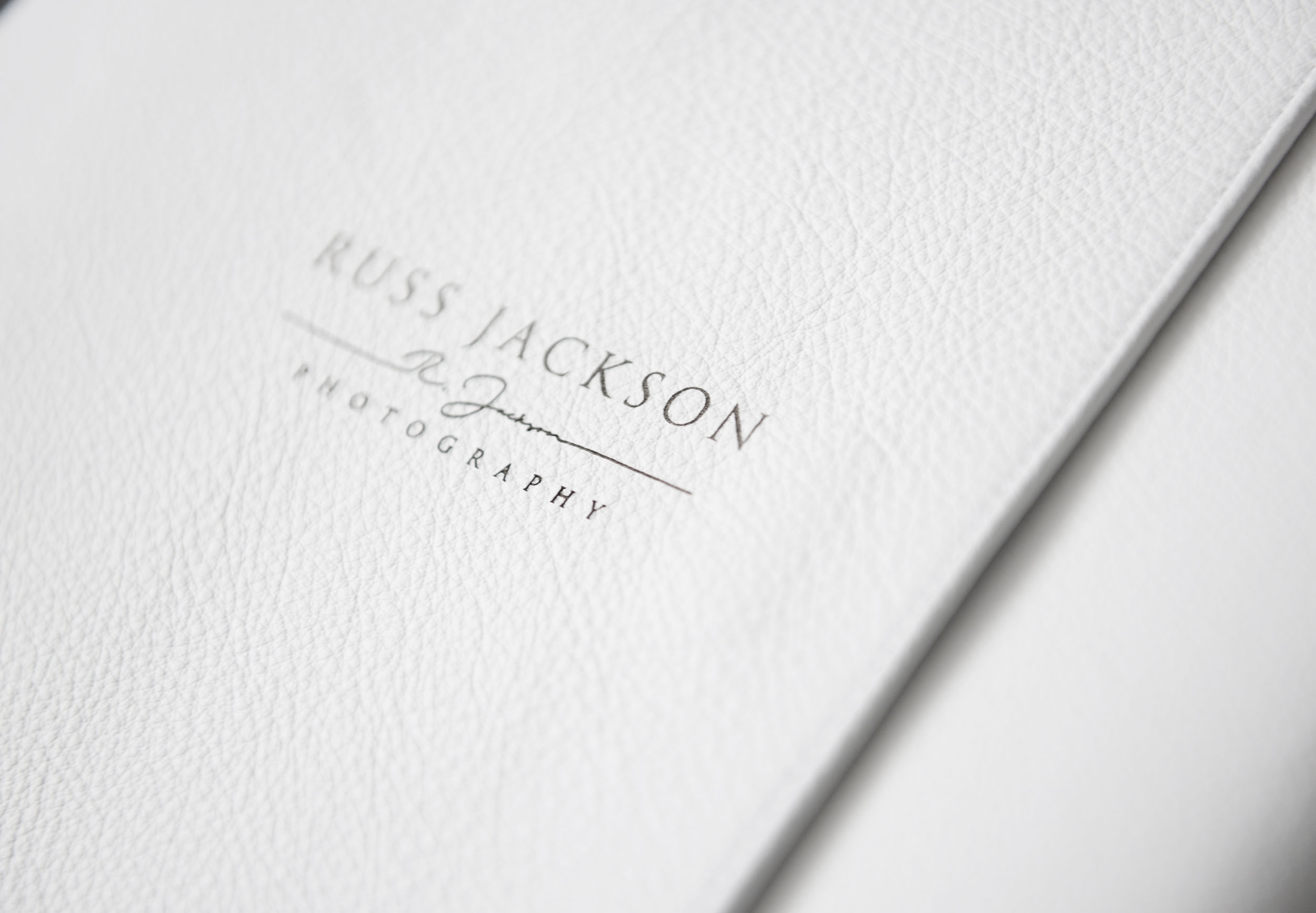
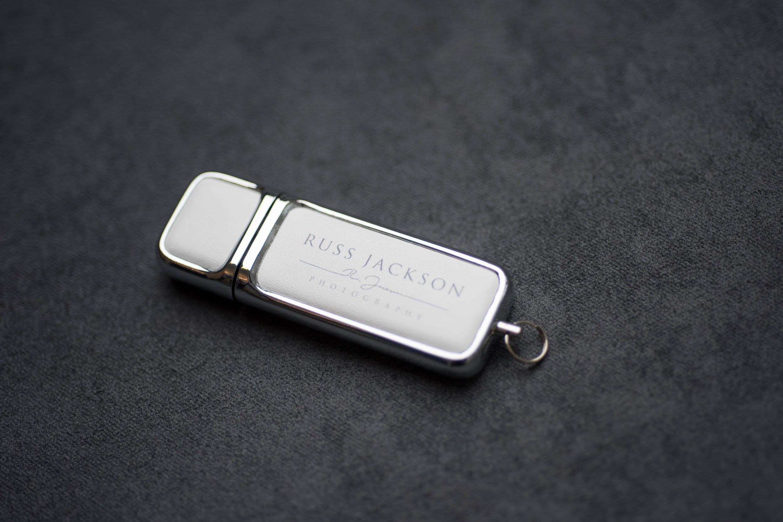
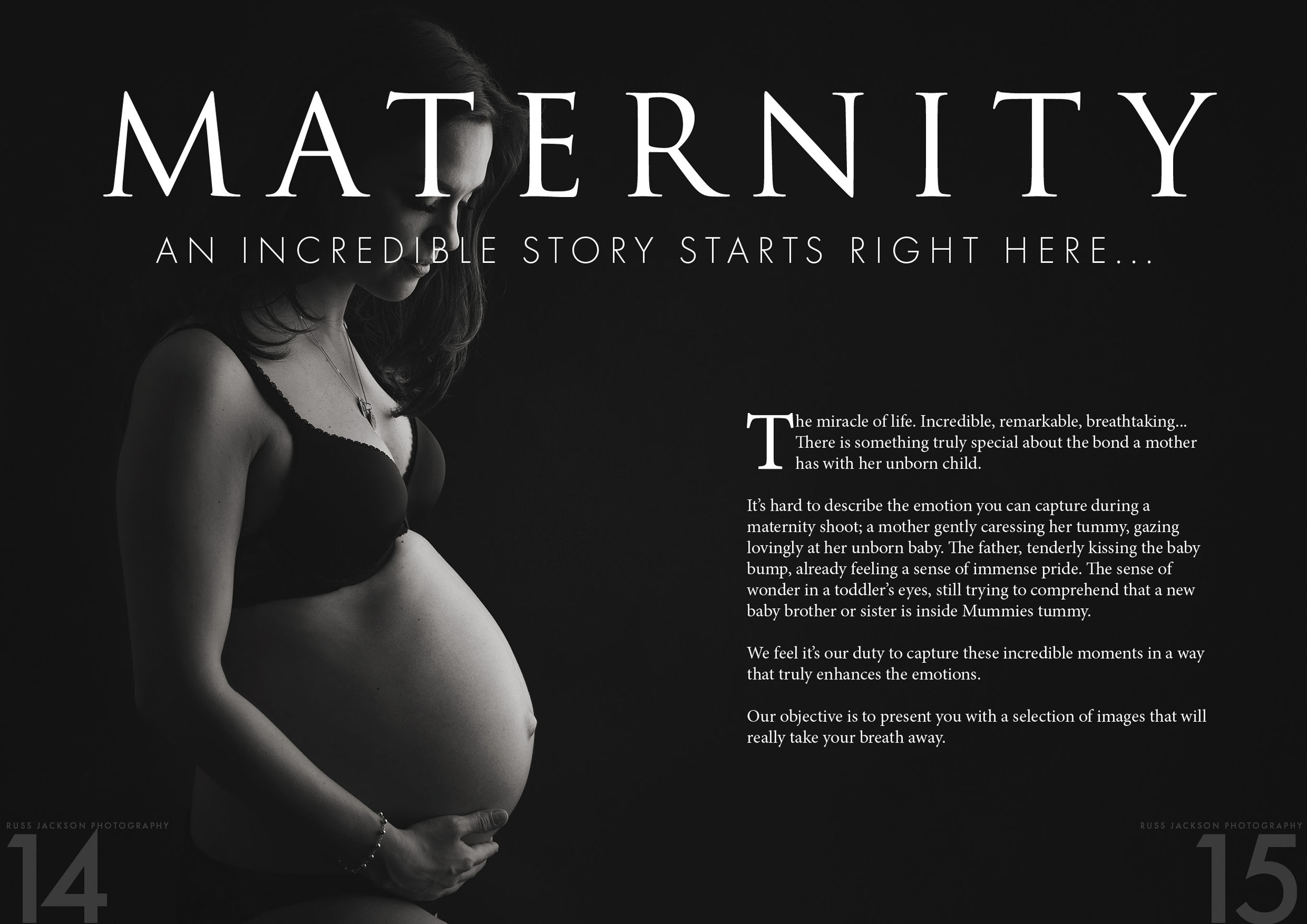
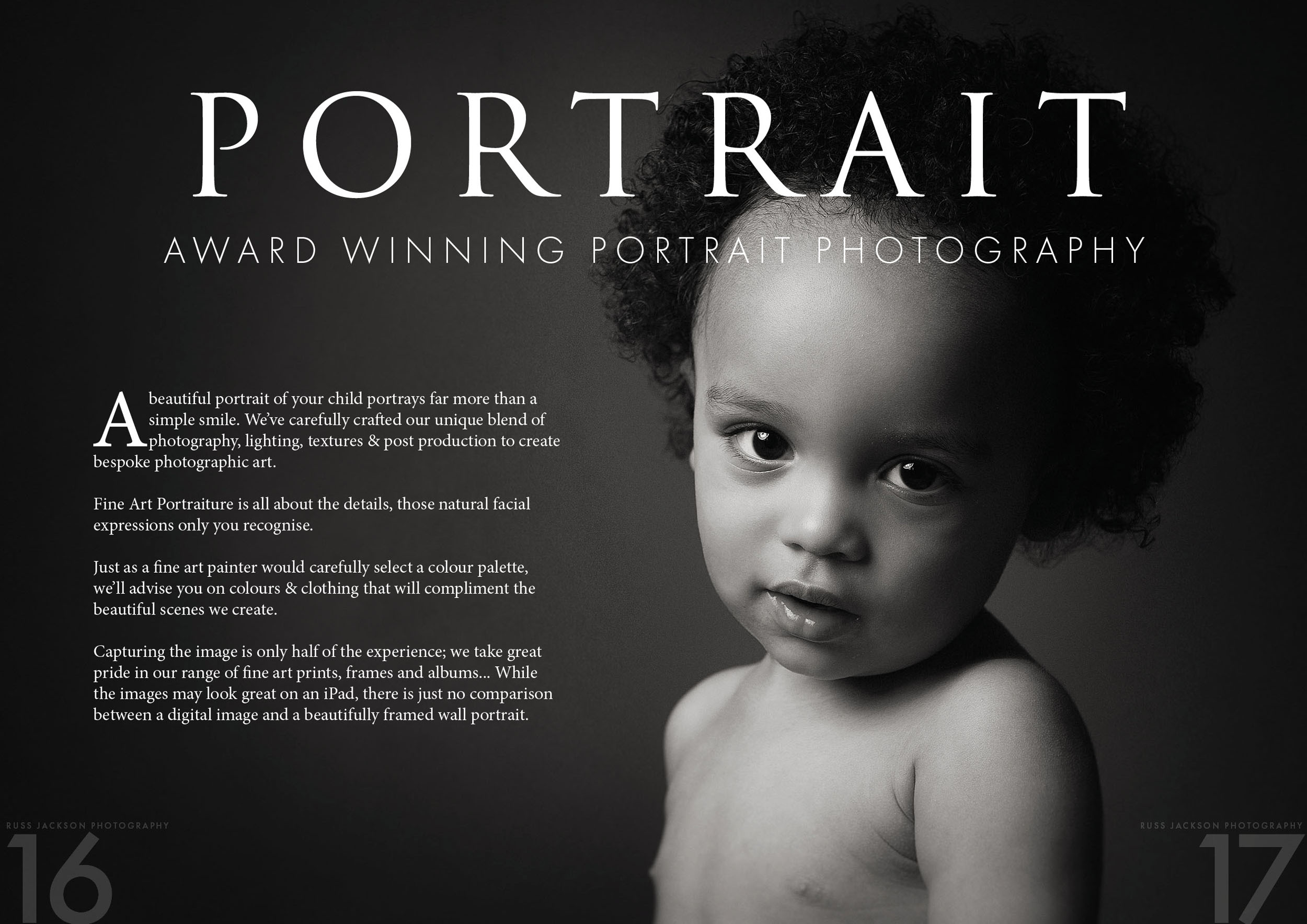
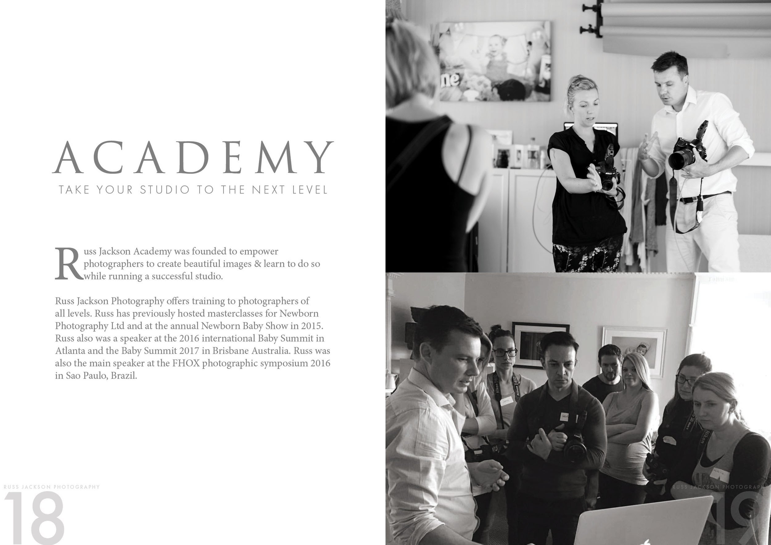
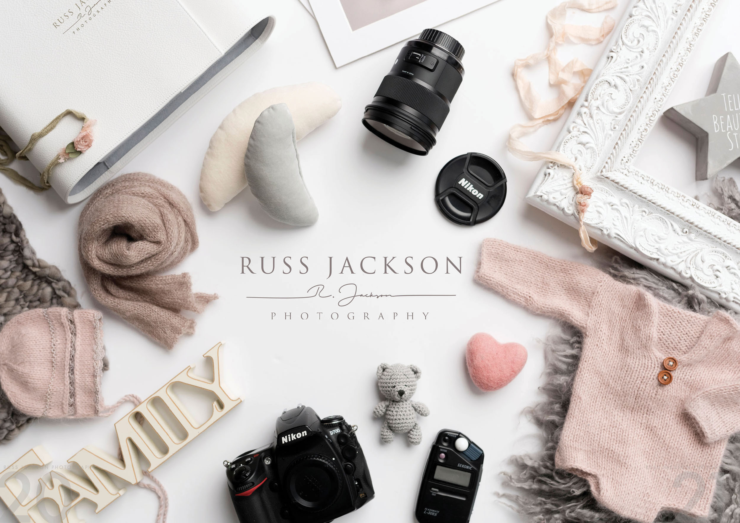
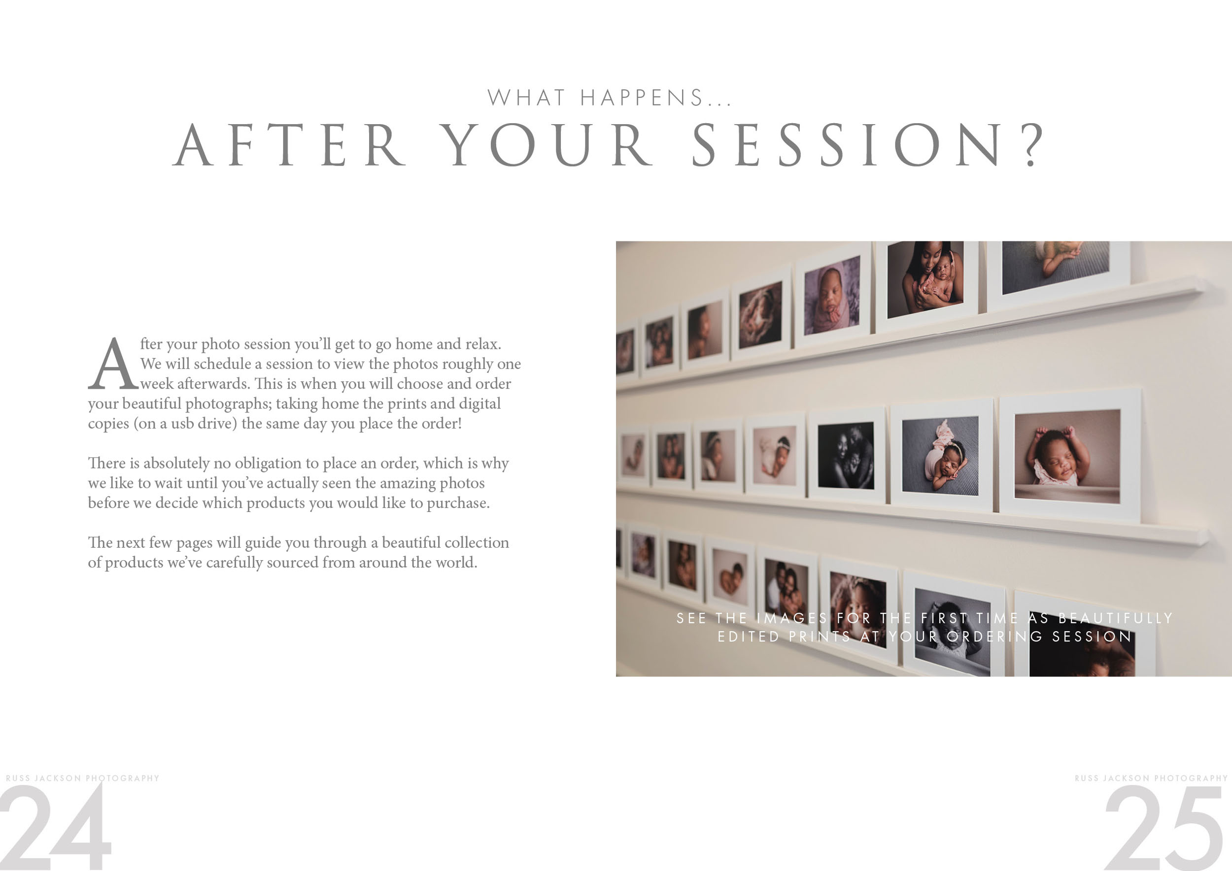
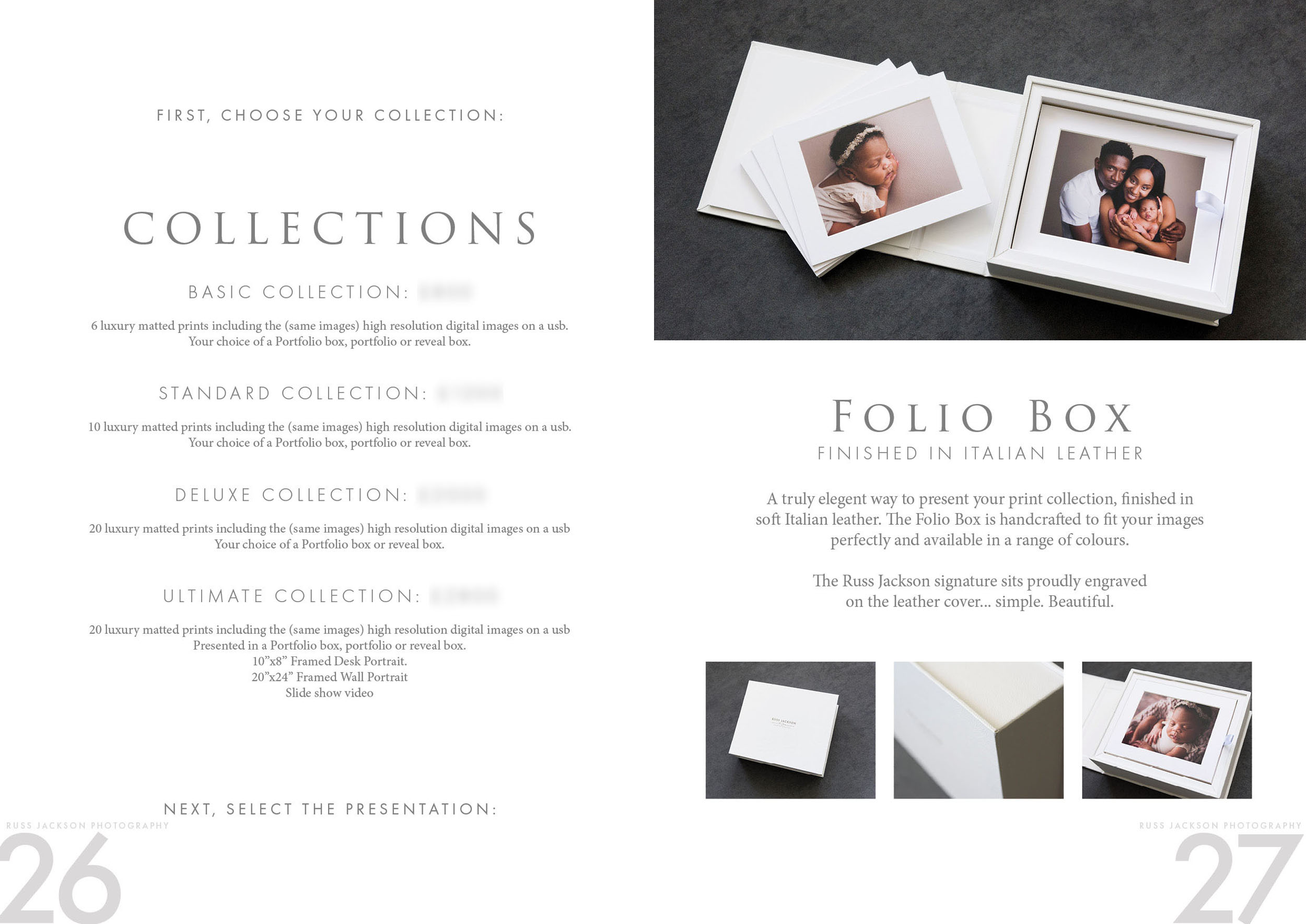
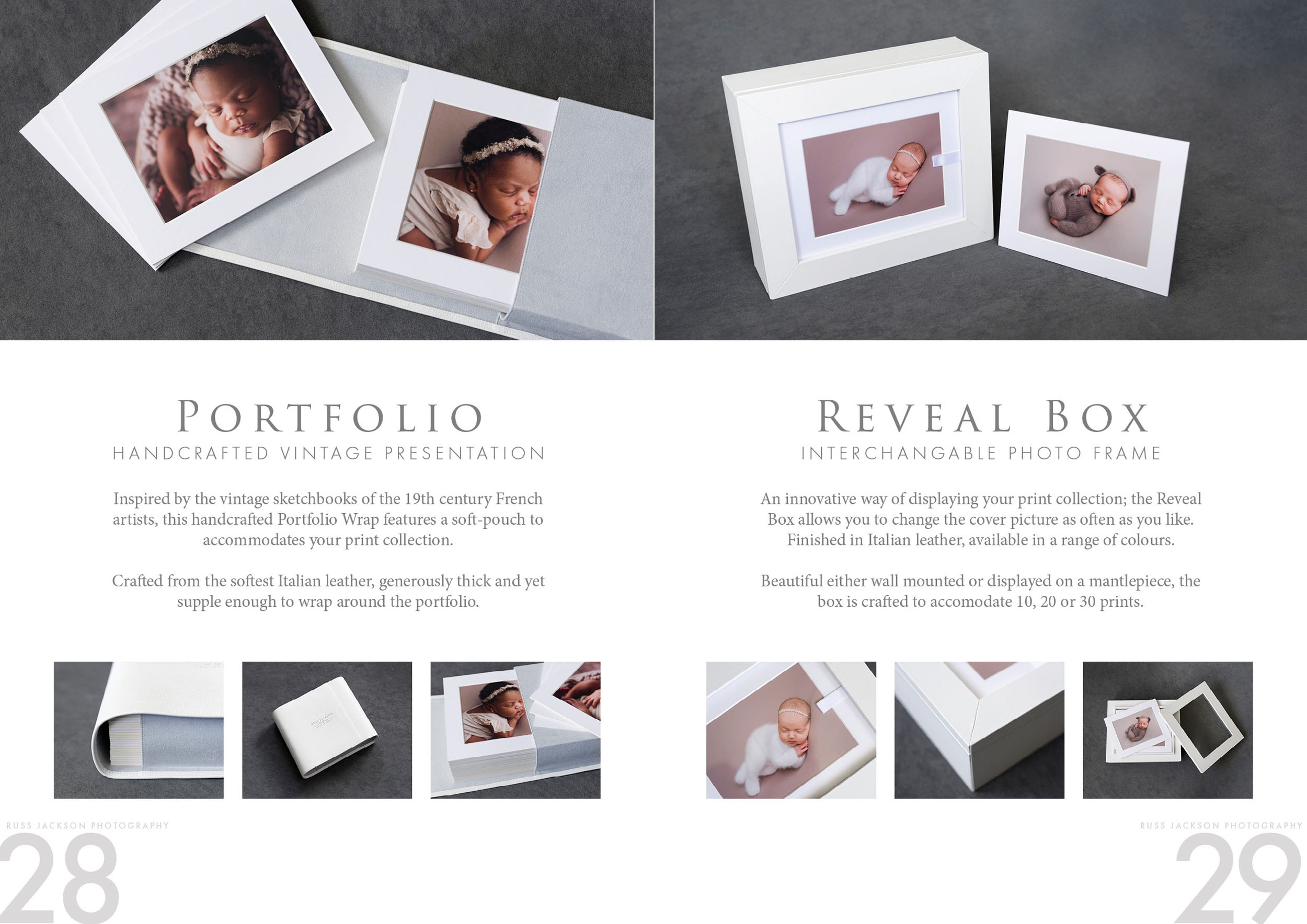
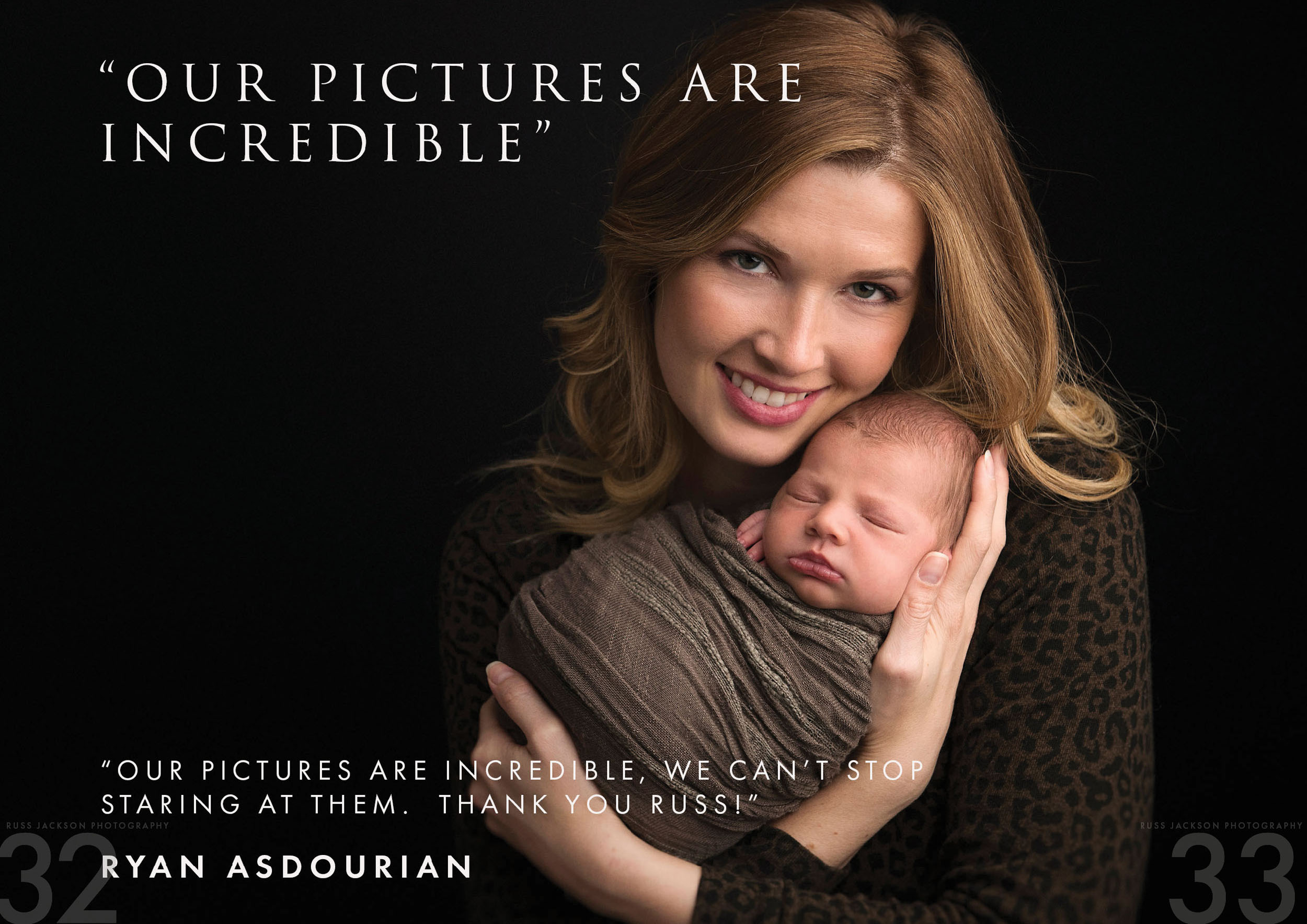
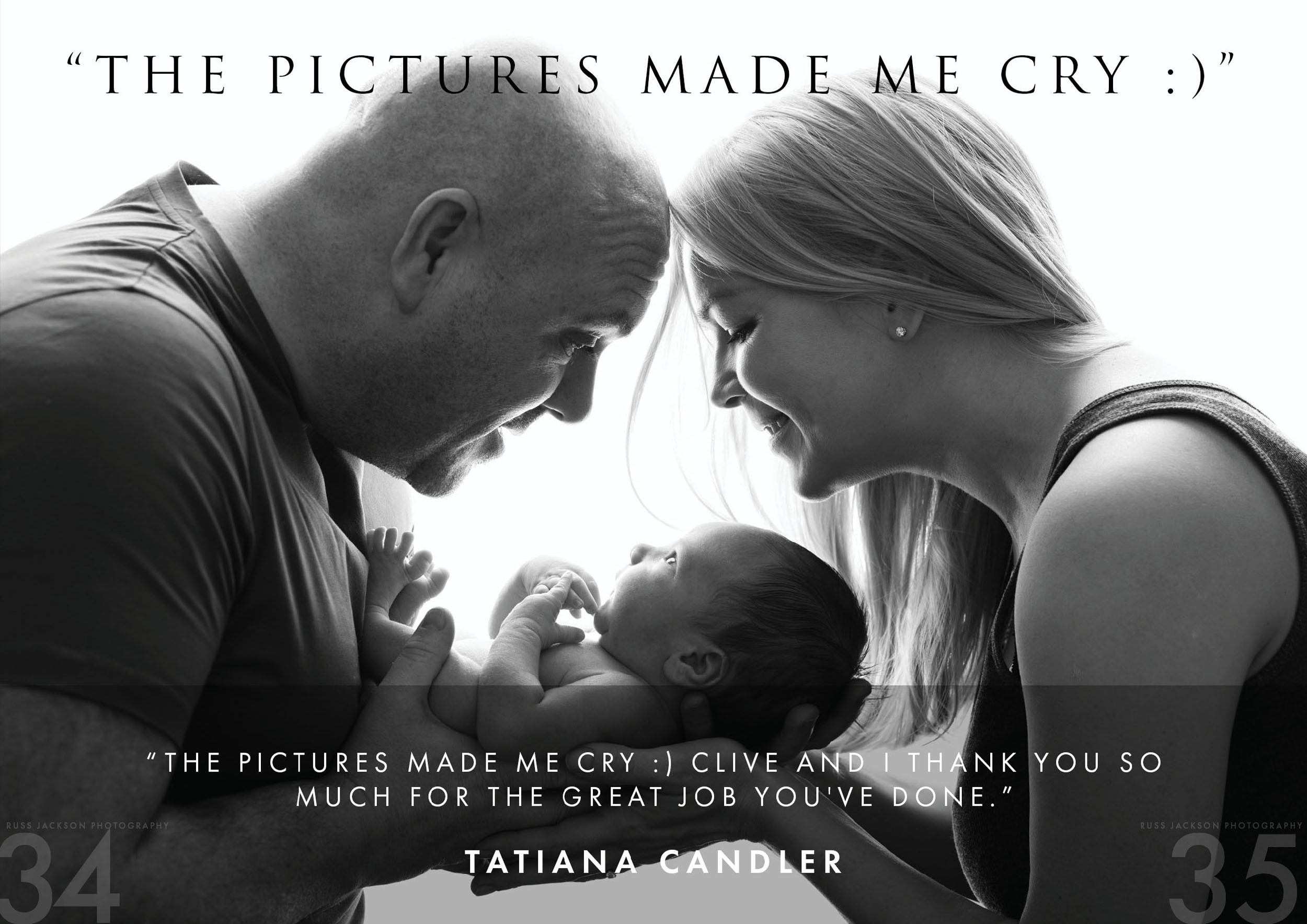
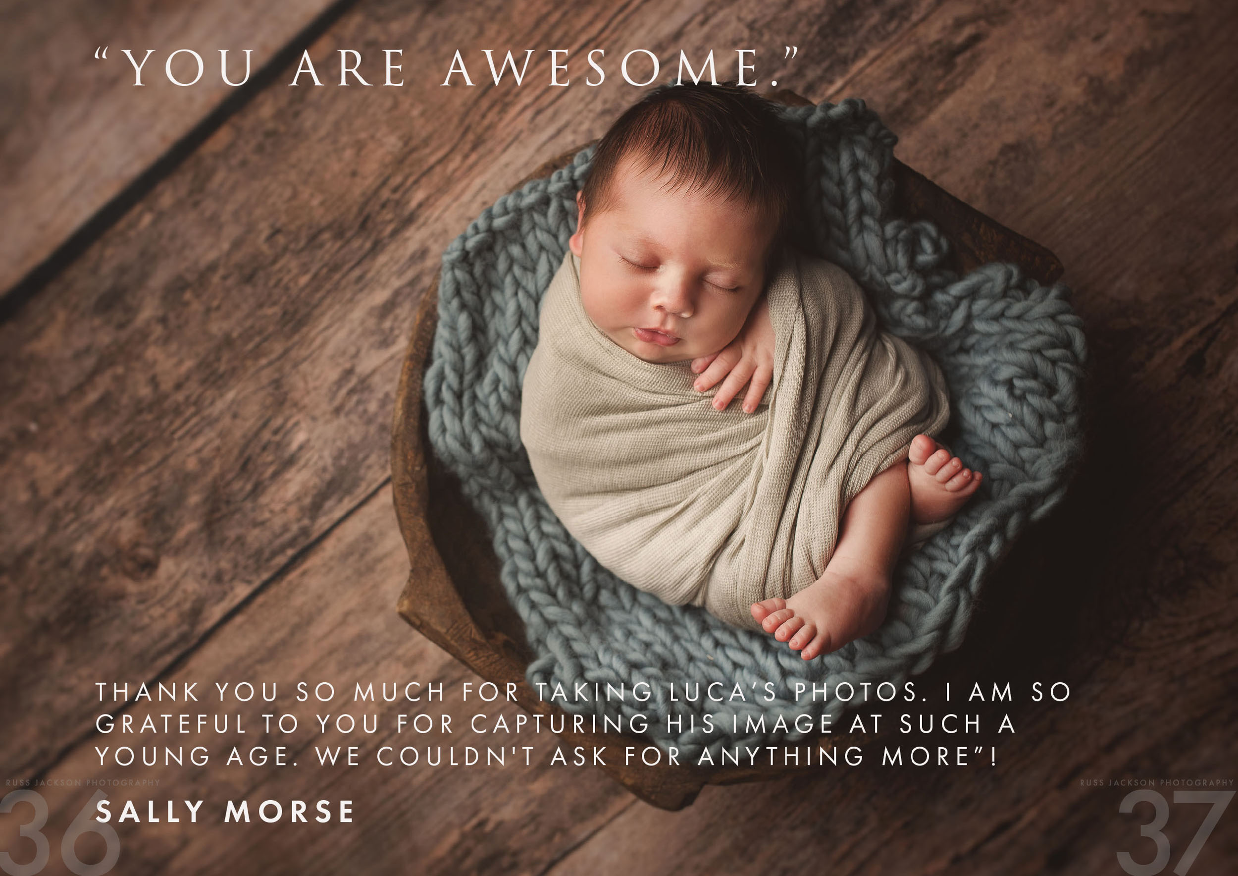
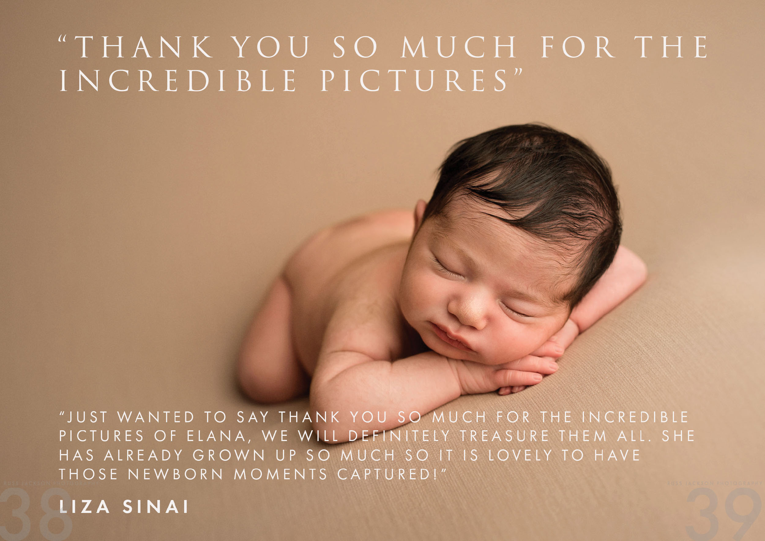
Below you have a sneak peak at the final brand guidelines created for Russ Jackson Photography, as well as some applications of the logo we designed, and finally a range of pages from a welcome brochure we created in line with the new guidelines. I really like the concept behind the logo. The signature works well to soften the overall tone of the logo, adding a bespoke, handcrafted feel to the brand – almost as if each and every branded item has been personally signed off by the photographer.
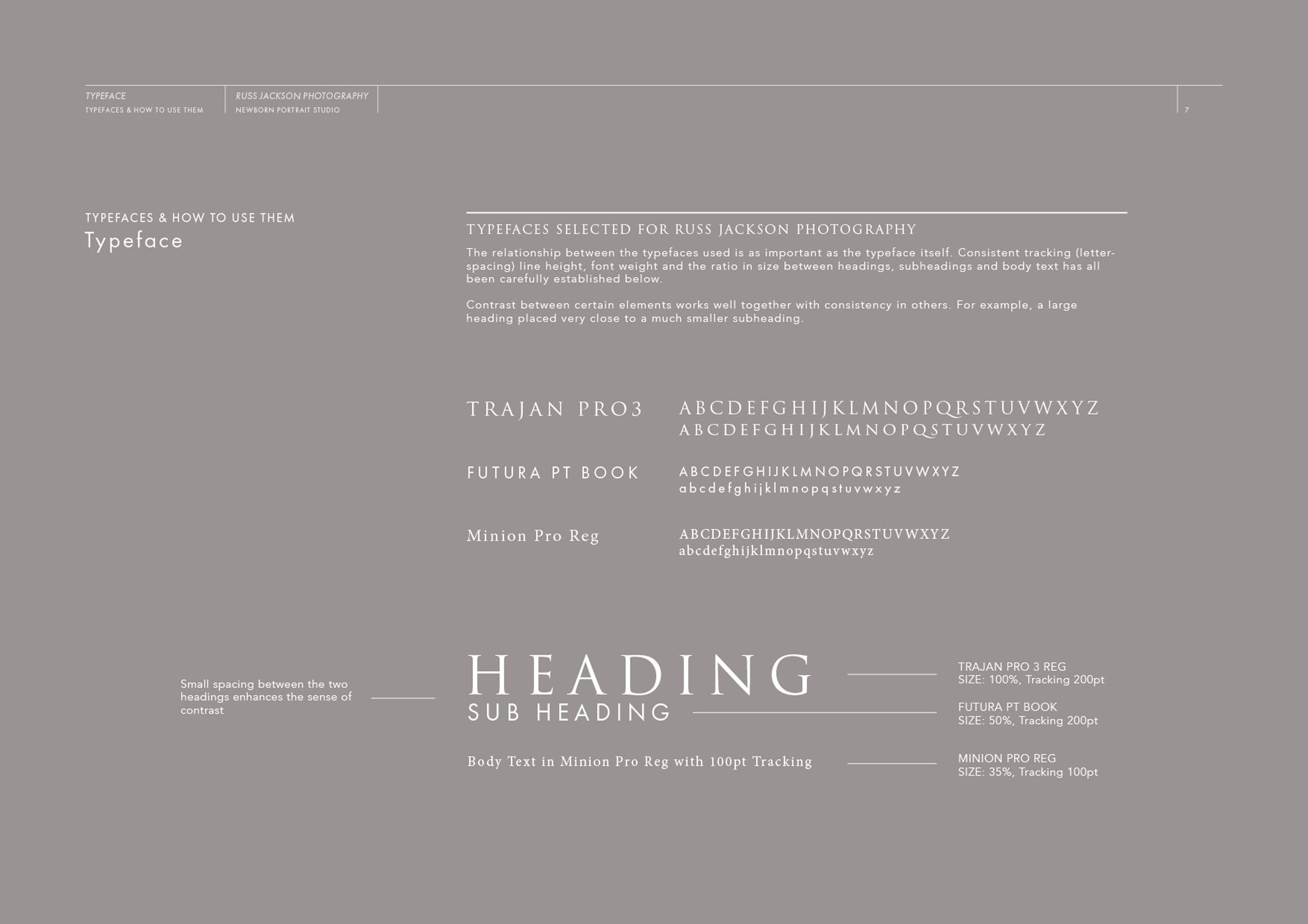
To give you a summary of the design decisions behind the branding, here’s a short extract from the brand book:
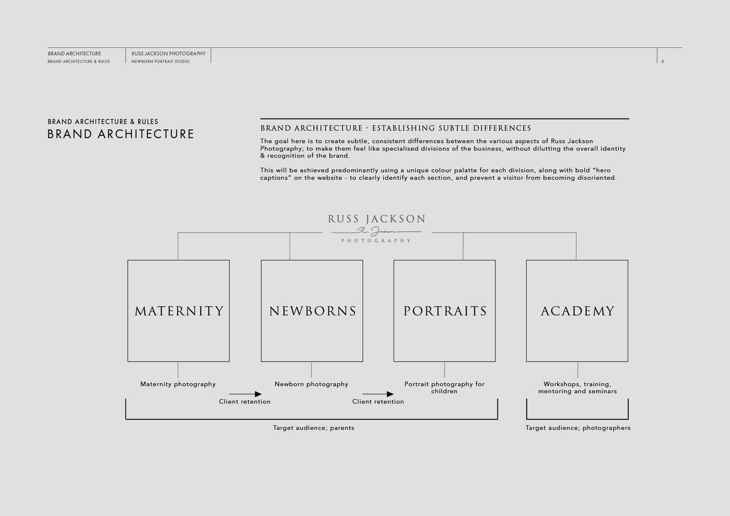
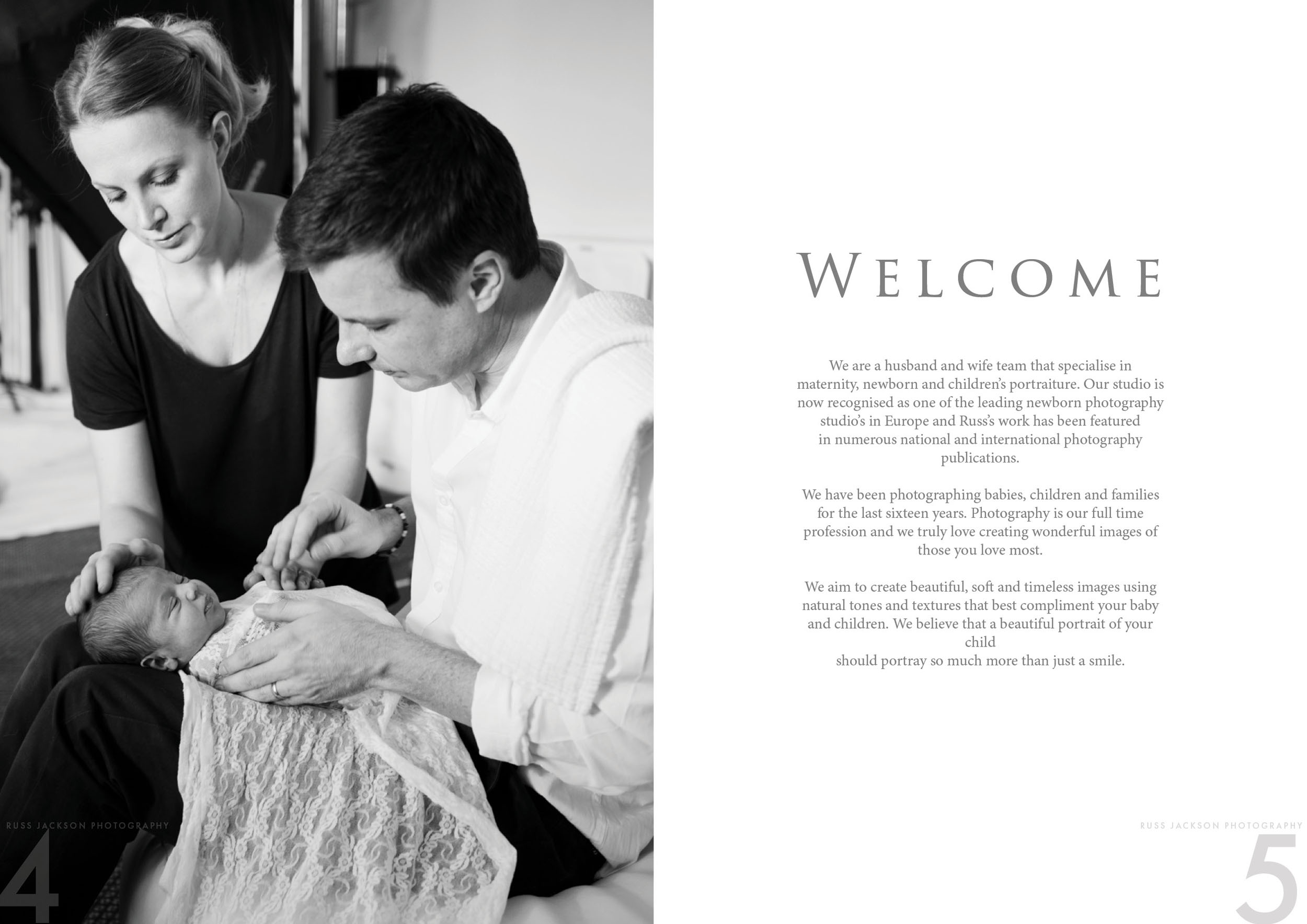
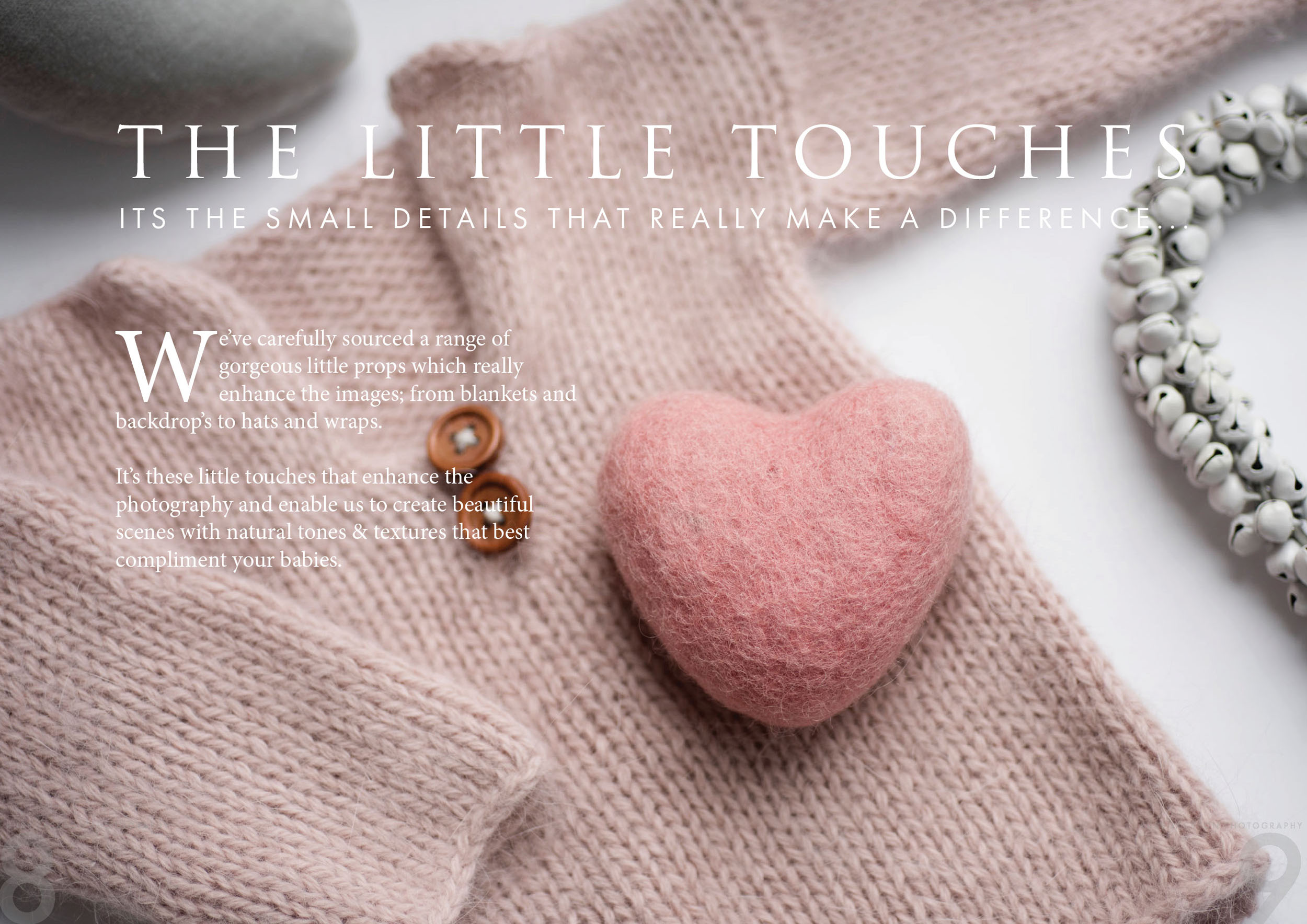
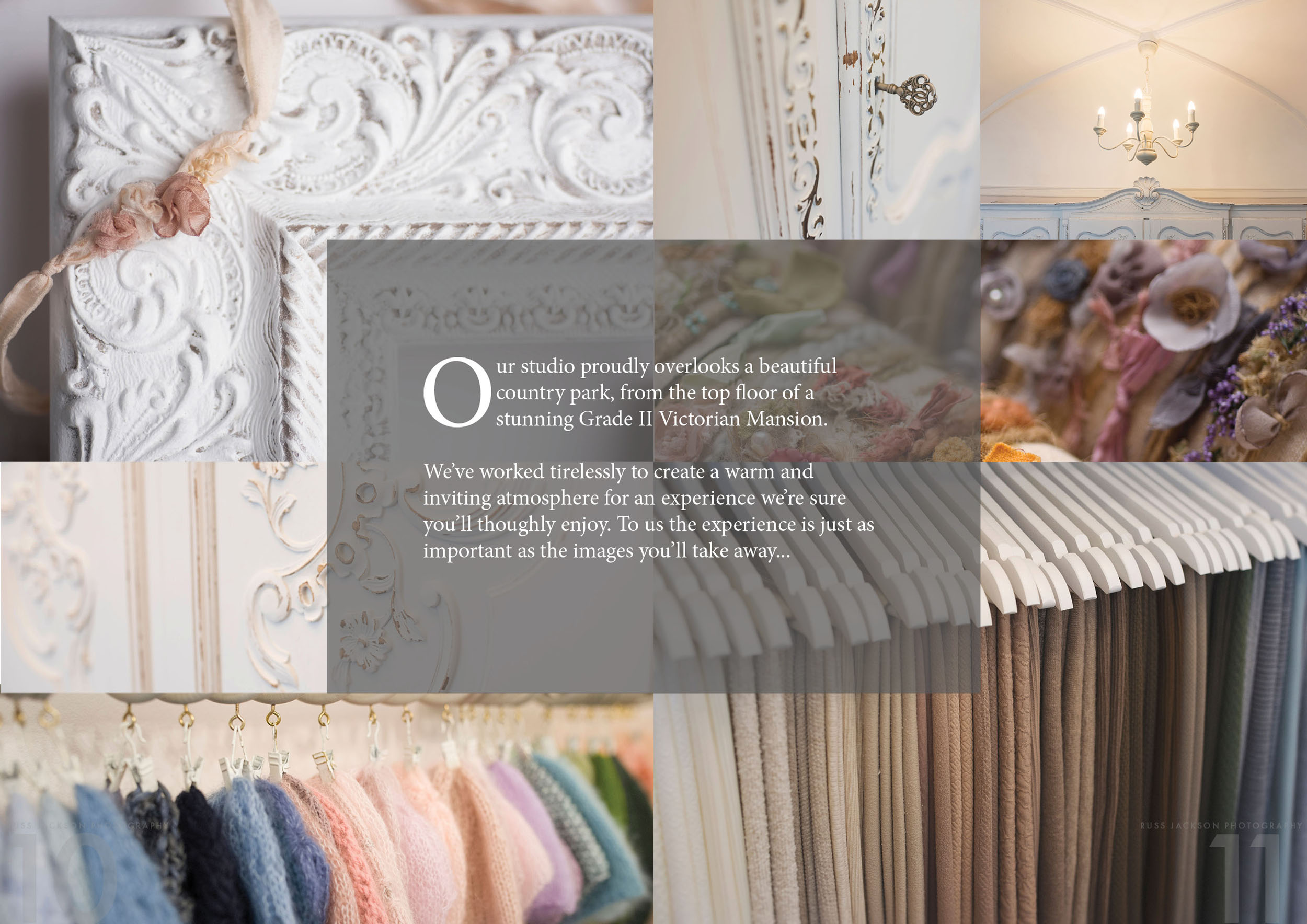
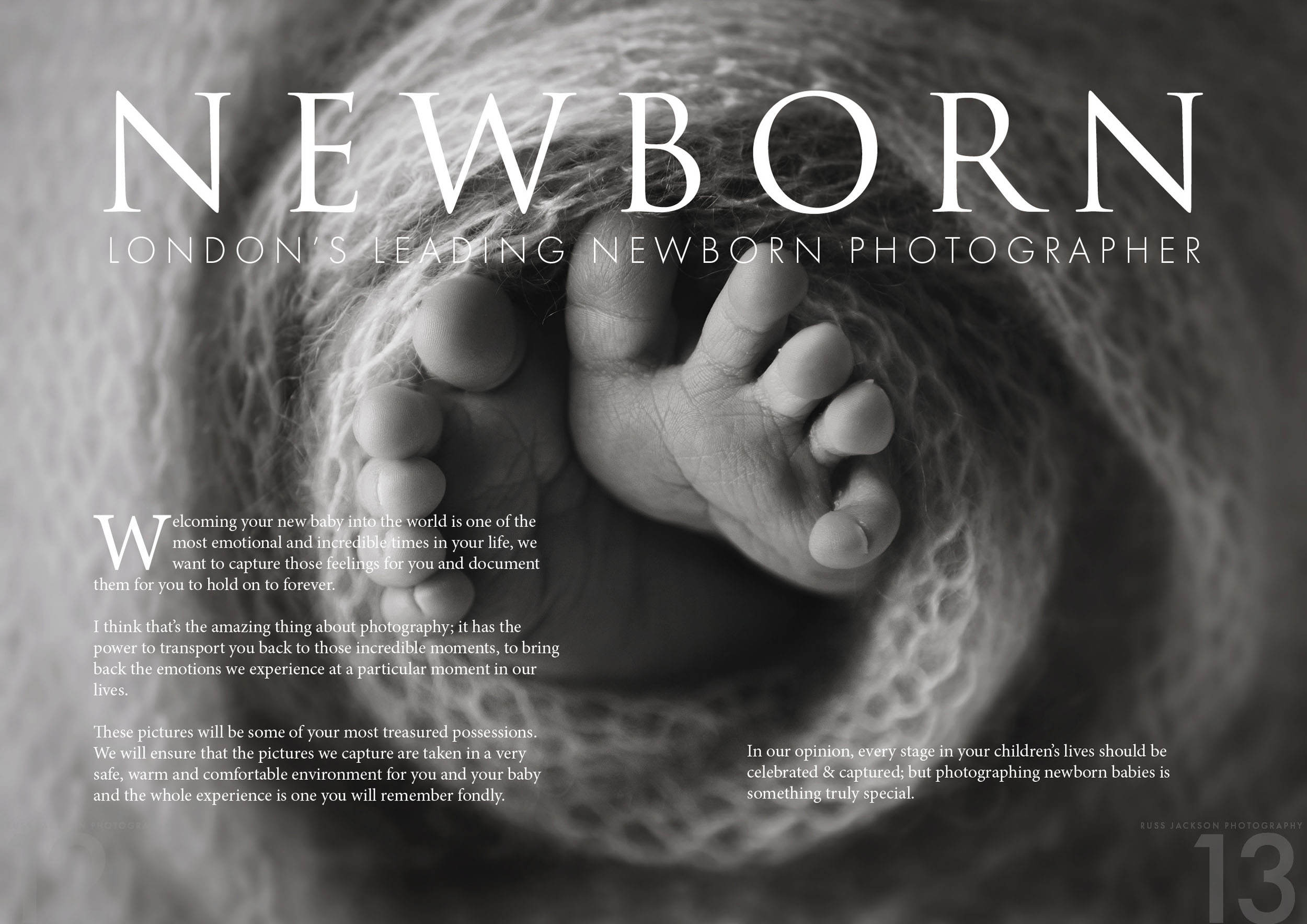
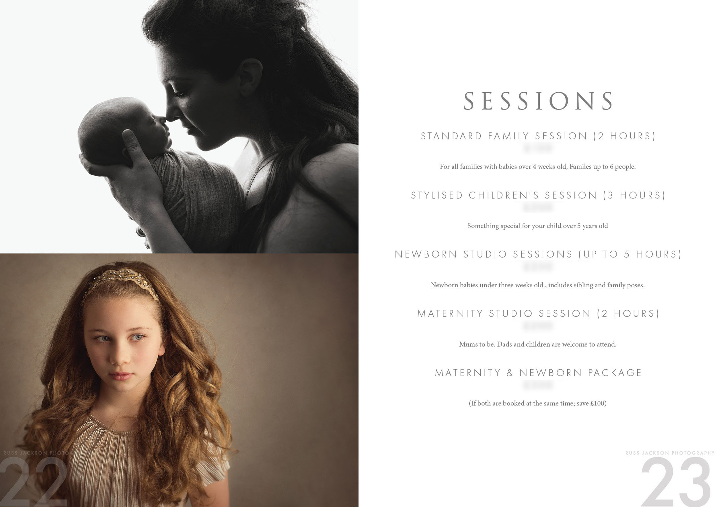
“Russ Jackson Photography is a high end photography studio specialising in newborn, children’s and maternity photography – as well as training. The stunning photography produced will be valued primarily for the emotional response it illicits; documenting the most emotional and incredible times in the lives of parents. It is highly valued Artistically as it is shot in a beautiful way using bespoke backgrounds, props and perfect lighting.
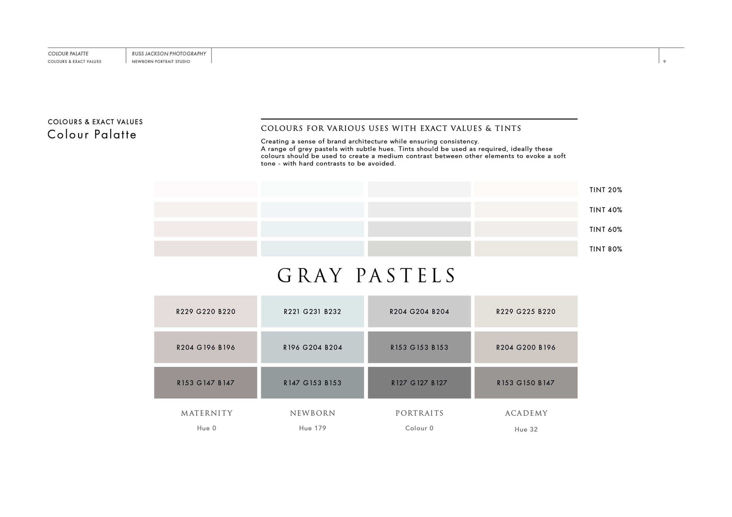
Brand Architecture must also be established; to create subtle differences between various areas of Russ Jackson Photography, while ensuring they all fall under the same umbrella.”

Case Study
Opportunity
Russ’s international profile and demand had begun to outpace the old brand, creating the risk of mixed messages. The identity needed to match a thriving, high-calibre studio—clear, premium and unmistakably authored.
Objectives
-
Elevate first-impression credibility for a studio specialising in newborn, children’s and maternity photography (and training).
-
Capture Russ’s personal craft without feeling “script-heavy” or casual.
-
Build a disciplined system (logo, sub-brands, guidelines, brochure) that stays coherent across print and digital.
Insight & Strategy
Clients value two signals at once: emotional artistry and professional assurance. We centred the identity on authorship with editorship: a signature element to convey personal oversight, paired with refined typography and spacing so every application reads calm, premium and intentional. Brand architecture creates subtle distinctions between studio offers while keeping everything recognisably “Russ Jackson.”
Identity Solution
-
Signature + Wordmark: A composed signature introduces warmth and ownership; the typographic wordmark provides clarity and balance. Lockups include horizontal, stacked and small-space variants for watermarking, stationery and digital avatars.
-
Architecture & Guidelines: Sub-brand descriptors and usage rules ensure newborn, children’s, maternity and training content remain unified under one umbrella. A concise brand book defines clear-space, minimum sizes, colour usage and watermark placement.
-
Applications: A welcome brochure and on-brand templates extend the system into everyday touchpoints, making polished communications repeatable.
Competitive Edge Now
The brand feels personally signed yet editorially composed—distinct from generic “photographer script” logos. The identity scales from a tasteful watermark to brochure spreads without visual drift, reinforcing a high-end, trusted practice.
What This Enables
Stronger alignment between Russ’s reputation and his visuals; coherent presentation across studio work and training; and a solid foundation for the website phase—keeping the same authored, premium voice at every touchpoint.

I specialise in branding, logo and web design for photographers – see some other projects I’ve worked on in the Photography industry here.