Silvia O. Lugo is a talented newborn & maternity photographer based in South Florida, providing not only stunning photography, but an experience to remember. I was delighted when Silvia contacted me, and our objective was ultimately to ensure her brand identity reflected the high end service she provides.
We explored ways of raising the percieved value of her brand – while ensuring the relaxed, friendly atmosphere she creates is also alluded to.
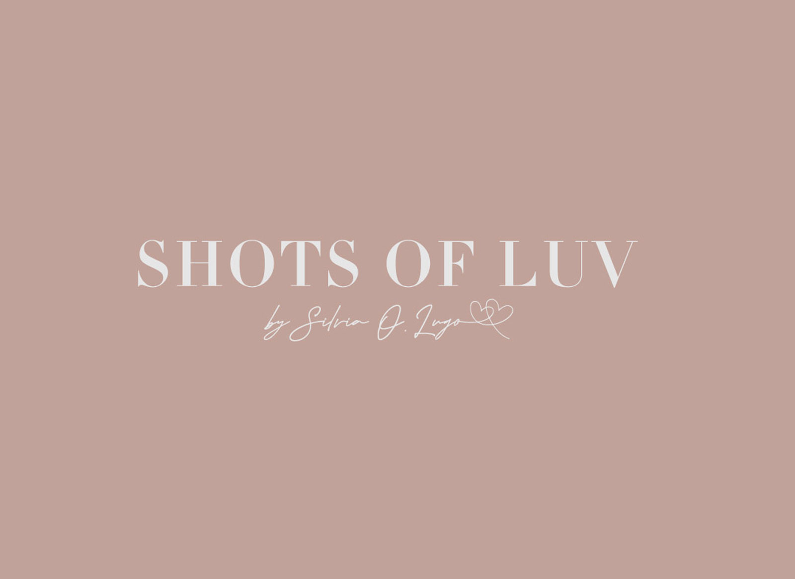
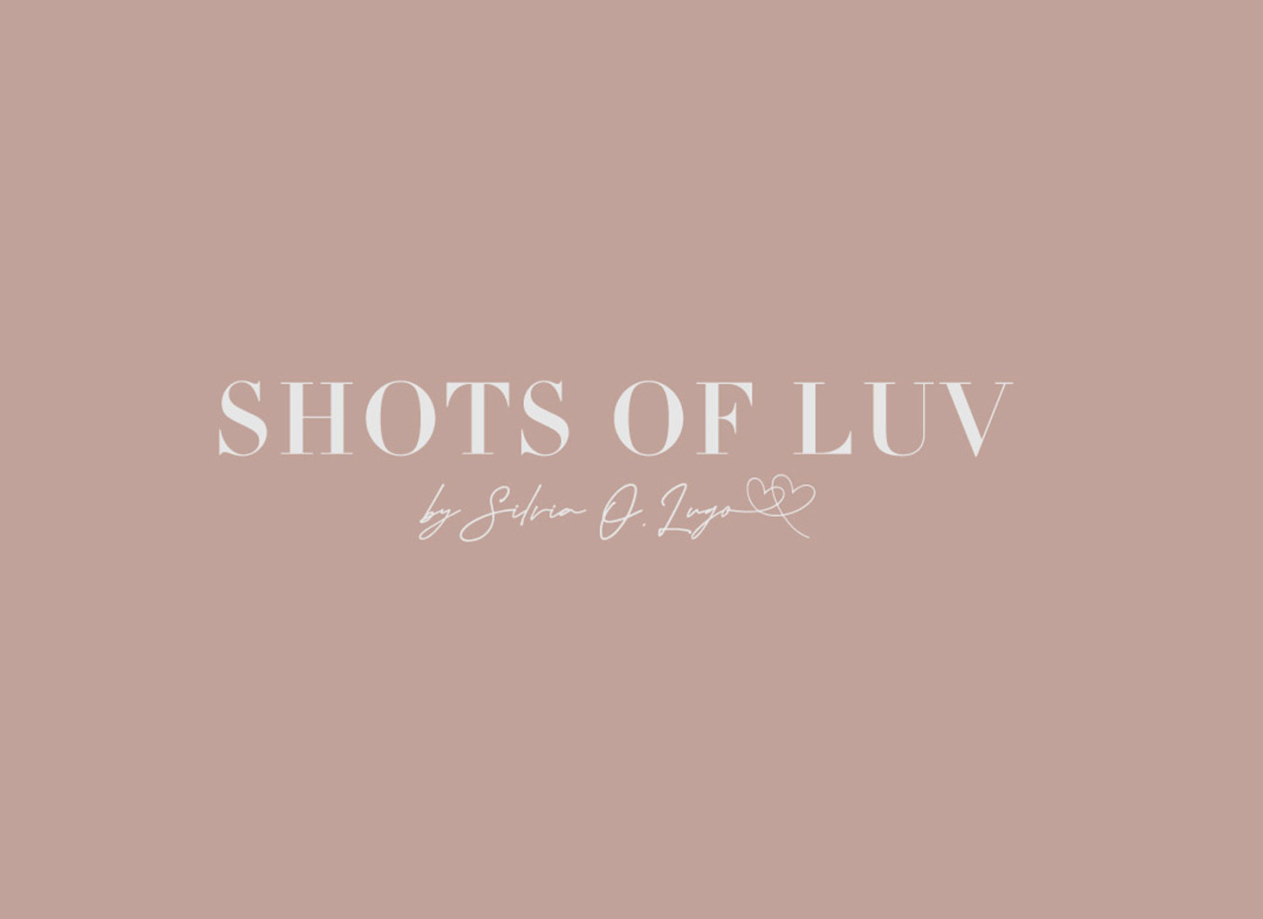
After evaluting a number of potential concepts that we really liked, we arrived at one in particular that really ticked every box in the brand strategy. A classic, elegant typeface combined with a stylish yet playful script, signed off with two hearts (a play on the brand name) – combines the promise of a high end experience with the bubbly personality Silvia brings to every photoshoot.
The dusty pink combined with pale silver offered a sophisticated take on the previous colour palette; white & bright pink.
As a finishing touch, we created a repeatable pattern from the signature; the perfect decorative element to create a bespoke wrapping paper.

Case Study
Opportunity
This boutique wedding photography studio needed an identity that would capture the energy and intimacy of their work—modern, playful and romantic—while still projecting professionalism for couples investing in high-end photography.
Objectives
-
Create a wordmark that feels personal and stylish without drifting into novelty.
-
Build a flexible system with a full logo and compact submark for watermarking and social avatars.
-
Use colour and typography to express warmth, modern romance and individuality.
-
Ensure applications feel equally strong across print, digital and overlaid on photography.
Insight & Strategy
Wedding clients seek both emotional resonance and reassurance. The design language leaned into playful sophistication: bold enough to stand out, refined enough to build trust. The typography was crafted to feel bespoke, with soft character shapes balanced by clean geometry.
Identity Solution
-
Wordmark: A custom-drawn logotype with rounded, contemporary forms—playful yet composed—designed to be instantly recognisable and legible across formats.
-
Submark: A circular monogram drawn from the initials, ideal for social avatars, watermarking, and small-scale collateral.
-
Palette: A romantic yet modern scheme blending soft pinks and deep charcoal, creating contrast that feels premium but approachable.
-
System: Guidance on lockups, reversal, watermark usage and clear-space rules so the identity remains sharp whether applied to photographs, stationery or digital platforms.
Competitive Edge Now
Where many wedding photography logos lean generic or overly script-led, Shots of Luv’s identity feels fresh, modern and personal. It telegraphs romance while carrying the professional polish needed to inspire trust and command value.
What This Enables
Consistent and stylish presentation across all touchpoints—from watermarking to social content—helping the studio stand out in a crowded wedding photography market and reinforcing its reputation for high-end yet heartfelt work.