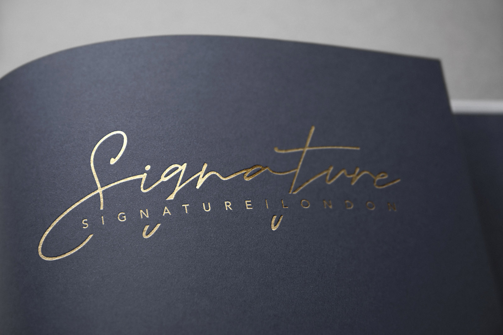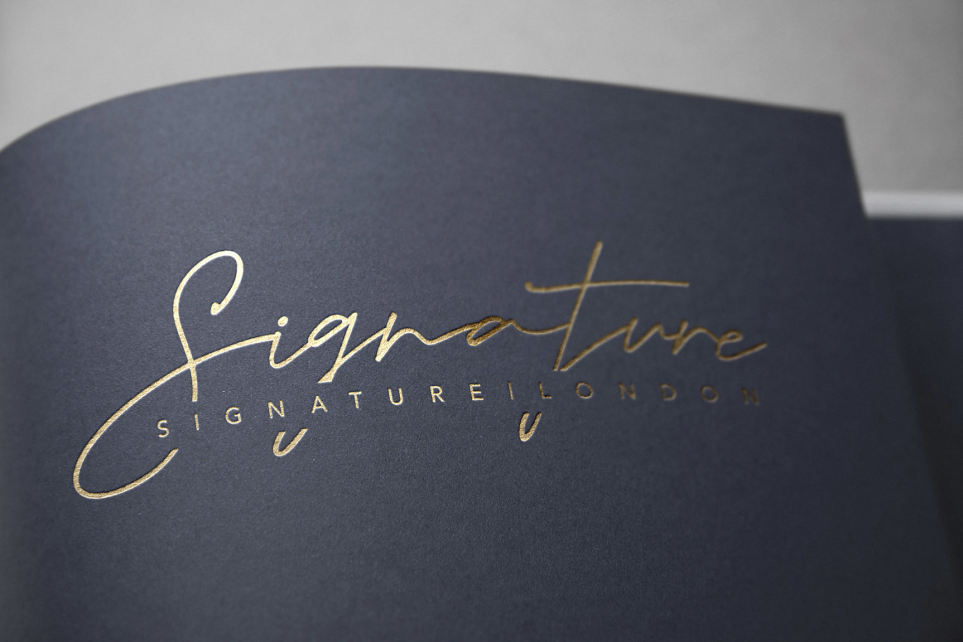
Signature London – providing luxury chaffeurs, concierge, and other services for a decerning clientelle. Sometimes the most obvious solution is actually the most effective – and the concept to play on the brand name and represent ‘Signature’ literally worked very well indeed. To ensure legibility, the full brand name is repeated below the script type; which gave us the freedom to really create something exciting, a dynamic signature with plenty of finésse. Intersecting the full brand name with the signature script allowed us to create a much ‘tighter’ logo lockup than would have been possible otherwise.
We also created a standalone brandmark, taken from the S of the signature script – which can be effectively used at small sizes and in situations where the full logo would appear too small.
The result is a strong, memorable identity that excudes a strong sense of luxury, exclusivity, and an elite level of service.

Case Study
Opportunity
For a luxury chauffeur and concierge service, the brand name itself suggests the right story: a personal signature that stands for discretion, finesse and five-star service. The space was there for a mark that feels authored and unmistakably premium at a glance.
Objectives
-
Create a signature-led logo that conveys exclusivity and personal attention.
-
Safeguard legibility across large signage and small digital uses.
-
Provide a compact brandmark for micro contexts without losing recognition.
-
Keep the overall tone refined, contemporary and production-ready.
Insight & Strategy
Clients at this level buy assurance and service standards. A literal “signature” becomes the perfect metaphor—provided we engineer clarity. The approach: pair a dynamic script with a crisp rendering of the full brand name, and compose them as one integrated lockup so the mark feels intentional, not ornamental.
Identity Solution
-
Primary lockup: A fluid, custom signature sits with the full brand name set beneath it for instant readability. Intersecting the signature and the word line creates a tighter, more cohesive silhouette that holds together at distance and in small contexts.
-
Submark: A standalone symbol drawn from the signature’s S provides a refined shorthand for avatars, seals and other micro applications.
-
System & usage: Horizontal and centred arrangements, clear-space and minimum-size rules, and guidance for monochrome/reversed use so the identity remains sharp on vehicles, stationery and digital headers.
Competitive Edge Now
Where many category marks feel generic or decorative, Signature London presents a crafted autograph: a memorable gesture anchored by clear typography. The composition reads luxury and discretion in a single glance, and the S submark secures recognition when space is tight.
What This Enables
A coherent presence across chauffeur livery, concierge materials and digital touchpoints; confident small-scale branding via the S mark; and a disciplined visual language that reinforces elite service standards as the offering expands.