Sulzer Consulting provide a wide range of IT services to a broad range of clients across several industires, with a particular focus on education, finance and investment / wealth management. Based in Switzerland but working with clients globally, they act as a long-term technology partner for their clients, often managing all aspects of their IT environment.
The brand identity needed to indicate Sulzer Consulting offer tailored, full service IT their clients can trust. It had to feel modern, reflecting the cutting edge approach Sulzer use – while feeling highly professional.
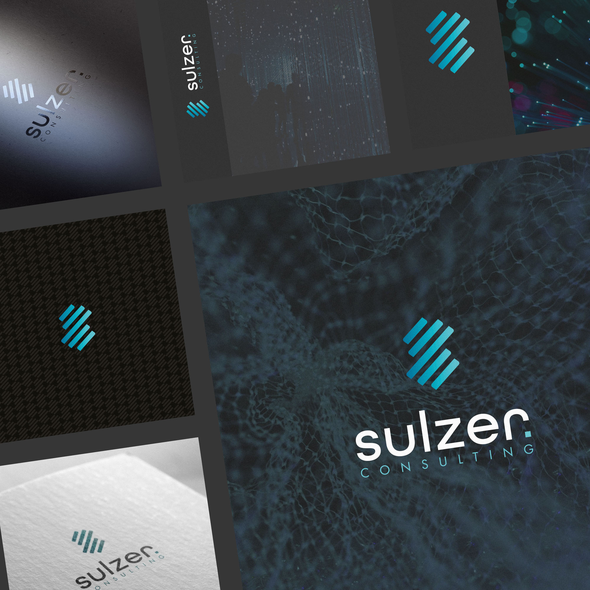
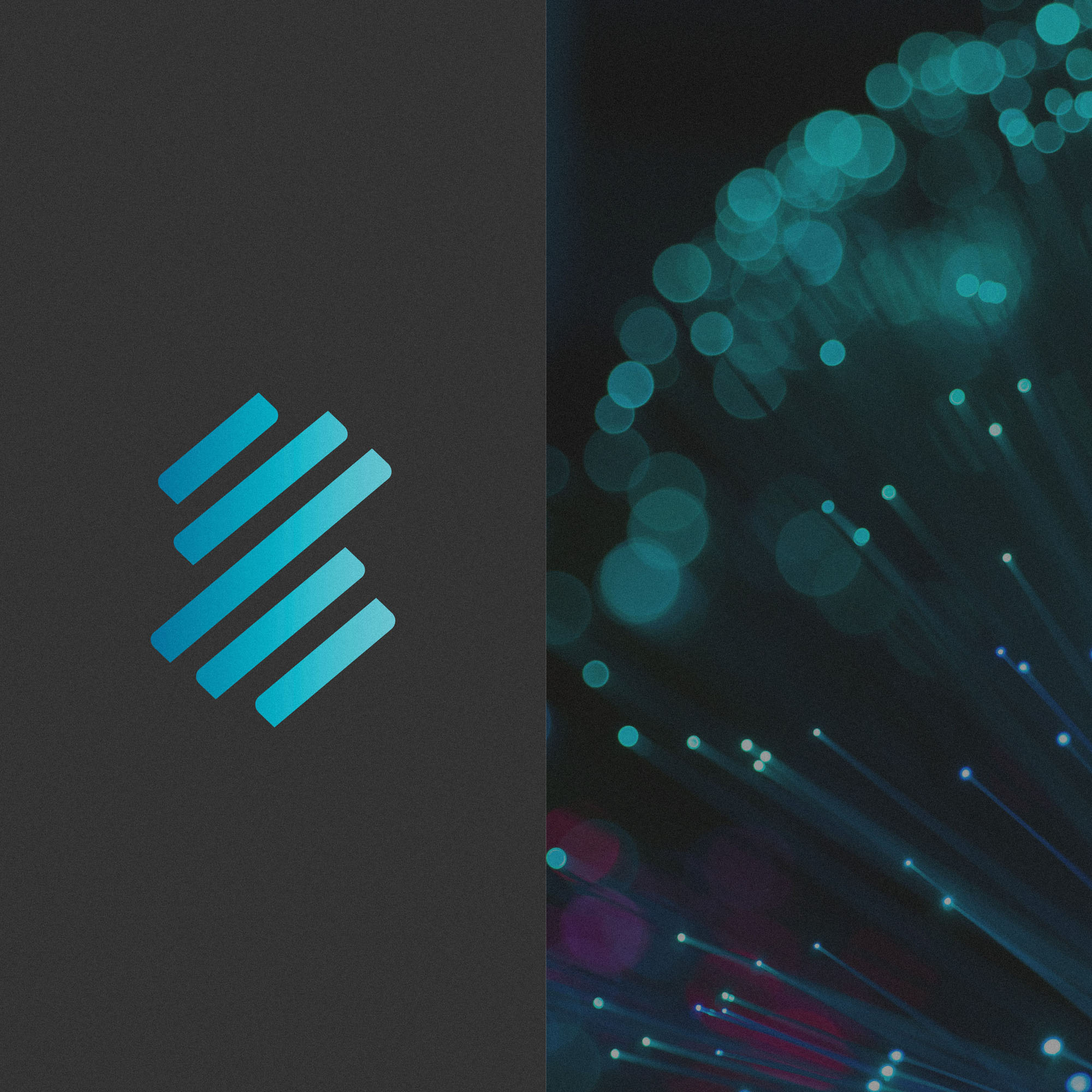
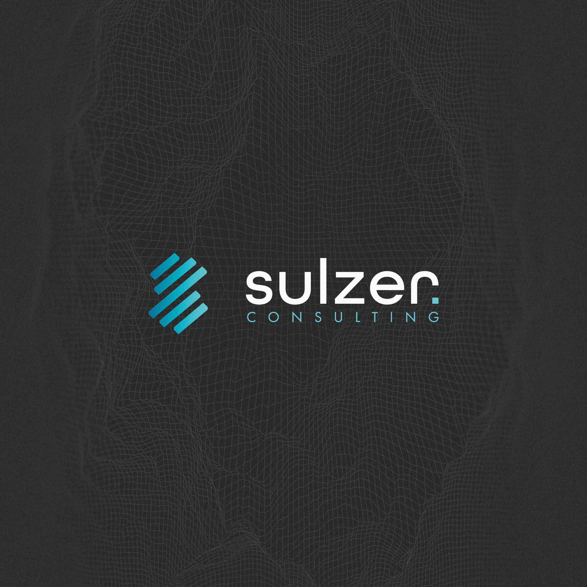
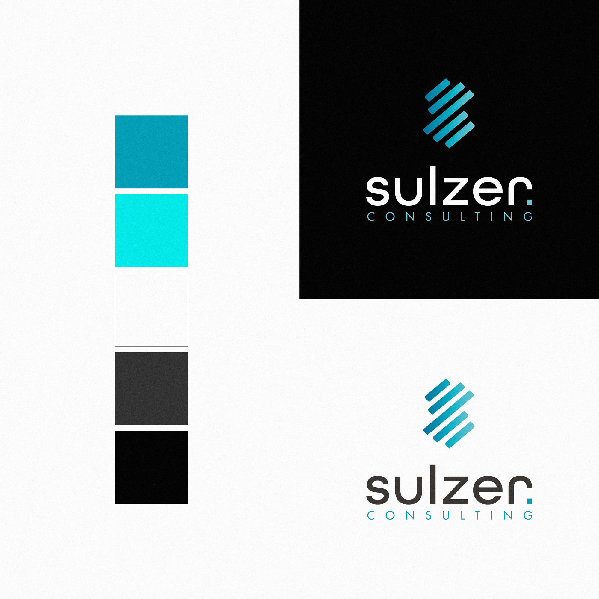
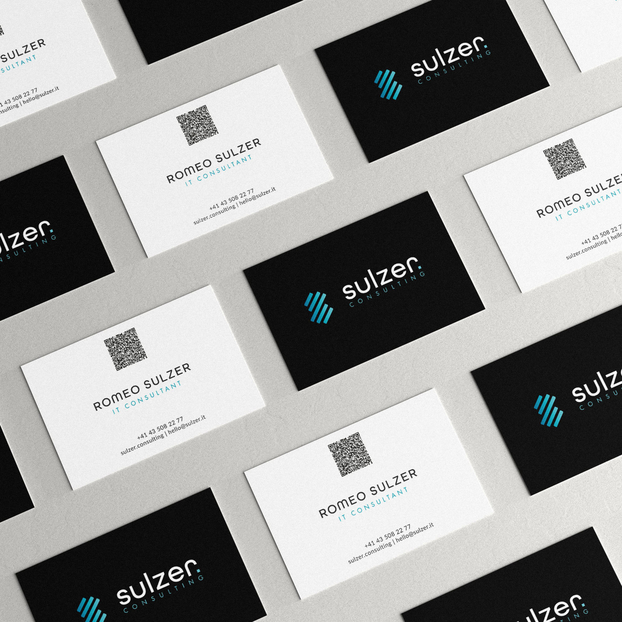
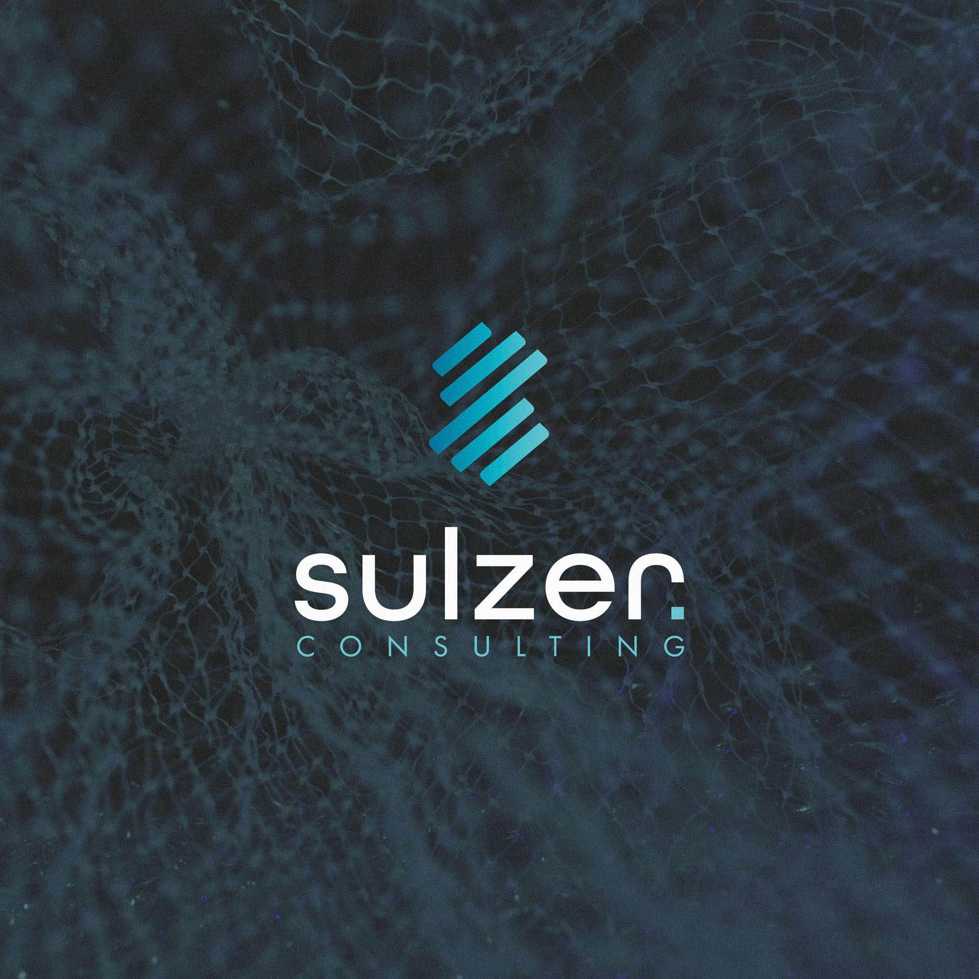
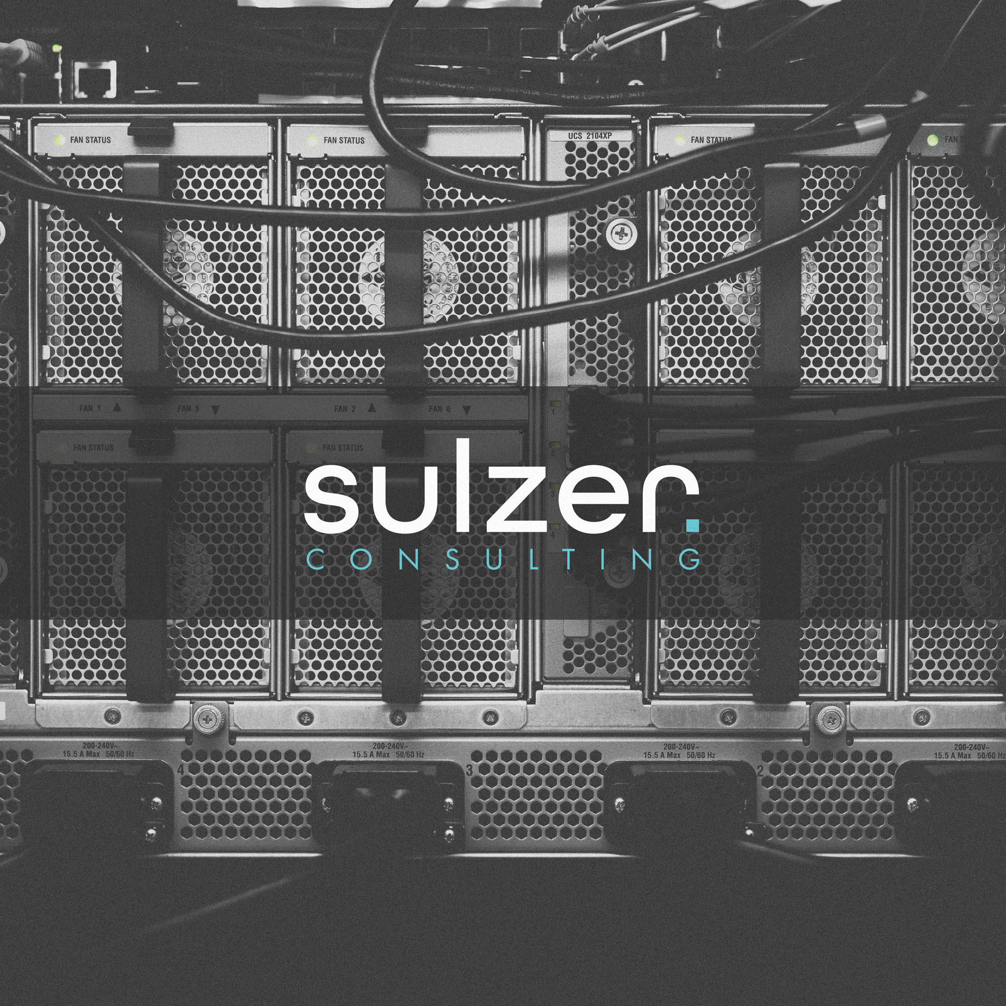
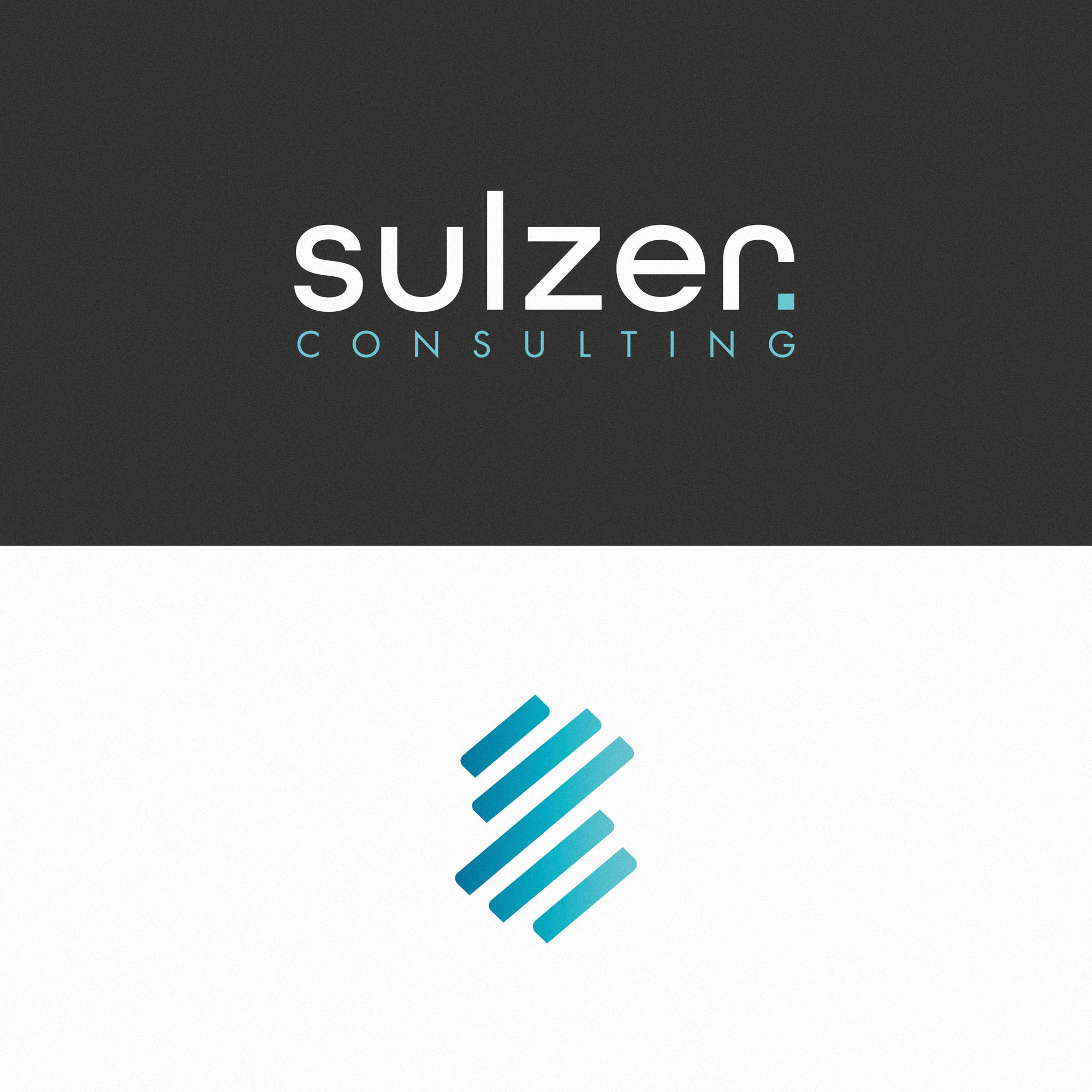
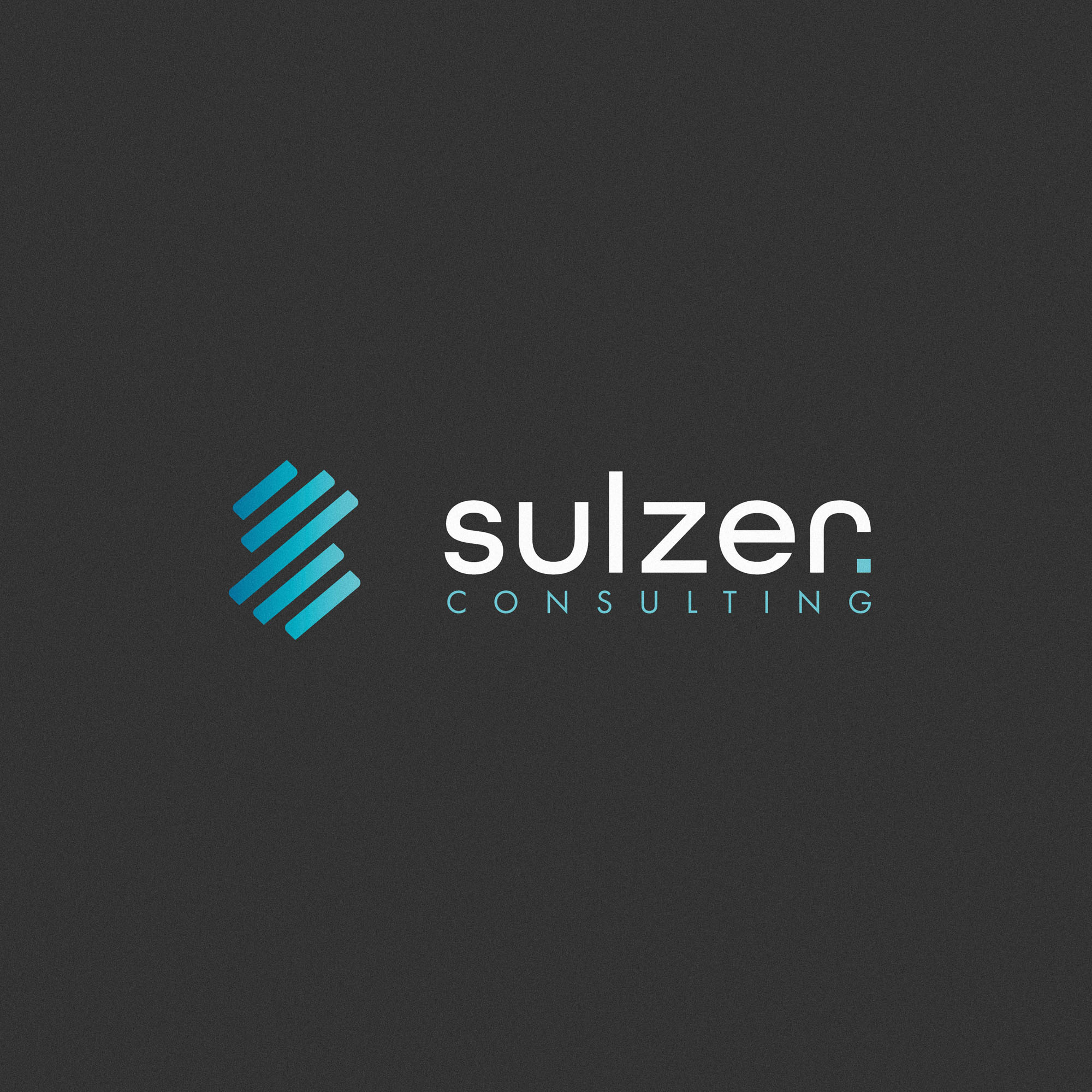
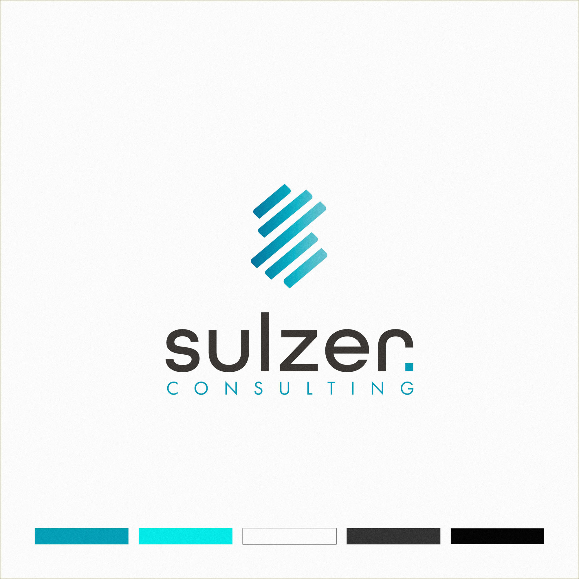
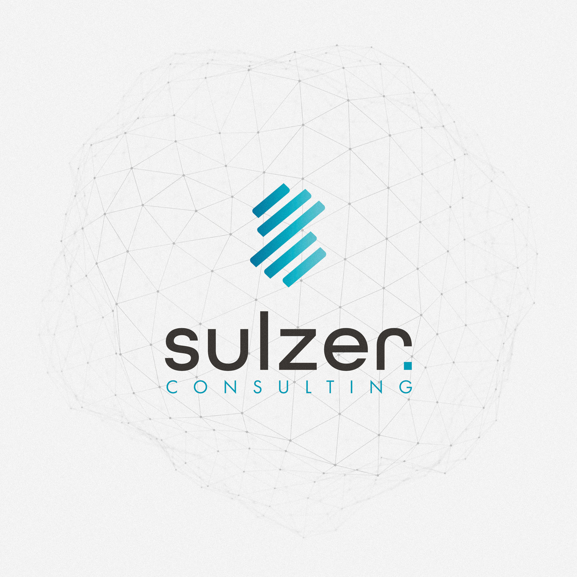
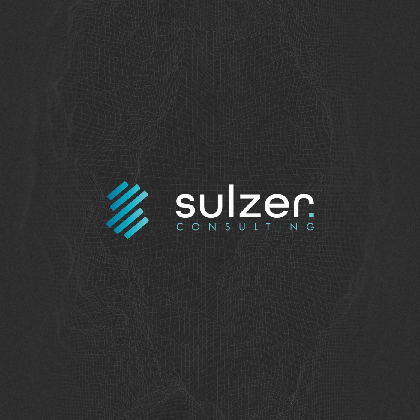
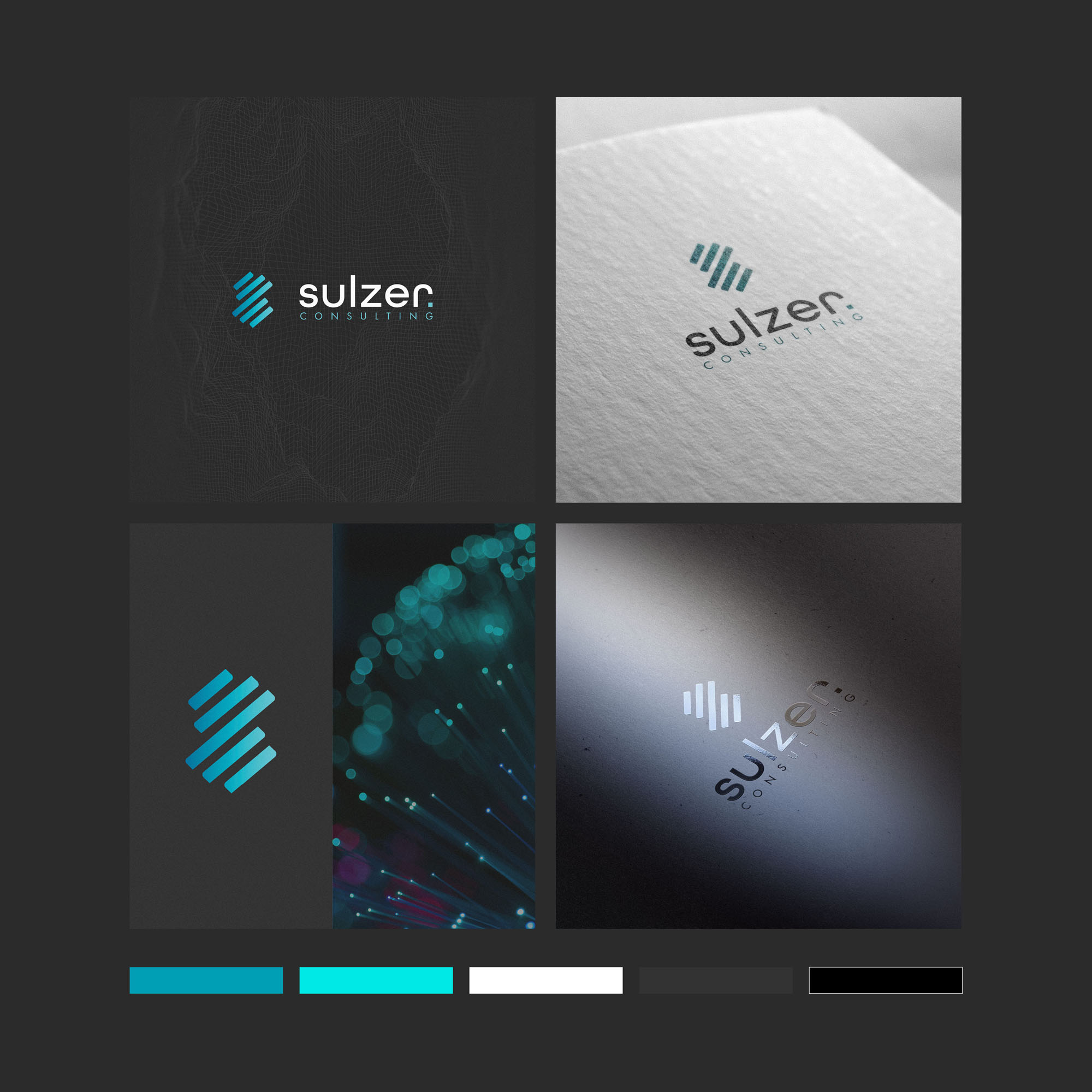
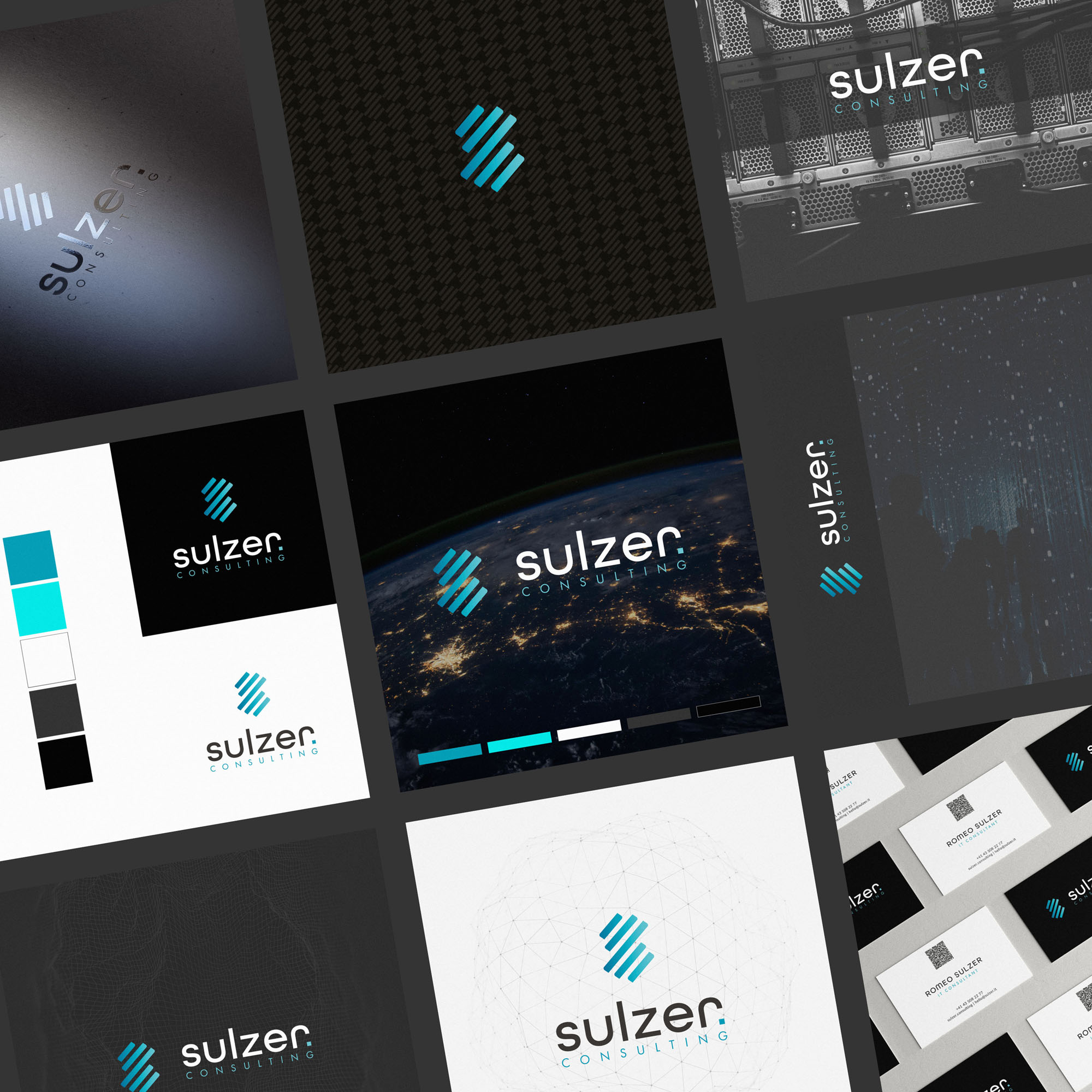
We felt a custom, abstract ‘S’ lettermark symbol was the perfect way to align with these brand messages and values; where a specific or pictorial mark may have limited the potential symbolism. A subtle gradient is applied to the lettermark, creating a sense of progress and movement – while the bars forming the S themselves are a subtle nod toward those often found in IT monitoring and financial graphs.
The colour palette features a vibrant light blue accent, paired with clean white and charcoal; which feels premium, high end, modern and trustworthy.
Case Study
Opportunity
Sulzer Consulting engaged us to craft a modern, trustworthy identity for a Switzerland-based IT partner serving education, finance and wealth-management clients worldwide—an identity that reads tailored and full-service from the first glance.
Objectives
- Express a premium, professional presence with a distinctive mark that scales cleanly.
- Signal end-to-end capability and forward momentum without locking into a narrow pictorial theme.
- Establish a clear system for proposals, slide decks, website headers and day-to-day documents.
- Define colour and spacing rules that reproduce reliably in print and digital.
Insight & Strategy
Clients choose long-term IT partners for clarity, control and steady progress. We centred the brand on an abstract, custom “S” lettermark—modular bars suggest monitoring dashboards and financial graph lines—paired with restrained typography and a confident, contemporary palette. A subtle gradient treatment introduces a sense of motion and optimism in digital environments.
Identity Solution
- Lettermark: A bespoke, bar-built “S” that conveys systems thinking and continuous improvement; optimised for both flat and gradient executions.
- Logotype & Lockups: A measured, modern wordmark balanced precisely with the symbol, with horizontal and stacked arrangements for varied layouts.
- Palette: Vibrant light blue accent with charcoal and white—premium, precise and trustworthy—specified for print and screen.
- Typography: Clean, technical sans-serif styles with disciplined spacing for proposals, credentials and UI labels.
- System Rules: Clear-space, minimum sizes, colour usage and guidance for gradient vs. solid applications ensure consistency across touchpoints.
Competitive Edge Now
The abstract “S” delivers immediate recognition and sector relevance without clichés: it reads as engineered, agile and dependable. The gradient option adds contemporary polish online, while the core lockups and palette provide effortless consistency across global materials.
What This Enables
A cohesive platform for RFPs and proposals, executive presentations, website and support documentation—positioning Sulzer Consulting to communicate tailored, full-service capability with a calm, high-end visual voice across markets and channels.