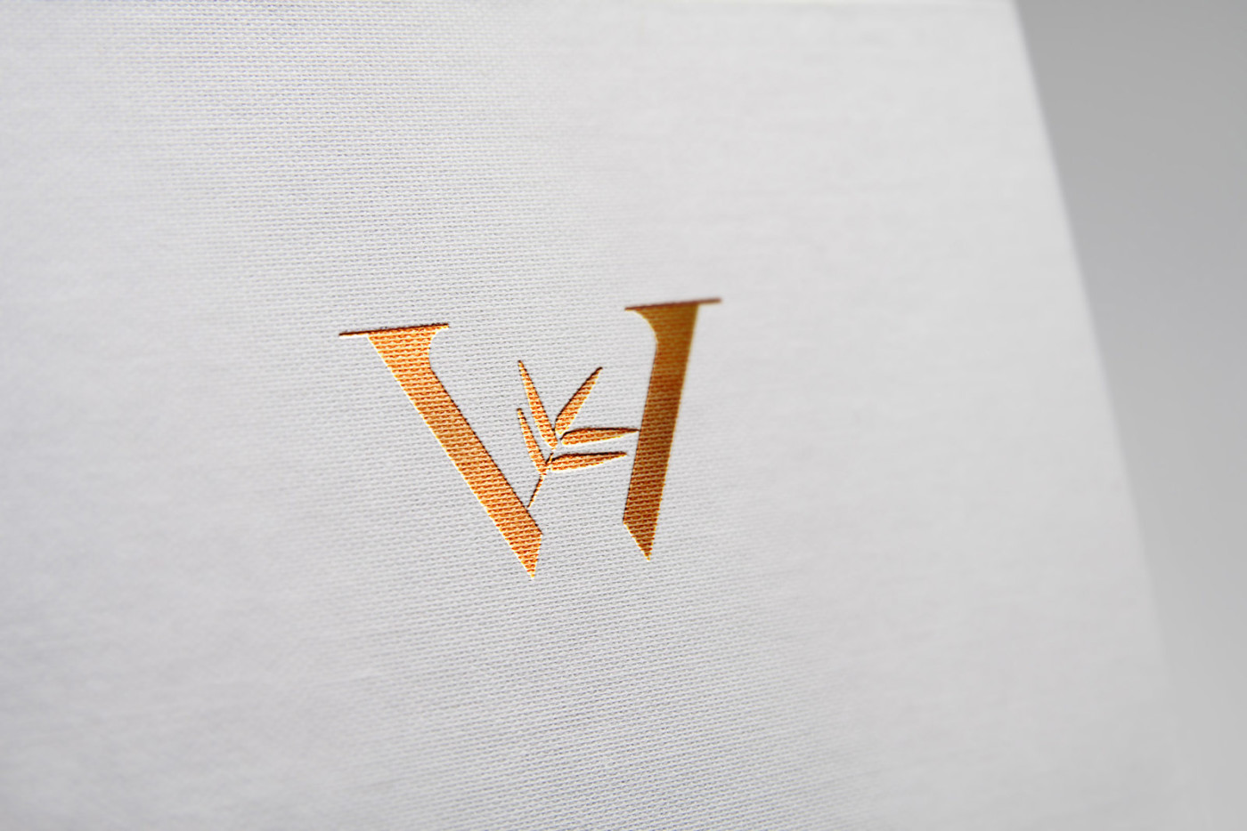
I was commissioned to create brand identity and packaging design for Wellesley products ltd; who provide a range of luxury, high quality items. We decided to plan and impliment clear brand architecture from the outset, so that while there is a consistent look and feel across the entire Wellesley parent brand, we created distinct varitions in the identity to indicate each sub-brand.
The first two sub-brands where to be Wellesley ‘Pooch’ and ‘Cane’, which would offer a range of dog accessories and bamboo products respectively. We loved the idea of using a subtle, interchangable symbol at the center of a simple W monogram – and then as the concept developed, also used this symbol as the basis for a background pattern. The brand colour would remain constant throughout, as would fonts, general layout rules and spacing – but the custom background and brandmark provided a clear system to identify each sub brand from the other.
Case Study
Opportunity
A growing product company needed a parent brand with the headroom to scale—and a clear way to distinguish multiple sub-brands on shelf without losing the premium, unified feel.
Objectives
-
Define a simple, ownable identity system that holds the parent brand together while giving each sub-brand a distinct signature.
-
Create packaging that reads premium and organised at a glance.
-
Keep core elements constant (colour, typography, spacing) so rollouts stay consistent and efficient.
Insight & Strategy
We treated the brand as a family from day one. The system centres on a refined W monogram that acts as the anchor for Wellesley, then introduces a subtle, interchangeable symbol and background pattern for each sub-brand. This makes differences legible without fragmenting the overall look and feel.
Identity & Packaging Solution
-
Parent brand: A disciplined framework—consistent colour, fonts, layout rules and spacing—to ensure instant recognition across the range.
-
Sub-brands: A modular approach where each line gains its own symbol placed within the W and a coordinated pattern derived from that symbol.
-
Packaging: Clear information hierarchy and repeatable panels so new SKUs can be added quickly, with visual cues that separate sub-brands while maintaining the Wellesley “family” on shelf.
Competitive Edge Now
The brand reads as premium and organised: one strong parent identity, multiple distinctive sub-brands. The modular kit (monogram + symbol + pattern) speeds launches and keeps everything coherent across formats.
What This Enables
Confident expansion into additional product lines without redesigning the core; faster packaging updates with fewer errors; and a recognisable presence that carries from digital to print to retail displays—maintaining unity while signalling clear choice within the range.


