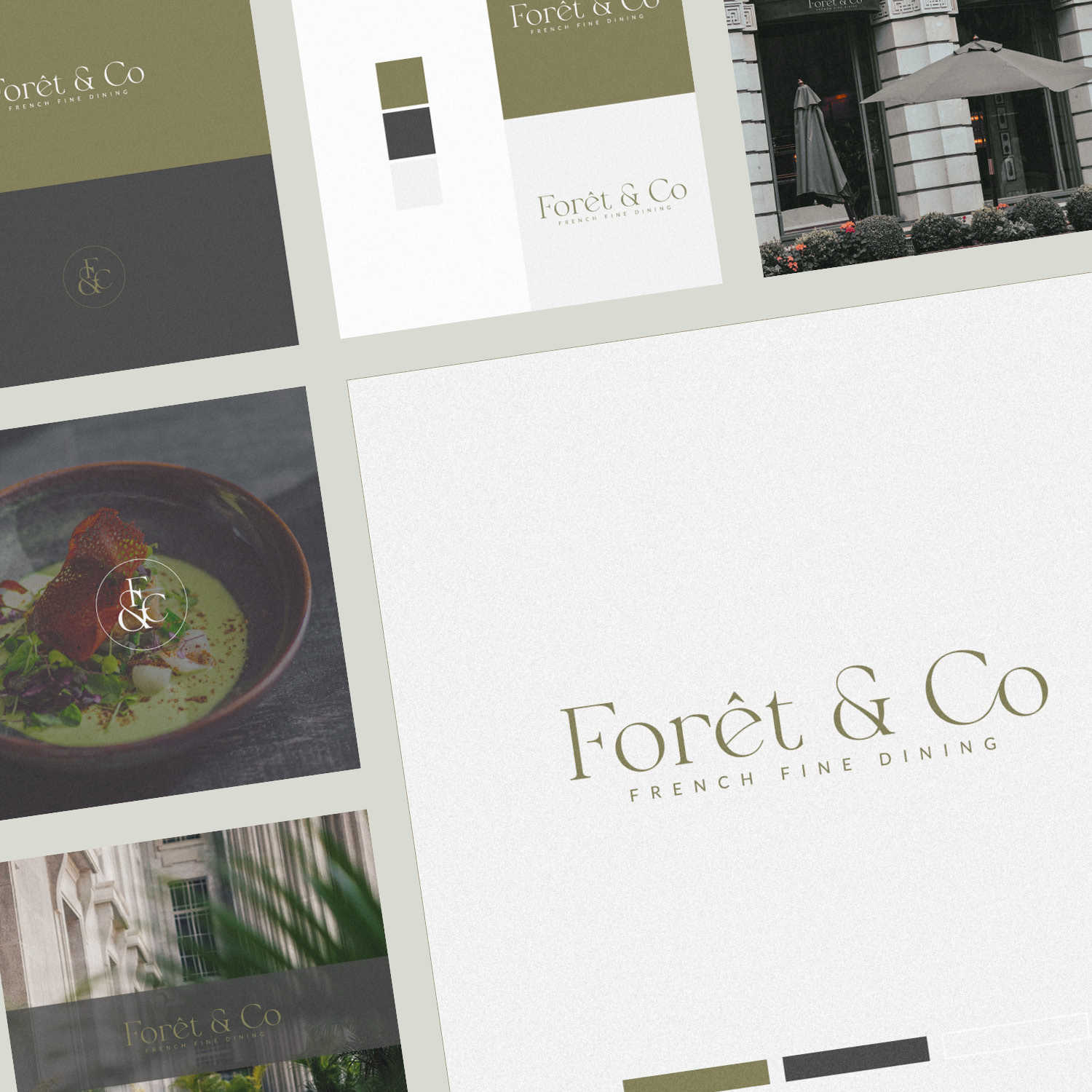
Brand Identity (including logo design) for Foret & Co – French fine dining restaurant. The combination of generously applied ivory negative space with a soft neutral greens and slate grey creates a fresh, elegant vibe.
The small details in the logotype make all the difference; the beautiful slant on the ‘o’ and the ‘e’, a flowing ligature between ‘C’ and ‘o’ – and a perfectly balanced ‘&’. Adding unique touches in a subtle way that enhances the overall effect rather than distract or compete for attention is so important.
Case Study
Opportunity
For a French fine-dining restaurant, the identity needed to express culinary refinement and garden-fresh elegance—inviting, modern and unmistakably premium, without leaning on literal leaf icons or rustic tropes.
Objectives
-
Capture a fresh, elegant mood suitable for a contemporary French dining room.
-
Build a typographic logo with characterful details that remain composed at small sizes.
-
Establish a calm, nature-inspired palette that keeps menus and digital touchpoints airy and readable.
Insight & Strategy
Fine dining guests read restraint as quality. We pursued edited elegance: generous ivory negative space, soft neutral greens and a grounding slate grey to suggest freshness and composure. Typography does the storytelling—small refinements convey craft without calling attention to themselves.
Identity Solution
-
Logotype craft: A subtly italic tilt on key letters adds flow; a quiet ligature joins C and o; the ampersand is redrawn for poise. Together, these gestures create a signature rhythm that feels bespoke yet effortless.
-
Colour world: Ivory, sage/olive notes and slate grey form a refined, botanical-leaning palette that supports legibility on menus and calm contrast on digital.
-
System notes: Primary and compact lockups with clear spacing/minimum sizes keep the mark crisp on print pieces and small UI elements; guidance covers monochrome/reversed use for photography-heavy layouts.
Competitive Edge Now
Compared with generic restaurant marks, Forêt & Co reads fresh, composed and confident: a bespoke typographic signature paired with a restrained, nature-toned palette that elevates the dining experience without visual noise.
What This Enables
Consistent, premium presentation across menus, reservations and digital touchpoints; an immediately recognisable wordmark that scales cleanly; and a calm visual voice that aligns with seasonal, garden-forward cuisine.


