Full Brand Identity created for Highbridge Partners; a specialist executive search and advisory firm, focussing on identifying transformational talent within the global commodity trading, natural resources, renewable energy and alternative investment markets.
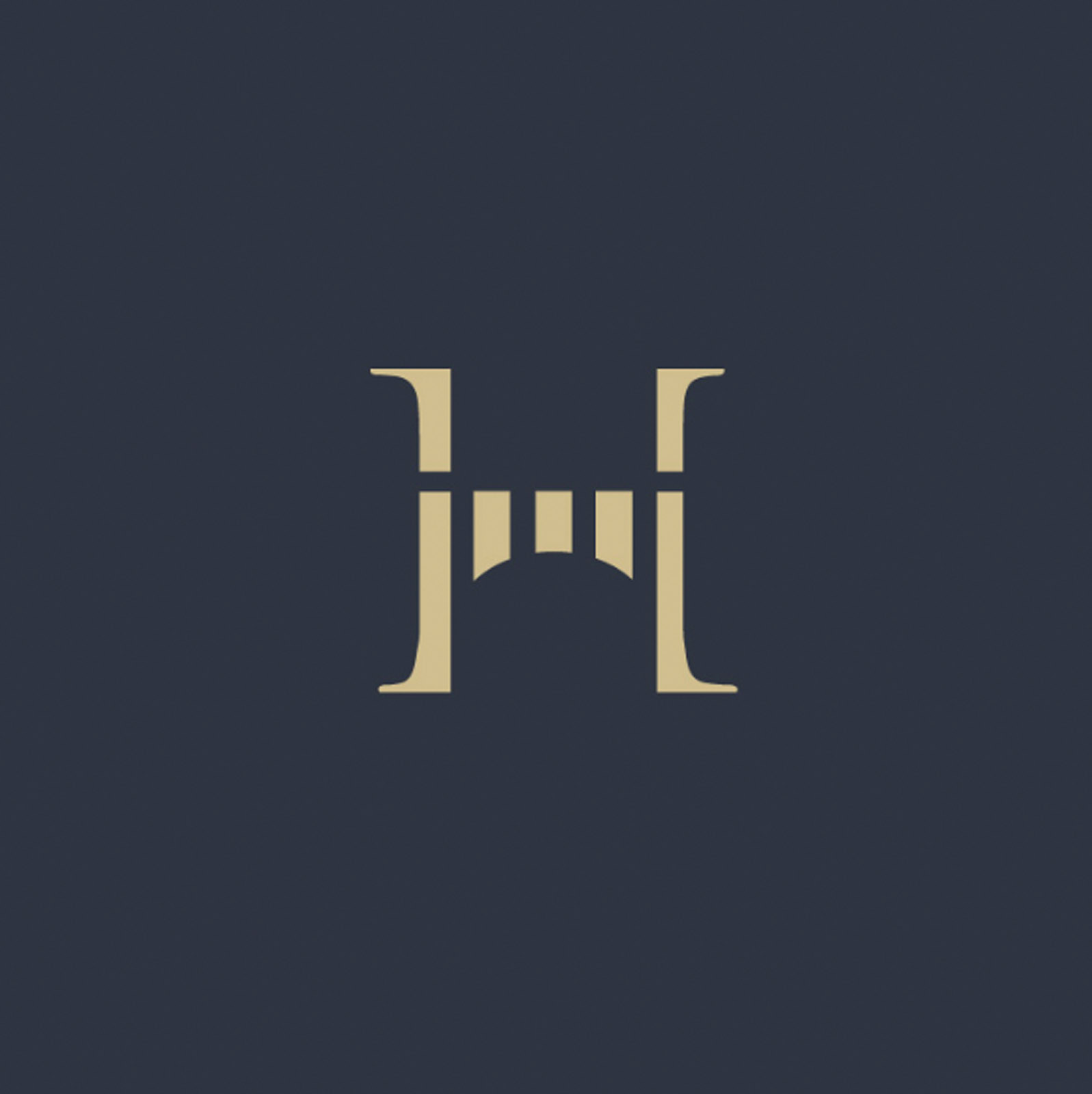
The Identity features an effective lettermark ‘H’, depicting a ‘bridge; a nod to the brandname to increase and speed up recognition. The ‘bridge’ symbolism also feels appropriate for the industry; executive search firms pride themselves on forming the bridge between executives and firms recruiting them.
While it’s important to ensure a logo is aesthetically pleasing, the real joy comes from seeing a combination of aesthetic and layers of meaning – as was the case here.

Case Study
Opportunity
In senior executive search and advisory—especially across commodities, natural resources, renewable energy and alternative investments—credibility and clarity must register instantly. There was room for an identity that pairs board-level polish with a mark that means something, not just looks good.
Objectives
-
Present a specialist, high-trust advisory that identifies transformational talent in complex global markets.
-
Create an ownable lettermark with clear, relevant symbolism tied to the name.
-
Build a disciplined system (lockups, sizes, usage) that holds together across proposals, pitch decks, website and LinkedIn.
-
Balance aesthetic refinement with layered meaning—beauty with purpose.
Insight & Strategy
Senior clients and candidates scan first, then read. We centred the identity on the idea of bridging: the firm as the link between exceptional leaders and the organisations that need them. The tone is composed and modern—editorial restraint, generous spacing and precise typography—so messages carry weight without noise.
Identity Solution
-
Lettermark (“H” as Bridge): A crafted H whose structure depicts a bridge—an immediate nod to the name and a metaphor for connection and passage. It reads as stability and reach at a glance, and it becomes a distinctive device at small sizes.
-
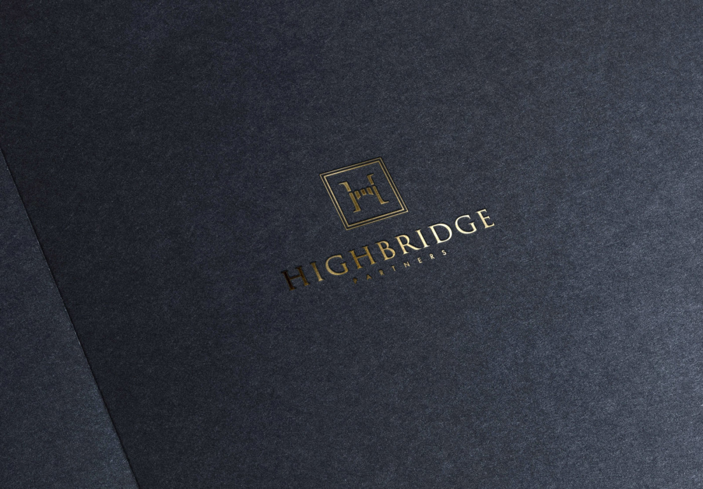
Wordmark & Lockups: A refined typographic wordmark paired with the lettermark in horizontal and compact arrangements. Spacing, proportions and minimum sizes are defined to protect clarity from proposal covers to small digital avatars.
-
System & Usage: Guidance for monochrome/reversed use, clear-space rules and deployment across presentation templates, website headers, stationery and LinkedIn assets. The result feels engineered, not ornamental—purposeful forms that endure.
Competitive Edge Now
Compared with generic corporate identities, Highbridge presents considered authority: a symbol that accelerates name recognition and encodes the firm’s role, supported by a calm, senior tone across every touchpoint. It’s aesthetically elegant, with layers of meaning that reward a second look.
What This Enables
Ideally positioned to reassure institutional clients and attract high-calibre candidates; to deliver proposals and sector insights with immediate credibility; and to scale coherently as the practice expands—maintaining a composed, meaningful identity that reflects the firm’s bridging role in global markets.