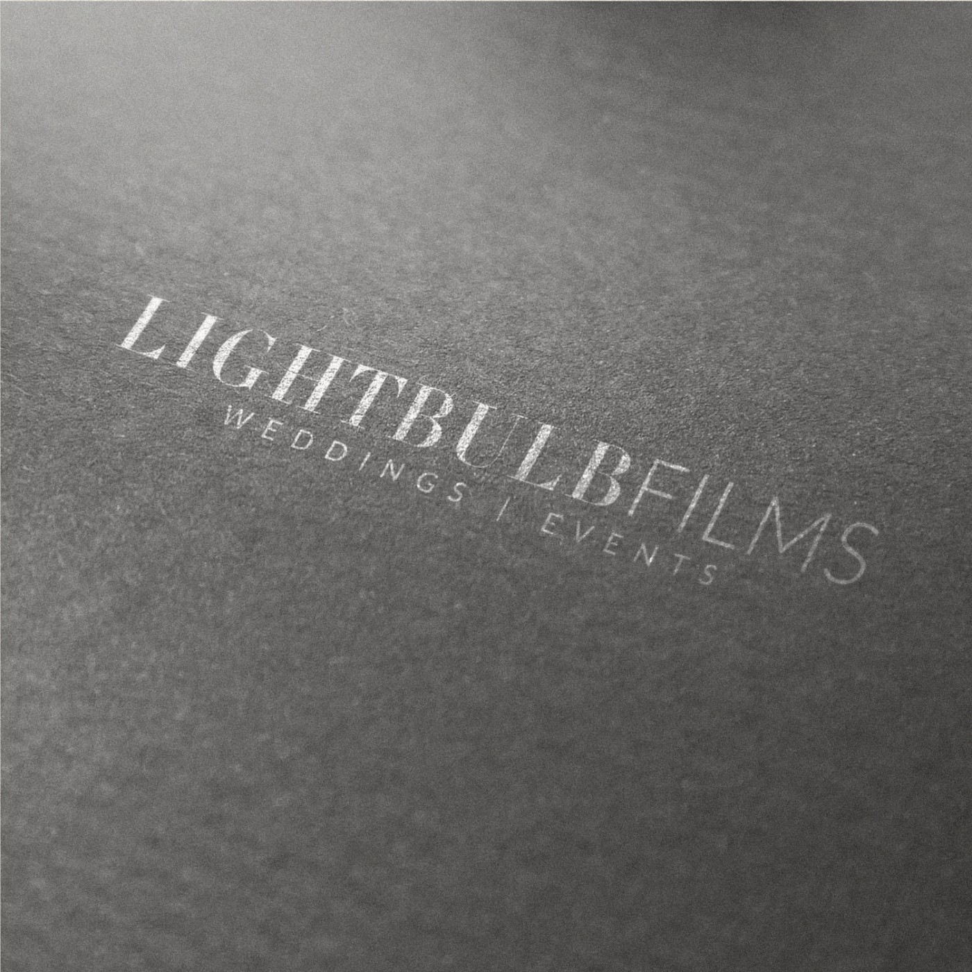
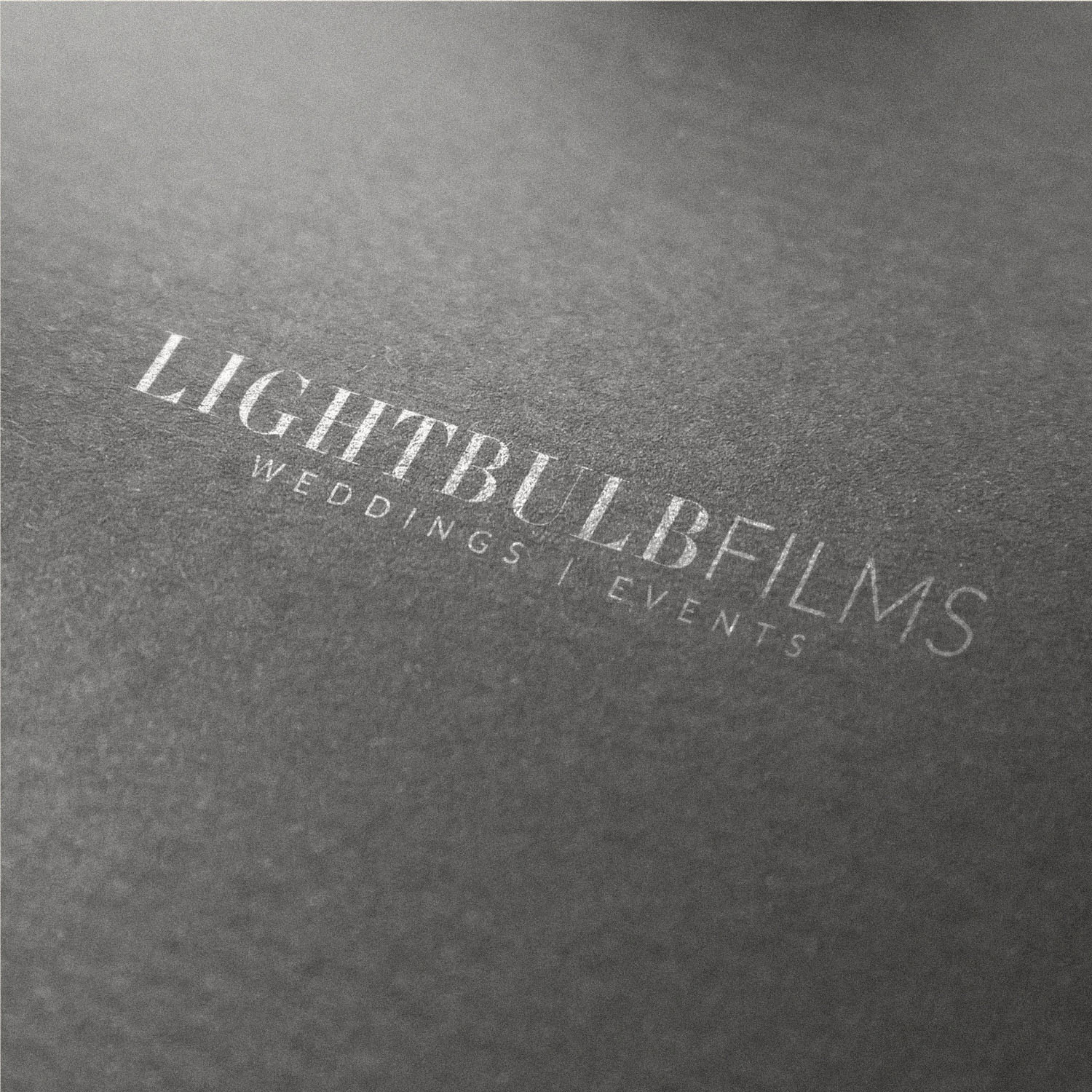
An Elegant and Minimalist Logo designed using a blend of Classic & Modern elements. It beautifully compliments the chic, high end style of videography produced by Lightbulb Films, postioning them as a Luxury brand.
In the world of film, even neutral colours could be enough to sway the perceived tone of the video; even a slightly warm background behind or alongside a video would make the video looking ‘cold’. For this reason a versatile, classic palette consisting of grey-scale tones was selected, from medium-dark grey, to black and white. Overall, the brand reflects quiet luxury, with a clean, editorial style.
Case Study
Opportunity
Luxury wedding and event filmmakers often default to cliché symbols or loud palettes that clash with their footage. There was room for an identity that feels editorial and timeless—elevating the brand while staying invisible beside colour-critical video work.
Objectives
-
Signal a chic, high-end filmmaking practice from first glance.
-
Create a wordmark with classical poise and modern clarity that reads perfectly on screen and in print.
-
Provide a palette and usage rules that won’t introduce colour bias when used near or over footage.
Insight & Strategy
Viewers subconsciously read brand colours against what they’re watching; even a warm UI can make a neutral scene feel “cold.” We therefore centred the identity on tonal neutrality and typographic craft: a classic serif for LIGHTBULB paired with a modern sans for FILMS, set with generous tracking for calm, editorial presence.
Identity Solution
-
Wordmark: High-contrast serif for LIGHTBULB balanced with a clean sans-serif FILMS; tuned kerning and alignment deliver a refined, contemporary silhouette.
-
Lockups: Primary horizontal mark with secondary small-space arrangements; optional “WEDDINGS | EVENTS” descriptor for context when required.
-
Colour system: A restrained greyscale (black → charcoal → soft white) ensuring overlays, title cards and watermarks don’t skew perceived colour in the film.
-
Applications: Guidance for watermark usage, opening/closing slates, stationery and social avatars so the mark remains crisp at micro sizes and elegant at scale.
Competitive Edge Now
The brand reads as polished and understated—confident enough to sit on luxury invitations and websites, yet restrained enough to disappear when the work should speak. The typographic pairing becomes the memory cue; the neutral palette protects the filmmaker’s colour grading.
What This Enables
Consistent presentation across films, social trailers and client communications; an identity that complements editorial cinematography rather than competing with it; and a scalable foundation for future collateral and digital touchpoints.


