In the world of luxury branding, detailed logos are experiencing a resurgence. While many heritage brands have always embraced ornate marks—think crests, monograms, intricate emblems—there is a renewed appetite for richness, craftsmanship and storytelling expressed through fine detail.
But designing a detailed luxury logo well is a different discipline from designing a simple geometric mark. The challenge is not only aesthetic; it is functional. A luxury logo must convey depth, artistry and heritage while still remaining versatile across sizes, mediums and touchpoints.
This article explores the correct methodology for creating detailed luxury logos, how to avoid the common pitfalls, and why the solution lies not in a single logo file, but in a complete identity system.
Why Detailed Logos Are Returning in Luxury Branding
Luxury audiences increasingly value craftsmanship and narrative. A highly detailed mark—when executed with discipline—signals:
- Heritage and lineage
- Craft and intentionality
- Exclusivity and uniqueness
- A richer emotional world behind the brand
However, as digital touchpoints proliferate, the old challenge returns: how do you maintain detail without sacrificing clarity?
This is where many attempts fail.
The Art (and Difficulty) of Designing Detailed Logos
I’ve worked with detailed luxury marks for years, and the truth is this:
there is a real craft to getting it right.
A detailed logo cannot simply be created as a single, fixed piece of artwork. Used incorrectly, it will collapse at small sizes, become illegible on digital interfaces, and lose its sophistication when scaled.
To succeed, the designer must anticipate:
- Large-scale hero applications (packaging panels, signage, print)
- Digital applications (websites, mobile screens, social media)
- Extremely small sizes (favicons, embroidery, seals)
A luxury mark must remain recognisable and consistent across all of these.
This is only possible through responsive design thinking.
The “Responsive Branding” Approach
In web design, we accept that users view the same site on a 4K desktop, a tablet and a mobile phone. The content remains the same—but the interface adapts.

Luxury branding works the same way.
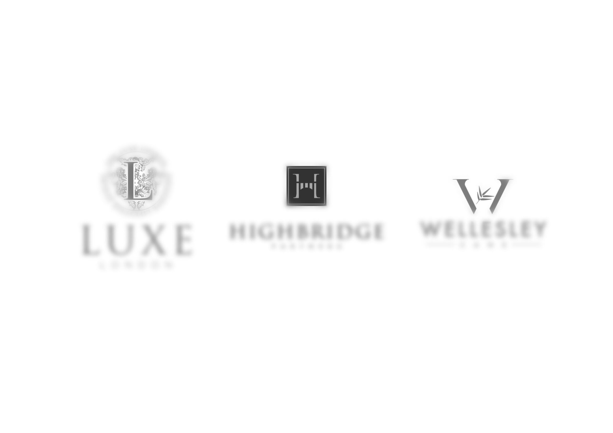
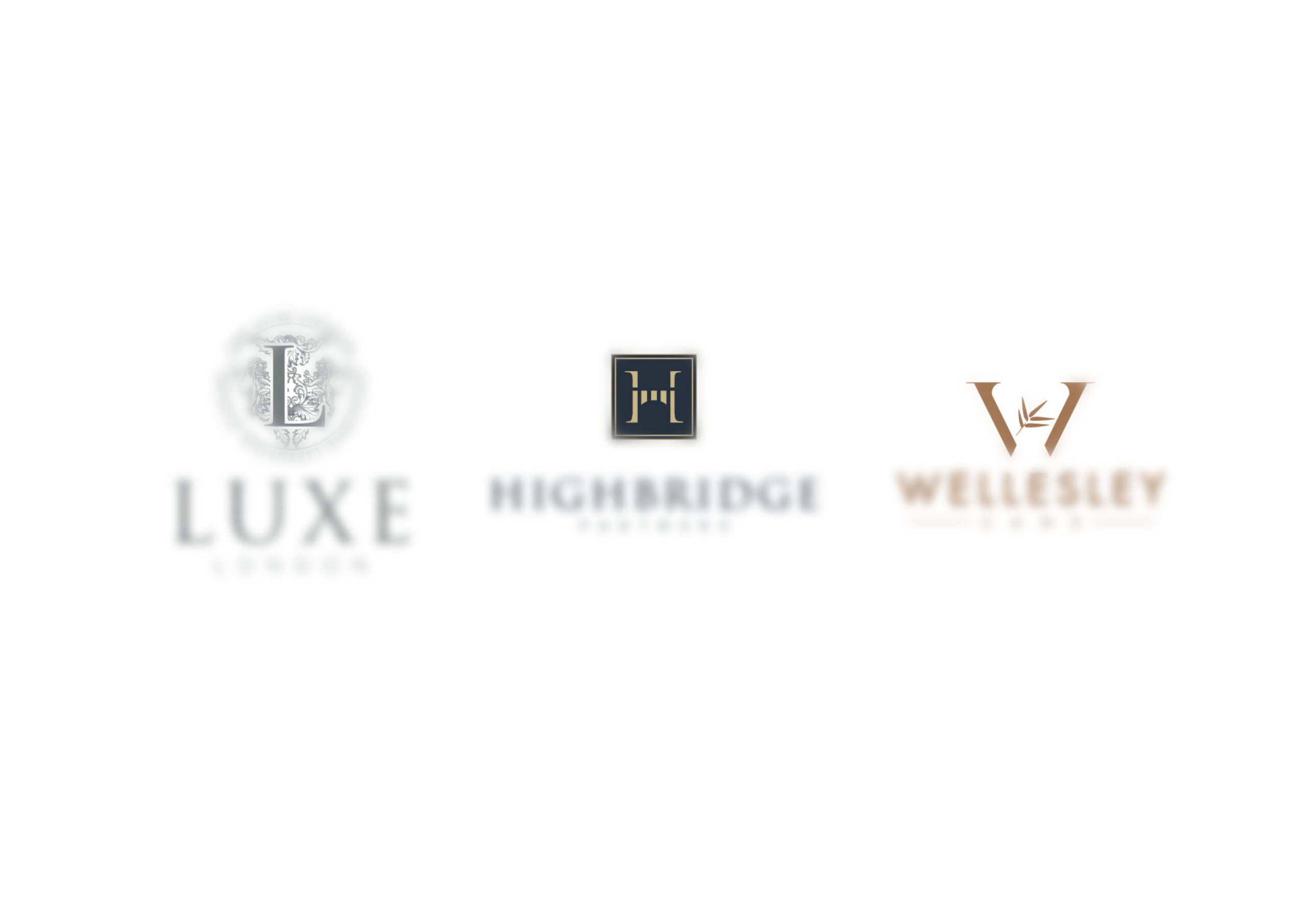
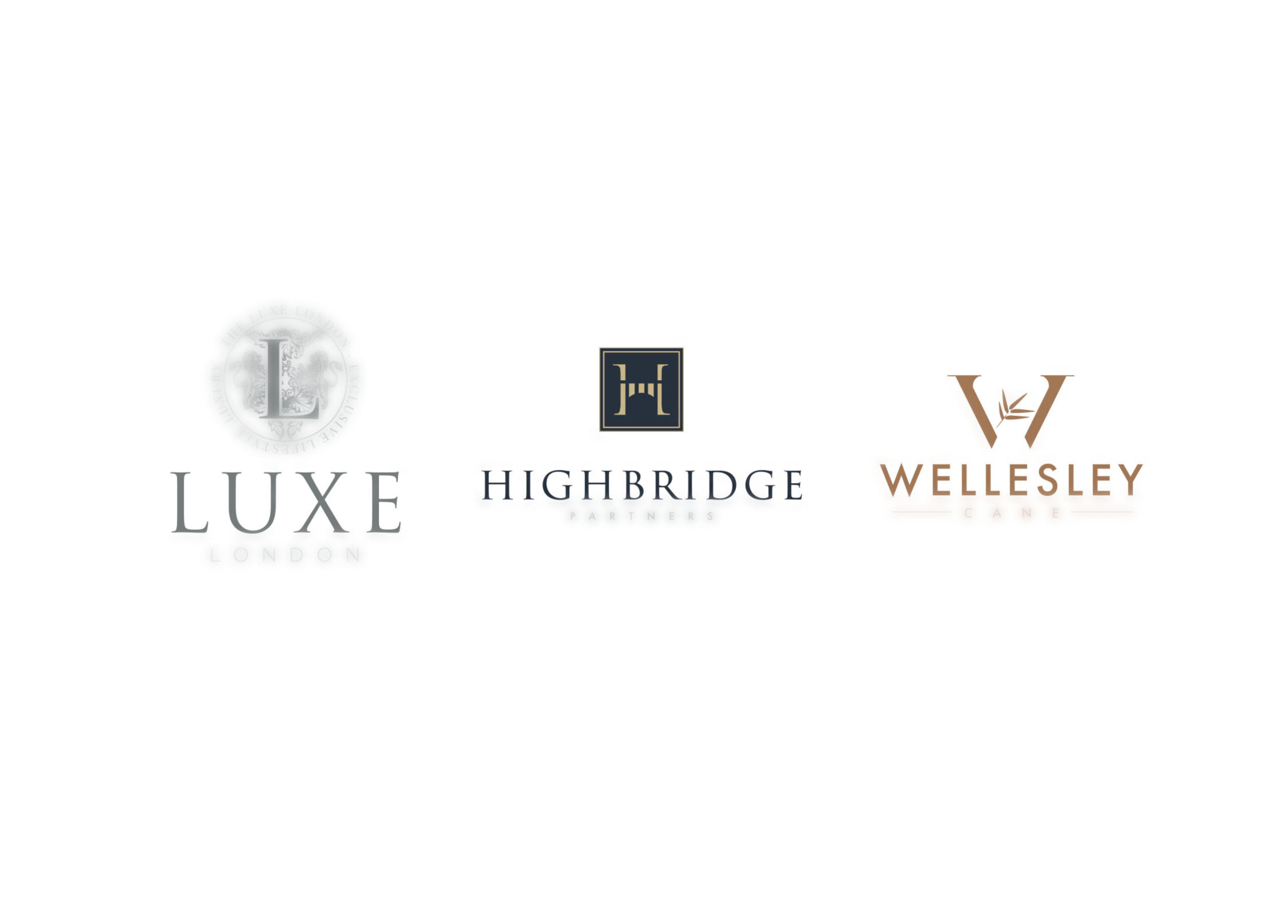
You cannot use the same hyper-detailed illustration in a tiny corner of a website or on a 16px label. Instead, you create a family of marks, each appropriate for its context. The identity system remains consistent, but the presentation adapts.
This is where detailed logos become both viable and powerful.
Complex Logos Require an Identity System
(Not Just a Single Logo File)
To create a richly detailed luxury mark, the designer must build a full identity system around it. This typically includes:
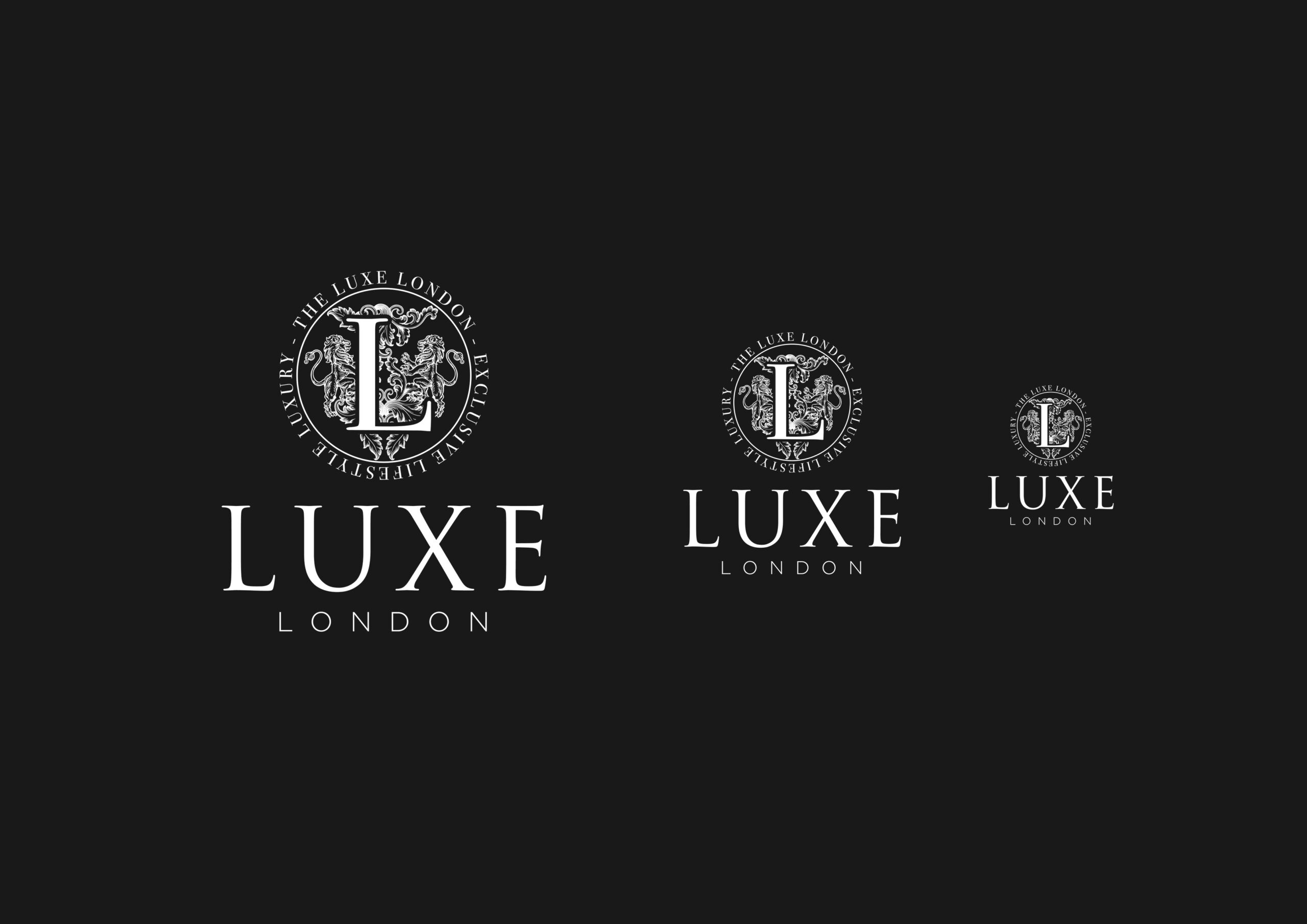
1. A “Rich” or “Hero” Version
This is the most detailed and ornate expression of the logo—often reserved for packaging, high-end print, certificates, premium campaigns or flagship products.
2. A Simplified Primary Logo
Reduced detail but still expressive. Works for most common applications.
3. A Minimal Mark or Symbol
A monogram, emblem, or simplified contour—used when space is limited or digital clarity is essential.
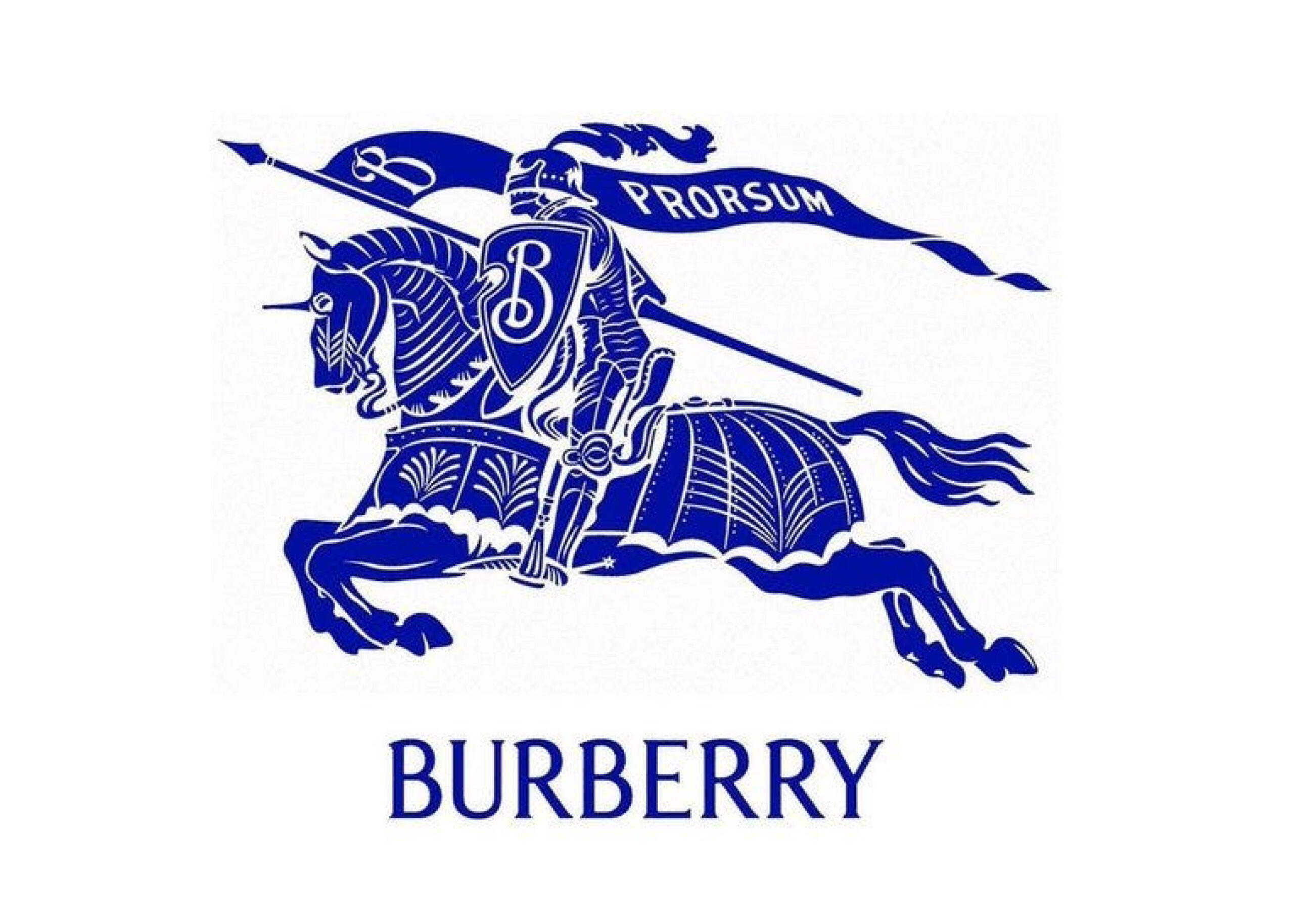
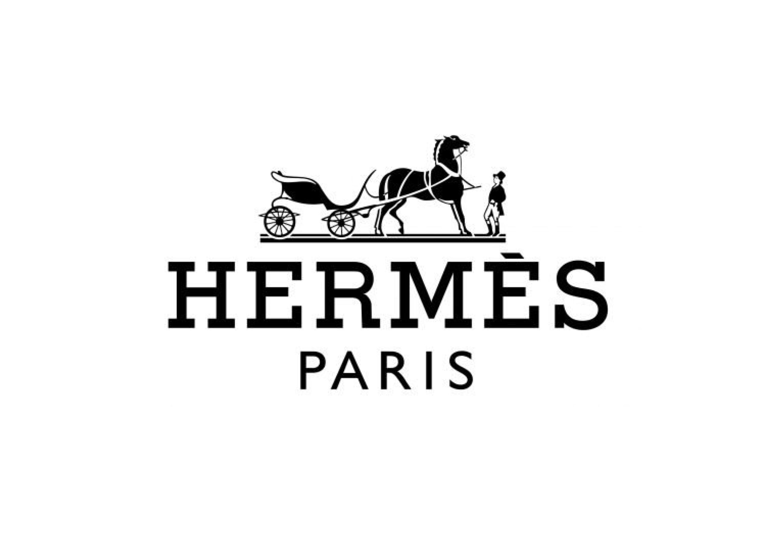
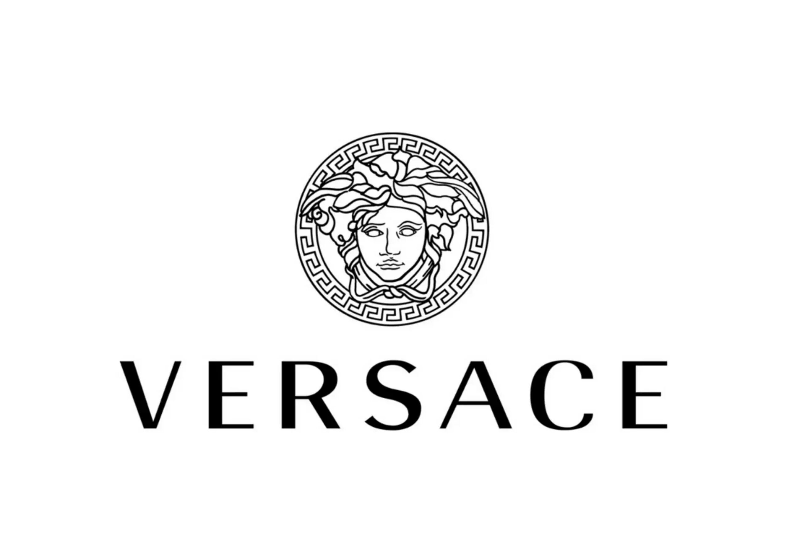
This tiered approach mirrors what major luxury houses already do. Their guidelines often show large-scale crests, simplified wordmarks, and small symbols, each used appropriately.
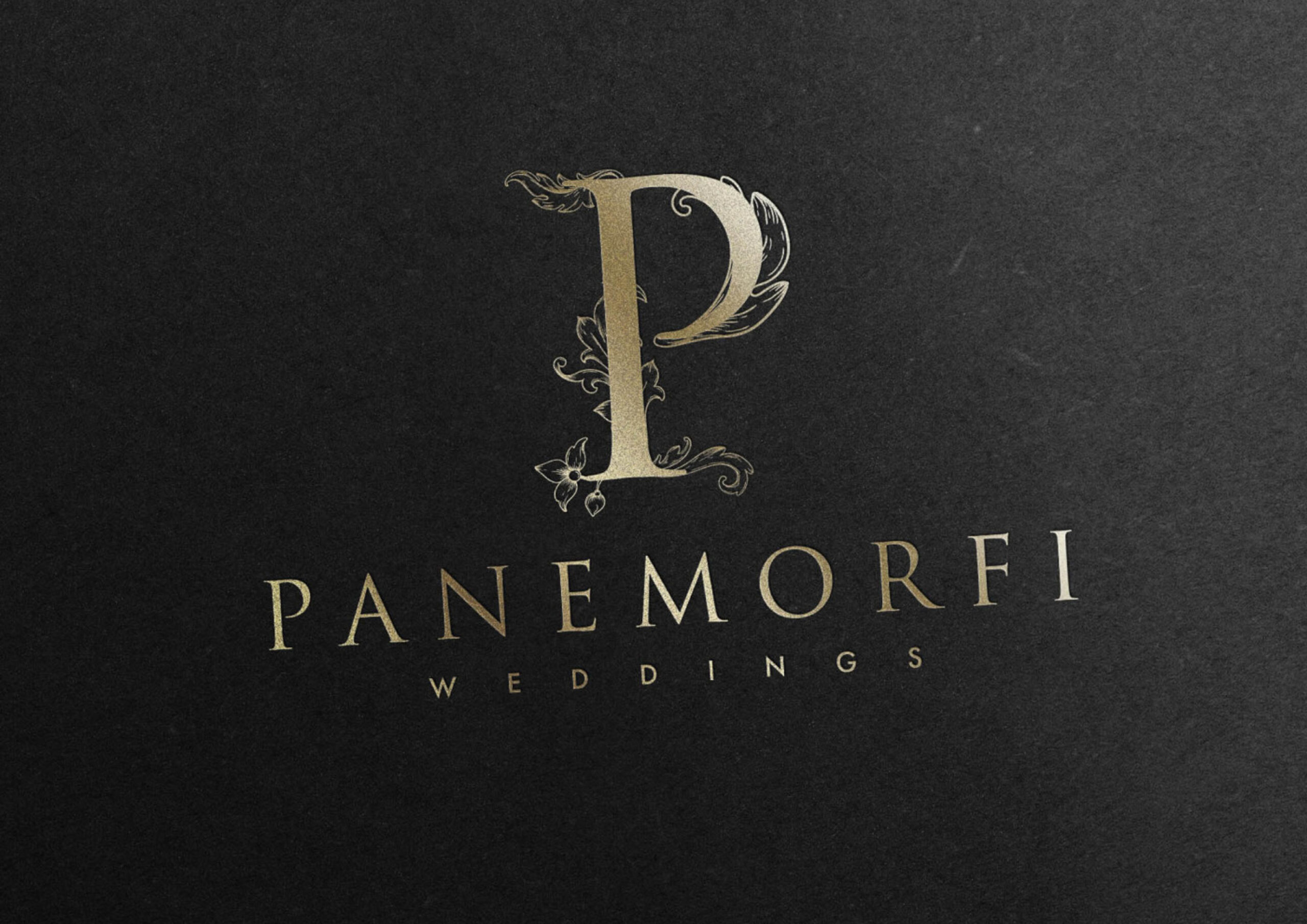
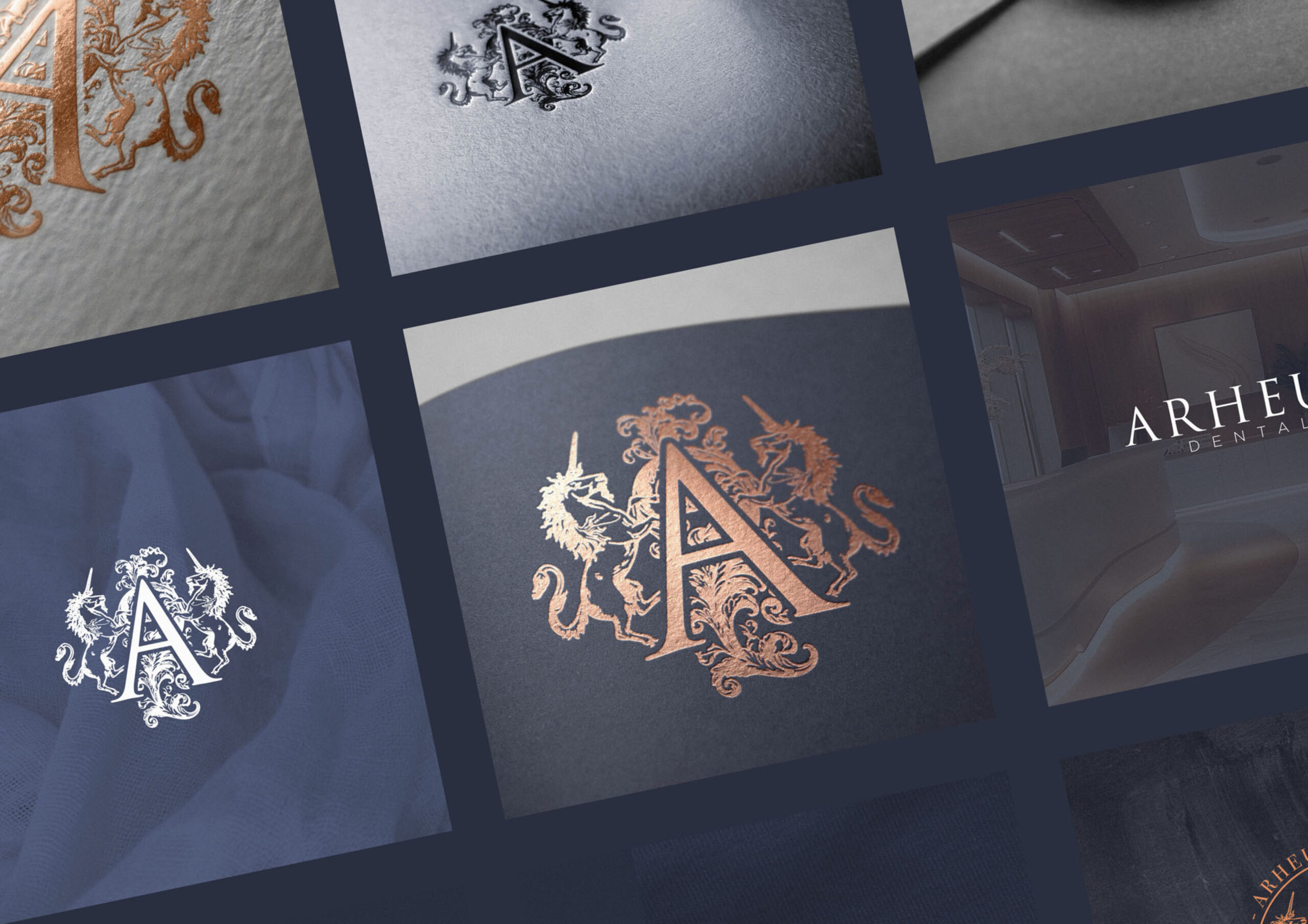
A Case Study in Detail: The Shahdokht Project
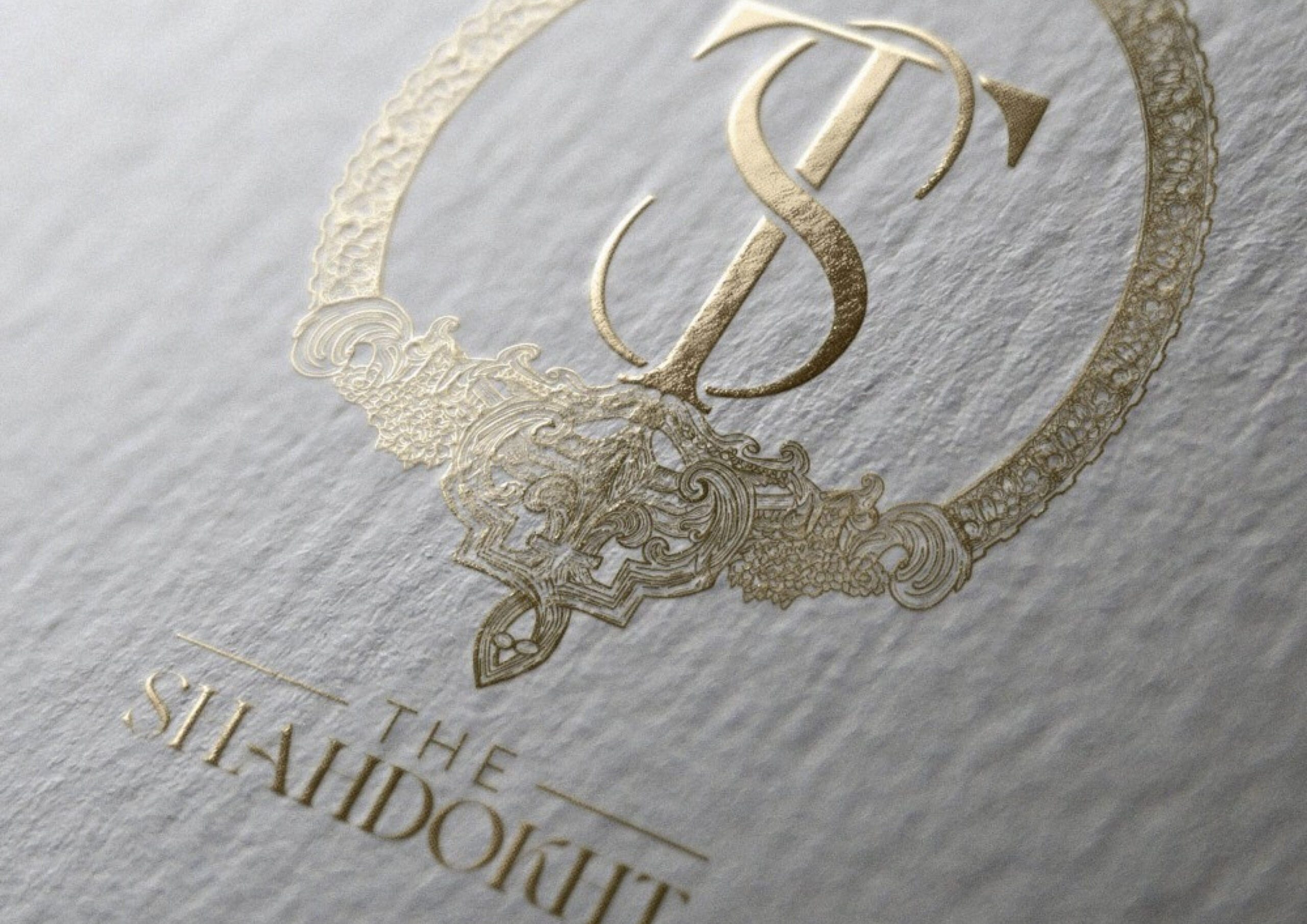
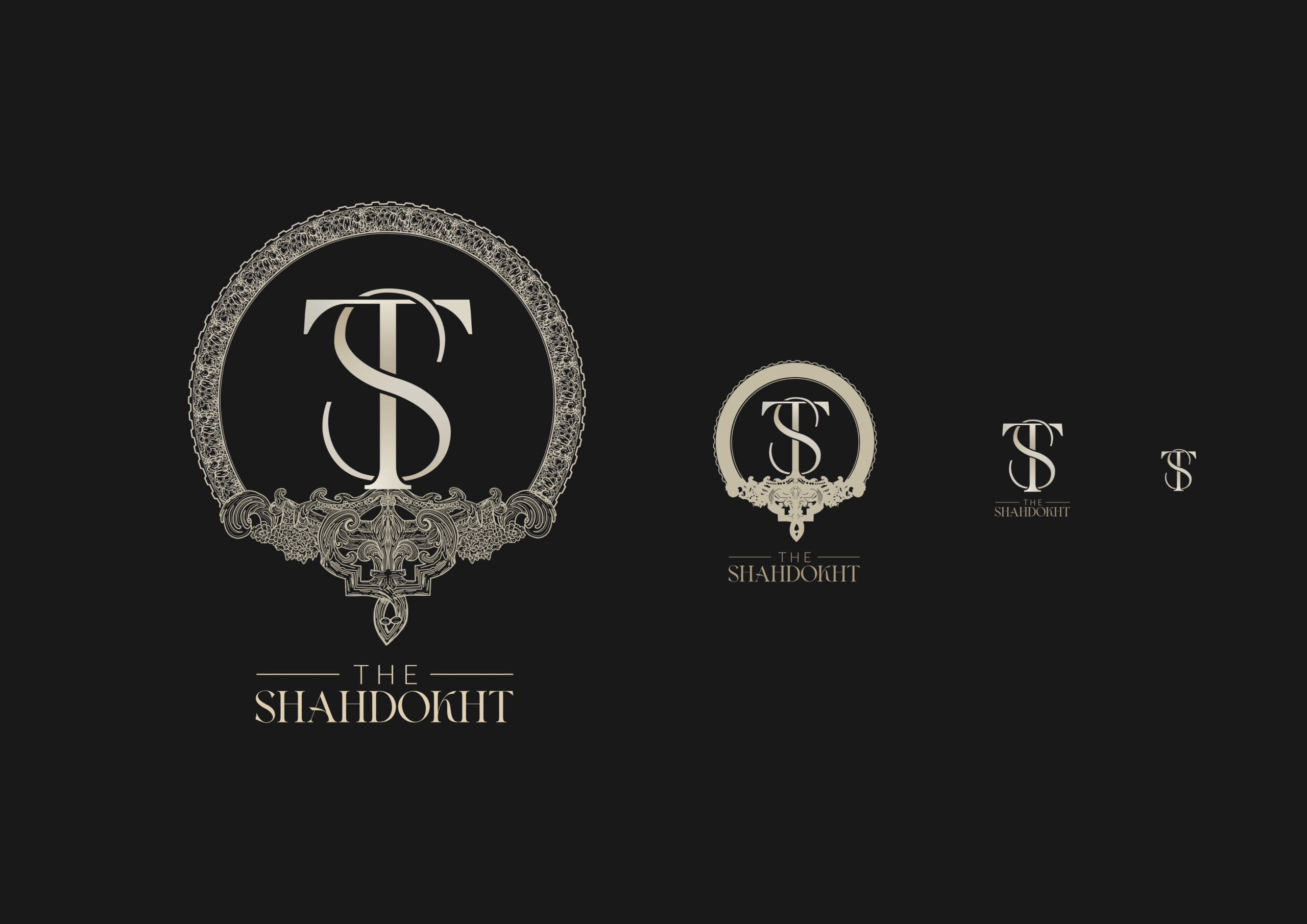
One of the most complex pieces of identity artwork I’ve ever created is the “rich version” of the Shahdokht logo.
It’s intentionally intricate—far more detailed than a typical logo—but that is precisely the point. It wasn’t designed to be used everywhere. It was designed as the top tier within a broader identity system, enabling:
- Hero moments in packaging
- Luxury print applications
- Statement pieces across brand storytelling
Because it sat within a structured system, the brand gained flexibility as well as visual drama.
This is the correct way to use detailed artwork: selectively, intentionally, and strategically.
Cognitive Principles: Why the System Works
When we look at a brand mark, our brains process information in a predictable sequence:
- Shape recognition – the overall silhouette
- Key internal structures – recognisable anchor points
- Detail – textural or illustrative nuance
- Fine texture – the smallest elements

By designing multiple logo versions that preserve the core shape and structure, you ensure recognisability remains intact—even when detail must be removed.
This is how complex logos remain functional across all sizes.
Common Mistakes to Avoid
Many designers (and brands) attempt detailed logos without the system to support them. This leads to:
- Marks that collapse at small sizes
- Loss of legibility
- Visual clutter
- Inconsistent brand presentation
- Unprofessional or amateur perception
Detail without strategy always fails.
Doing It Properly: Your Two Options
If you’re considering a detailed luxury mark, you have two paths:
1. Learn the process
I teach a class on creating luxury logos the right way—from structure to detail to system-building.
https://www.youtube.com/watch?v=gfw1F_s-sa8
2. Have it done professionally
If you’d prefer a bespoke luxury identity, feel free to reach out. I specialise in creating detailed, system-based logos for high-end brands.
Final Thoughts
Detailed luxury logos are powerful—but only when created with restraint, structure and strategic intent. The secret is not the artwork itself, but the identity system surrounding it.
When executed correctly, a detailed mark becomes:
- A storytelling device
- A symbol of craftsmanship
- A premium brand asset
- A multi-tiered tool for different contexts
Luxury branding rewards those who think beyond decoration and focus on identity architecture.